
I inherited four broken decks when my younger brother moved out of my parents’ basement and into his first apartment — he didn’t want them, I didn’t want to throw away boards with actual history on them, and for about eight months they just leaned against my hallway wall in a pile that my landlord side-eyed every time she came by for a maintenance visit.
It wasn’t until I actually sat down and treated it like a real design project — measuring, spacing, picking a layout on paper first — that it stopped looking like clutter and started looking like the thing everyone asks about when they walk into my apartment.
Skateboard wall decor has a reputation problem. Done lazily, it reads like a 2013 dorm room that never grew up.
Done with any intention at all, it’s genuinely one of the more interesting things you can put on a wall — it’s sculptural, it’s got real texture and color variation that most wall art doesn’t, and if the boards actually mean something to you (yours, a friend’s, a shop you used to ride for), it’s decor with an actual story instead of something you bought because a room needed “something.”
This list covers the full range — from a single statement deck to full gallery walls, from renter-safe options that won’t cost you your deposit to permanent builds if you own your place.
I’m also covering the stuff most posts skip: what mounting hardware actually holds a 3-4 lb deck without sagging after a month, what this costs at different budget levels, and the mistakes that make skateboard walls look cheap instead of curated.
1. The Single Statement Deck, Centered and Alone
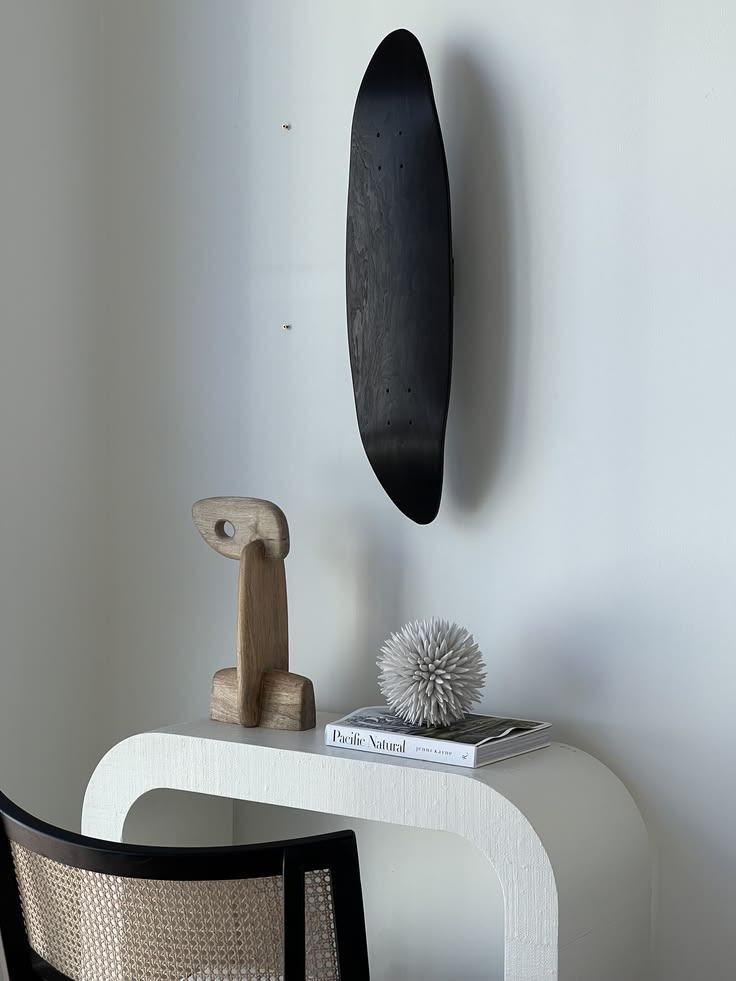
Why it works: the biggest mistake people make with skateboard decor is assuming more is more. One board, well-placed, does more for a room than five crammed together. It reads as art, not as “I used to skate and didn’t know what to do with this.”
How to do it: center it at eye level (roughly 57-60 inches from the floor to the middle of the deck, same rule as hanging a painting) on a wall with some breathing room around it — at least 18-24 inches of empty wall on each side if you can manage it. This works best over a console table, a desk, or a low dresser rather than in the dead center of a big blank wall, where it can look stranded.
Pro tip: if the graphic on the deck has a clear “up” orientation — a face, text, a logo — don’t just eyeball it level. Boards have a slight camber (the curve along the length), and if you don’t account for it, a perfectly level board can look crooked from across the room. Use a level, not your eye.
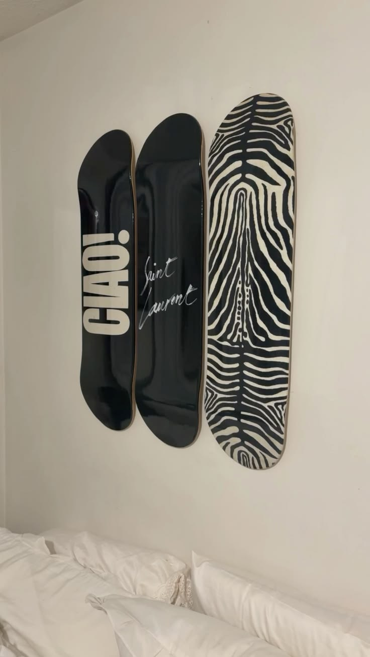
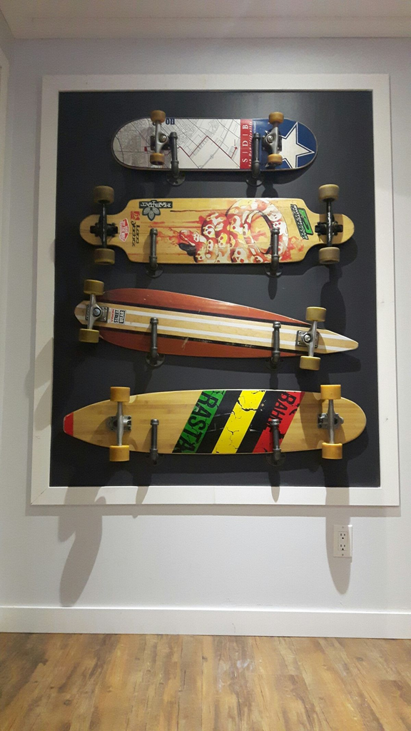
2. The Vertical Trio (Odd Numbers, Not Even)

Why it works: three boards stacked vertically is one of the most forgiving layouts there is, and it works in narrow spaces — stairwells, hallways, the sliver of wall next to a door — where a wide gallery wall physically won’t fit.
How to do it: space them evenly, nose-to-tail or all facing the same direction, with 3-4 inches between each board. Odd numbers of anything in a vertical run read as more intentional than even numbers — I genuinely don’t know the design-theory reason for it, but every stairwell gallery I’ve ever seen that used 4 boards looked slightly off compared to the ones that used 3 or 5.
Pro tip: measure your stairwell wall’s rise before you buy hardware. A lot of stairwell walls have an angled top edge, and if your top board is close to that angle, even a half-inch of miscalculation looks bad. Cut a paper template first.
3. The Full Gallery Wall (6+ Boards)
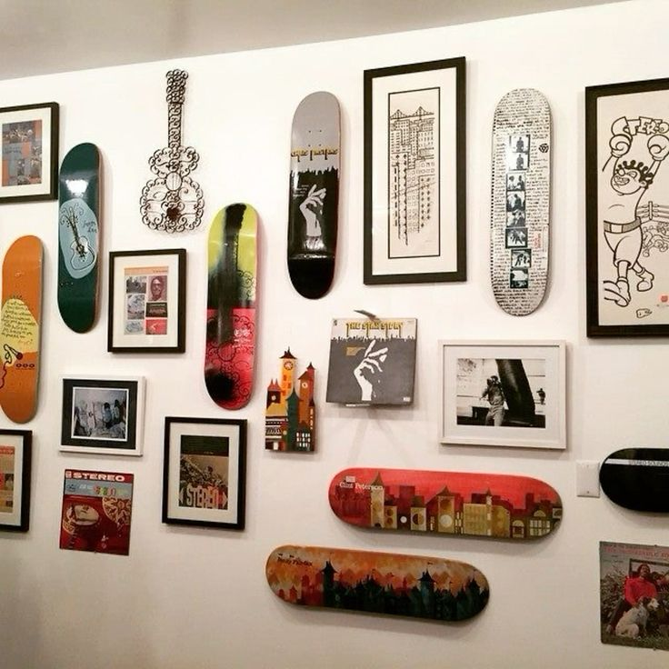
Why it works: this is the “statement” version, and it’s genuinely the best way to use a mismatched collection of boards that don’t share a color story — old decks, a friend’s board, a shop deck, whatever you’ve collected over the years. The chaos becomes the point.
How to do it: lay everything out on the floor first (I cannot stress this enough) and photograph it from above before you put a single hole in the wall. Mix orientations — some vertical, some horizontal, a couple at a slight diagonal — and vary the spacing slightly rather than forcing a rigid grid, which tends to look more like a display case than a wall you actually live with.
Pro tip: leave one gap in the layout, even a small one, like you’re mid-project. A perfectly filled gallery wall with zero room to grow looks static; one with an obvious “next board goes here” spot looks like it belongs to someone actually still into this.
4. Horizontal “Shelf Line” Mounting
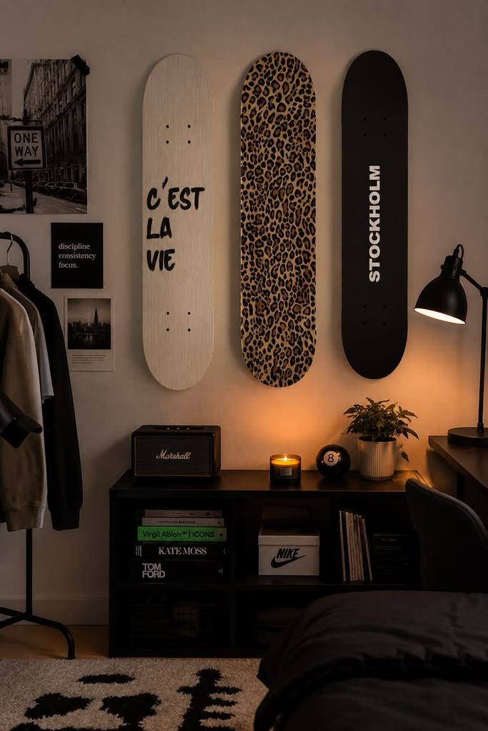
Why it works: mounting boards horizontally, in a straight line, at a consistent height reads more like a design choice and less like a skate shop. It also plays well with furniture — a horizontal line above a couch or a long dresser echoes the furniture line below it instead of competing with it.
How to do it: pick one height and stick to it obsessively — use a laser level if you have access to one, painter’s tape as a guide if you don’t. Space boards 2-3 inches apart for a tight, gallery-style look, or 8-12 inches apart if you want each board to read as its own piece.
Pro tip: this layout is the least forgiving of mismatched hardware. If even one bracket sits a millimeter higher than the others, it’s the first thing anyone notices. Buy your hardware in one batch from one source rather than mixing brands.
5. The Diagonal Cluster
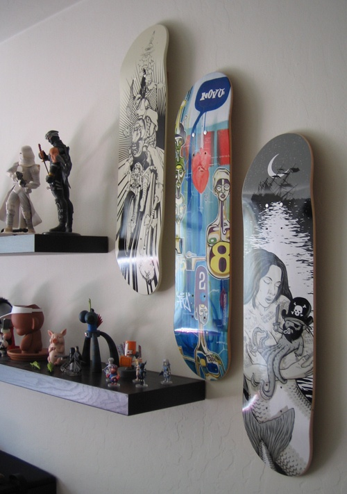
Why it works: this is the layout for people who find grids stressful. Angling boards at 15-45 degrees and clustering them creates movement on the wall — it feels more like a piece of art than a display.
How to do it: pick a dominant angle (say, 30 degrees) and let most boards follow it, with one or two at a contrasting angle to break the pattern. This works especially well with boards that have busy, colorful graphics — the diagonal energy matches the visual noise of the deck art instead of fighting it with rigid horizontal lines.
Pro tip: diagonal layouts are the hardest to get level-adjacent hardware for, because most brackets are designed to hang flush. Look specifically for adjustable or swivel-mount hardware, or expect to do some improvising with picture wire and two hooks per board instead of a single center mount.
| Layout | Best For | Difficulty | Boards Needed |
|---|---|---|---|
| Single statement deck | Small walls, minimalist rooms, renters | Easy | 1 |
| Vertical trio | Hallways, stairwells, narrow gaps | Easy | 3 |
| Full gallery wall | Large blank walls, mismatched collections | Hard | 6+ |
| Horizontal shelf line | Above couches, dressers, headboards | Medium | 3-6 |
| Diagonal cluster | Statement walls, colorful/busy graphics | Medium-Hard | 4-7 |
6. Deck-as-Floating-Shelf
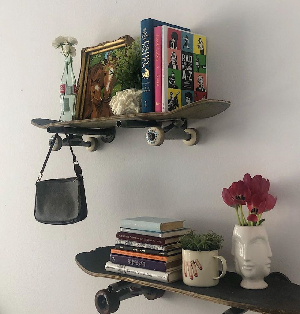
Why it works: this is the move if you want your skateboard decor to actually do something, not just look at it. Old, non-riding decks are structurally solid enough to hold books, small plants, or a record player if you mount them right, and it solves the “is this decor or clutter” problem by making it obviously functional.
How to do it: you need real shelf brackets rated for weight — not just a couple of screws through the trucks — because a loaded shelf puts way more stress on the wall than a hanging display piece. L-brackets mounted underneath, hidden by the deck’s width, work best.
Pro tip: don’t use a deck you actually still ride, obviously, but also don’t use one with major structural cracks — the wood needs to hold its shape under weight, not just look intact.
7. Grouped by Color Story, Not by Owner or Brand

Why it works: if you’re combining boards from different sources — yours, a friend’s, thrifted decks — grouping by color rather than by “these are all mine, these are all Jordan’s” makes the wall read as designed rather than assembled from spare parts.
How to do it: pull your dominant wall colors and pick boards that either match or intentionally contrast. A wall of mostly neutral decks with one loud graphic in the center reads as curated; a random mix of every color at once reads as a garage sale.
Pro tip: if you don’t own enough boards in a coherent color story, this is where secondhand shopping actually pays off — thrift stores, garage sales, and skate shop “seconds” bins are full of cheap decks you can buy purely for their graphic, not their ride quality.
8. The Monochrome Wall
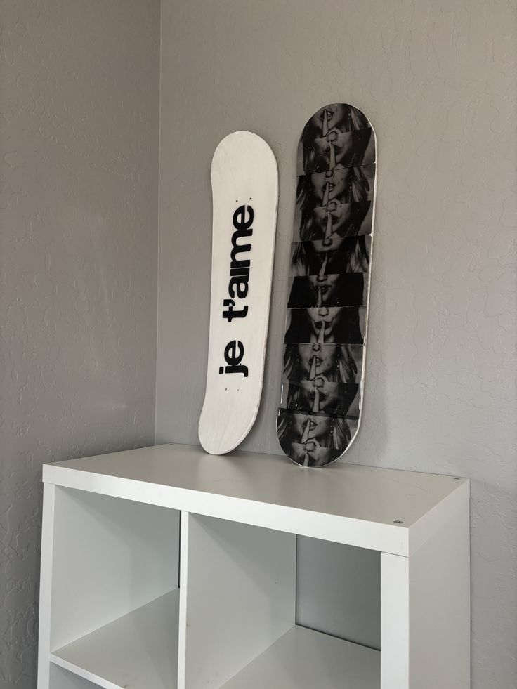
Why it works: this is the opposite instinct from a color-story gallery — instead of variety, you go all-in on one palette (all-black decks, all-white, all-natural wood grain) for a minimalist, almost architectural look. It’s the layout that reads least “skater” and most “design blog,” which is exactly the appeal if your space leans more Scandinavian-minimal than skate shop.
How to do it: source blank or solid-color decks specifically — most skate shops sell “blanks” cheaper than graphic decks, since you’re not paying for the printed art, which also makes this one of the more budget-friendly options on this list.
Pro tip: monochrome only works if your spacing is precise, because there’s no colorful graphic to distract from uneven gaps. This layout demands the most measuring of anything on this list.
9. Skateboard Wall Clock
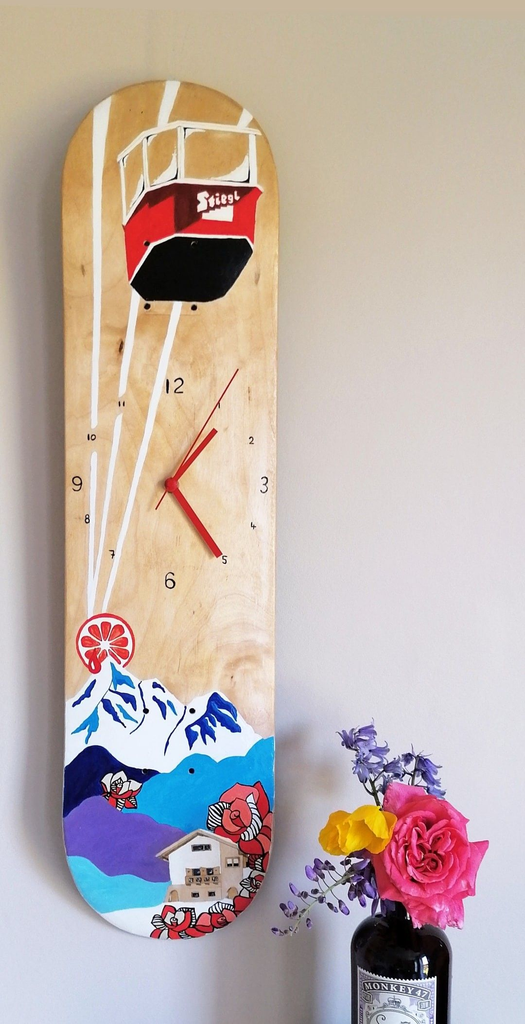
Why it works: this is a genuinely clever repurpose — an old deck with clock hardware installed through the center becomes a functional piece instead of purely decorative, and it’s a great option if you only have one board you want to feature but want it to earn its wall space.
How to do it: you can buy a clock mechanism kit for under $15 and install it yourself with a drill — center the hole where the mechanism shaft goes, thread it through, attach the hands on the front.
Pro tip: the graphic orientation matters a lot here — a board with a strong directional design (an arrow, a face, text) can look genuinely odd once it’s got clock numbers implied around it. Blank or abstract decks work best for this one.
10. Deck Fragments as Small Art
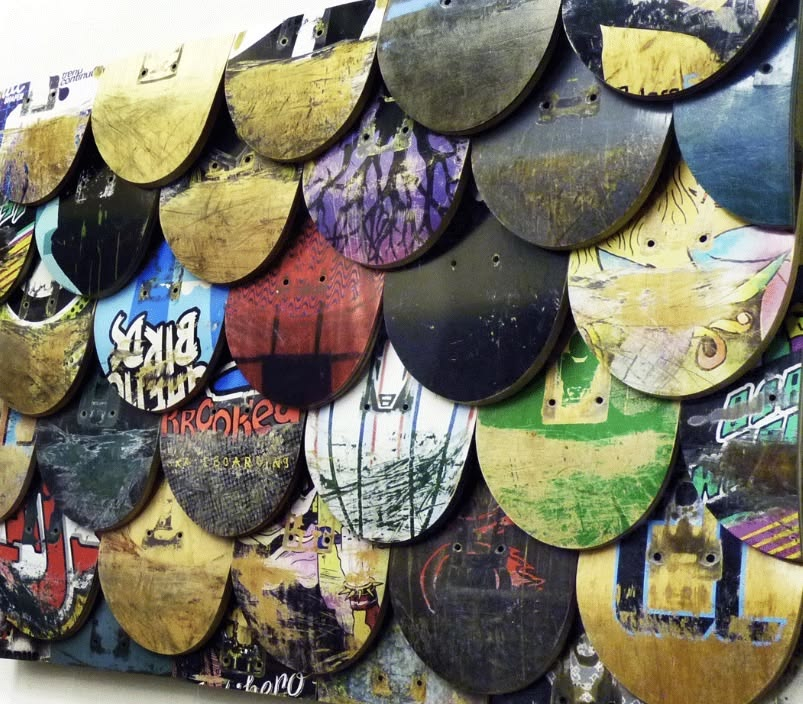
Why it works: a broken deck doesn’t have to go in the trash. Cutting a snapped board into smaller pieces — the nose, the tail, a chunk of the graphic — and framing or mounting them individually turns a piece of “damage” into intentional small-format art, and it’s the best use for boards that are too cracked to hang whole.
How to do it: use a jigsaw for clean cuts, sand the edges so they’re not sharp, and mount with small D-rings or a simple shadow-box frame if you want it protected behind glass.
Pro tip: keep the trucks or grip tape texture visible on at least one piece in a grouping — a fragment that’s been sanded totally smooth loses the “this was actually ridden” texture that makes skateboard decor interesting in the first place.
11. Grip-Tape-Out Instead of Graphic-Out

Why it works: nobody talks about this one, but flipping a board so the black grip tape faces out instead of the printed graphic gives you a completely different texture — matte, black, almost like a piece of fabric art — and it’s the move if your board’s graphic is faded, damaged, or just doesn’t match your space, but the shape is what you want.
How to do it: mount exactly the same way you would graphic-out, just flip your bracket placement to account for the reversed curve.
Pro tip: grip tape yellows and fades in direct sun faster than a printed graphic does, so this works best out of direct light — an interior hallway, not a south-facing window wall.
12. Skateboard Coat Rack / Entryway Hooks
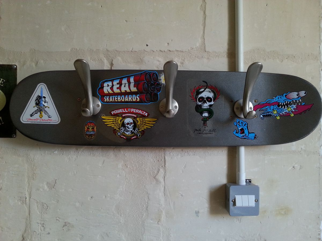
Why it works: mounting hooks directly into an old deck and hanging it in an entryway solves two problems at once — you get skateboard decor and a place to hang keys, bags, or a jacket, which is exactly the kind of dual-purpose piece that makes small entryways feel more functional instead of more cluttered.
How to do it: 3-4 coat hooks screwed directly through the deck into wall studs (not just drywall anchors — coats and bags add real weight over time), spaced evenly across the length of the board.
Pro tip: pick a deck with a graphic you don’t mind partially covering, since bags and coats will sit right over the center of the design most of the time. A busy, all-over pattern hides this better than a deck with one centered focal image.
13. The Riser-Stacked Display (For Textural Depth)
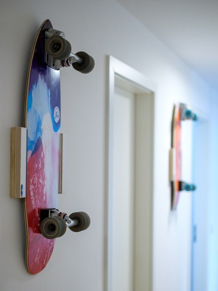
Why it works: mounting a board flush against the wall is the default, but adding risers (small wood or foam blocks) behind it lifts the deck off the wall by an inch or two, which throws a subtle shadow and gives the whole display more depth — especially noticeable under any kind of angled light.
How to do it: cut small blocks of scrap wood, attach them to the wall first, then mount the deck to the risers instead of directly to the wall.
Pro tip: this is the layout where mounting hardware visibility matters most, because the gap behind the board is exactly where you’d see exposed screws or brackets from an angle. Use hardware that mounts from the back of the riser block, not through the face.
14. Skateboard Wheel Wall Art (No Deck Required)
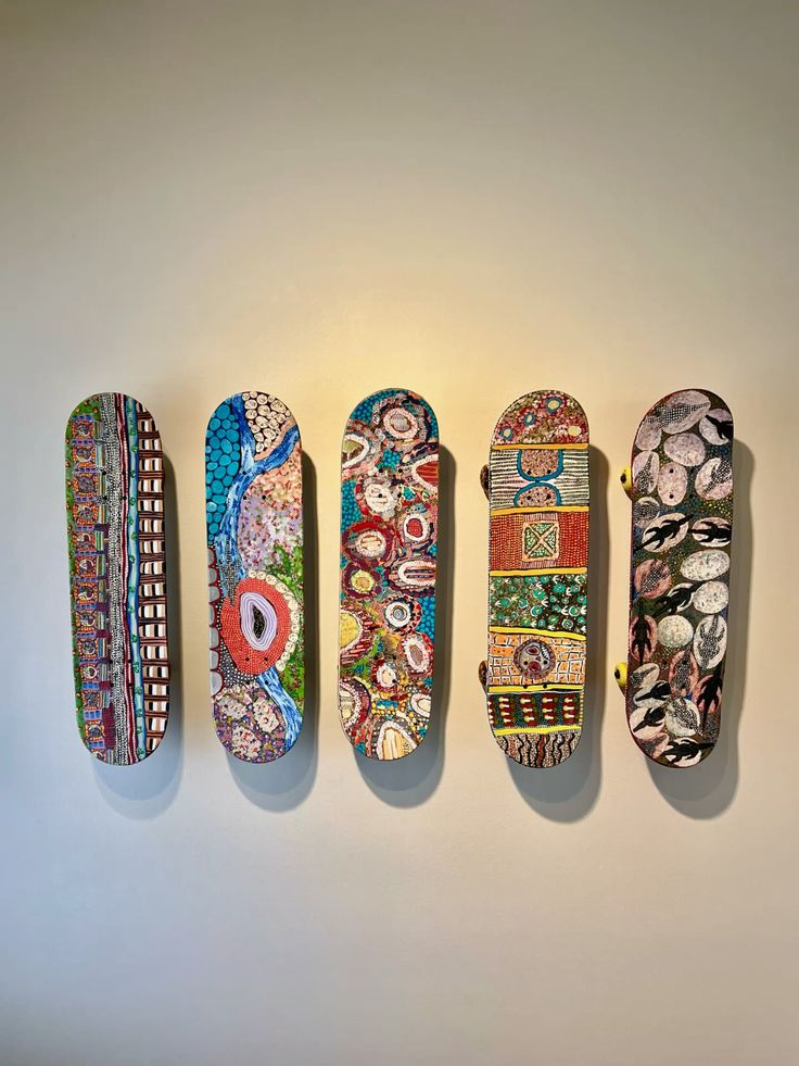
Why it works: if you don’t have full decks but you’ve got a pile of old wheels — from board upgrades, broken setups, whatever — mounting just the wheels in a grid or a circular pattern is a completely different visual than a deck wall, more abstract and pattern-based, and it works in tighter spaces where a full board won’t fit.
How to do it: wheels mount easily with a single screw through the center bearing hole into the wall, so this is genuinely one of the easiest and cheapest projects on this list.
Pro tip: mix wheel colors and sizes intentionally rather than using a uniform set — the variation is what makes this read as an art piece instead of just “spare parts on a wall.”
15. Truck-and-Wheel Assemblage (3D Wall Sculpture)

Why it works: this is the most sculptural option here — mounting full trucks with wheels still attached, arranged in an abstract pattern, creates real three-dimensional shadow and texture that flat deck mounting can’t. It’s a bigger commitment, both in wall space and in how “skate-forward” your room reads, but it’s genuinely unlike anything else on this list.
How to do it: trucks mount through their existing baseplate holes, so you’re just screwing directly into studs or heavy-duty anchors — no special hardware needed beyond what came with the truck.
Pro tip: this one gets dusty fast because of all the exposed hardware and moving wheel parts. If you’re not up for wiping it down every few weeks, this isn’t the layout for a bedroom — better suited to a garage, workshop, or a room you’re not precious about.
16. Skateboard Headboard
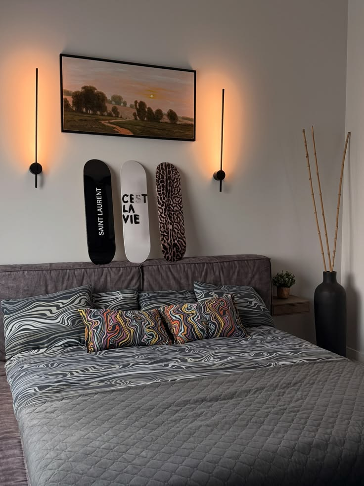
Why it works: this is a bigger, more permanent project, but mounting boards in a line behind your bed — essentially building a headboard out of decks — is one of the more striking things you can do with a collection, and it solves the “what goes above my bed” question in a way that’s specific to you instead of generic framed art.
How to do it: you’ll want 4-8 boards depending on your bed width, mounted in a tight horizontal line at headboard height (usually starting right at or just above mattress-top height), ideally into studs given how much wall space this covers.
Pro tip: measure twice against your actual mattress width, not your bed frame width — decks that extend past the edges of the mattress on either side look intentional; decks that stop randomly mid-mattress look like a miscalculation.
17. The Rotating “Current Favorite” Slot

Why it works: this is less a layout and more a system — designating one mounting spot as a rotating feature, where you swap the board out every season or whenever you get something new, keeps a permanent display from feeling static, and it’s a good way to actually use hardware you already installed if your interests (or your kid’s) shift over time.
How to do it: use hardware designed for quick removal — J-hooks or clip-style mounts rather than anything that requires re-drilling — so swapping the board takes thirty seconds, not a full re-hang.
Pro tip: keep the rest of the wall around this slot deliberately calmer or more neutral, so the rotating piece has room to actually be the focal point instead of competing with everything else.
18. Skateboard Nursery or Kid’s Room Art
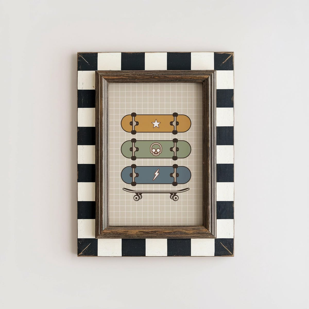
Why it works: this sounds like an odd category, but skateboard decor scaled down for a kid’s room — smaller boards, brighter colors, mounted lower on the wall — reads as playful and a little unexpected in a way that generic kid’s-room art doesn’t, and it’s a genuinely popular choice for parents who skated themselves and want to pass some of that into the room without it looking like a teenager’s basement.
How to do it: use mini or “cruiser-length” decks rather than full-size street decks, mounted lower than adult eye level — closer to a child’s sightline, roughly 40-48 inches from the floor.
Pro tip: sand any rough or chipped edges more aggressively than you would for an adult room, and skip any deck with graphics you haven’t actually looked closely at — some skate graphic art is genuinely not kid-appropriate, and it’s an easy detail to miss if you’re grabbing boards secondhand in bulk.
19. Renter-Safe Command Strip Mounting
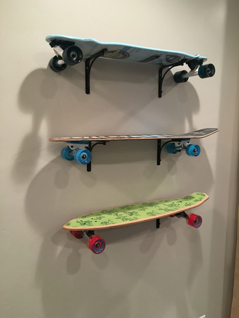
Why it works: this is the one most people actually need. If you’re renting and can’t drill into the wall, heavy-duty adhesive strips rated for the weight of a deck (most full decks run 3-4 lbs) let you do almost any layout on this list without losing your deposit.
How to do it: use adhesive strips rated for at least double your board’s actual weight — so for a 4 lb deck, look for strips rated 8 lbs or more per pair — and apply to a clean, dust-free wall; oil and dust from just wiping the wall with your hand is enough to weaken the bond over months.
Pro tip: don’t trust a single strip. Use at least two sets per board — one near the nose, one near the tail — even on a smaller deck, because a single central mount point puts too much leverage on the adhesive if the board gets bumped.
20. Skateboard Bar Cart or Serving Tray Repurpose
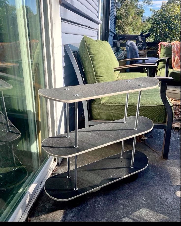
Why it works: mounting hardware isn’t the only option — an old deck with the trucks removed and legs or a stand added underneath makes a genuinely solid small side table or bar cart top, and it’s a good project if you’d rather use your favorite board than just look at it on the wall.
How to do it: remove the trucks, sand any exposed screw holes smooth, and attach hairpin legs or a simple stand to the underside using the existing truck mounting holes, which are already positioned to distribute weight evenly.
Pro tip: seal the deck’s surface with a food-safe wood sealer if you’re planning to actually set drinks on it — the printed graphic under bare wood can wear or smear from condensation rings over time without a protective coat.
21. Skateboard Deck Frame Shadow Box (For a Damaged or Sentimental Board)
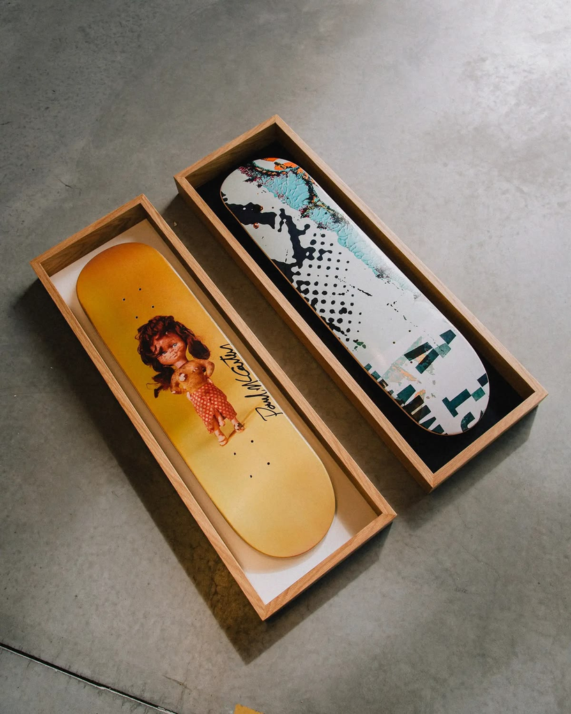
Why it works: if you’ve got a deck that’s too cracked or worn to mount flush, or one with real sentimental value you want protected — your first board, a signed deck, something a friend rode — a deep shadow box frame keeps it dust-free and protected behind glass while still displaying it fully, which none of the direct-mount options on this list offer.
How to do it: you’ll need a custom or deep shadow box, since a standard-depth frame usually isn’t deep enough for a full deck’s camber — most custom framers can build one, or you can build a simple plywood box frame yourself if you’re comfortable with basic woodworking.
Pro tip: this is by far the most expensive option here, but it’s also the only one that actually protects a board from dust and fading over years, so it’s worth the cost specifically for boards you’d genuinely be upset to lose to wear.
What This Actually Costs
Skateboard wall decor spans a huge budget range depending on how many boards you’re using and how much hardware you need:
- Under $30: A single deck you already own plus a basic 3-piece mounting kit ($10-15) — the single statement deck or a DIY wheel-grid piece both fit here easily.
- $30-80: A vertical trio or small horizontal line using boards you already have, plus proper hardware for each (figure $8-15 per board in mounting hardware if you’re buying real J-hooks or wall mounts instead of improvising).
- $80-200: A full gallery wall of 6+ boards, especially if you’re buying some secondhand decks specifically for their graphics rather than using ones you already own — budget $10-25 per thrifted deck depending on where you’re shopping.
- $200+: Custom builds — a headboard, a shadow box frame, or a bar cart conversion — where you’re paying for either a large quantity of boards or actual custom fabrication/framing work.
Renter-safe adhesive hardware runs slightly more per board than permanent wall anchors do, but it’s still a fraction of the cost compared to a framed art piece of comparable size, which is honestly one of the better arguments for this whole category of decor if you’re on a budget.
Where I’d Start
If I were doing this over from scratch, knowing what I know now, I’d start with option one — a single deck, centered, with real breathing room around it — and live with it for a few weeks before deciding whether I wanted to build out further. Almost every skateboard wall I’ve seen (including my own early attempt) went wrong from doing too much at once instead of too little. The gallery walls, the headboards, the sculptural truck pieces — those all work, but they work because someone built up to them, not because they nailed twelve boards to a wall in one weekend and hoped for the best.
Start small, get your spacing and hardware right on one board, and let the rest of the wall earn its way in over time.


Leave a Reply