
Let’s be honest—picking paint colors for a nursery can feel like walking through a candy store with a blindfold on.
Too many choices, way too many undertones, and don’t even get me started on the Pinterest rabbit holes.
I’ve been there, staring at fifty shades of “white” wondering why one looks like vanilla ice cream and the other looks like a dirty sock.
If you’re in that same boat, don’t panic. I’ve rounded up 21 of the best nursery paint colors that actually work in real life—not just on those perfectly lit Instagram feeds.
1. Soft White – The Timeless Classic
White in a nursery? Absolutely. Soft white walls create a clean, airy backdrop that pairs with literally any décor. You can switch from pastel accents to bold pops of color as your child grows—without repainting every year.
Why it works: White reflects natural light, making even small nurseries feel bigger. Add warm wood furniture, and you’ve got instant cozy vibes.
2. Warm Beige – Subtle but Cozy
Beige isn’t boring when you pick the right one. A warm beige feels earthy and grounding, but still neutral enough to let your nursery décor shine.
Pro tip: Pair it with woven baskets, rattan furniture, and soft cotton throws for that trendy, natural look.
3. Light Gray – Calm and Sophisticated
Gray might sound “adult,” but in nurseries, it’s a winner. A light gray shade creates a peaceful backdrop without feeling sterile.
And FYI—gray plays nicely with almost any color scheme. Pastels? Perfect. Bright accents? Yep. It’s basically the Switzerland of nursery paint colors.
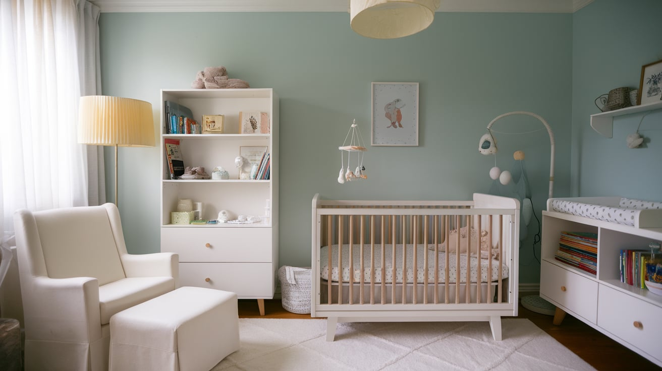
4. Pale Blue – Sweet and Dreamy
Blue has been a nursery go-to forever, but the secret is keeping it soft and pale. Think sky at sunrise, not superhero blue.
This color soothes the eye, making bedtime (hopefully) a little easier. IMO, pale blue also pairs beautifully with whites and soft woods.
5. Mint Green – Fresh and Playful
Want something cheerful but not too bold? Mint green gives off fresh, playful vibes while still keeping things calm.
It’s gender-neutral, timeless, and works equally well with modern or vintage nursery furniture.
6. Lavender – Gentle and Calming
Lavender adds just a hint of color without overpowering the room. It’s soft, soothing, and gives off that magical bedtime-story feel.
Pro tip: Choose a muted lavender instead of neon purple unless you want your baby’s room to glow like a disco. 🙂
7. Butter Yellow – Warm and Happy
Yellow gets tricky—you don’t want “highlighter” walls that overstimulate your baby. Instead, go for a soft butter yellow.
It’s warm, cheerful, and perfect for creating a bright nursery without being overwhelming.
8. Dusty Rose – Chic and Soft
Skip the Barbie pink. A dusty rose shade feels way more modern and sophisticated while still giving off those sweet nursery vibes.
Pair it with gold accents and light wood for a dreamy, Instagram-worthy nursery.
9. Sage Green – Trendy and Serene
If you’re into that earthy, calming aesthetic, sage green is where it’s at. It’s soft, versatile, and looks great with natural materials like linen and wood.
Honestly, sage green might be the most “Pinterest-approved” nursery shade right now—and for good reason.
10. Light Peach – Warm but Subtle
Peach might sound old-school, but light peach tones add warmth and charm without feeling dated.
It’s a great compromise between pink and beige, giving you a soft blush that feels cheerful but not too girly.
11. Aqua – Bright but Soothing
Soft aqua adds a refreshing splash of color that still feels calming. It’s lively without being loud, which is basically the perfect combo for a nursery.
Try pairing it with crisp white trim and natural textures for a breezy, coastal vibe.
12. Cream – Warm and Neutral
Cream is like white’s warmer, cozier cousin. It works especially well if you want a neutral nursery that doesn’t feel too stark.
It’s also super forgiving when it comes to marks and scuffs—because let’s be real, nurseries don’t stay spotless for long.
13. Light Coral – Fun and Cheerful
If you want something playful without going neon, light coral is the way to go. It’s cheerful, gender-neutral, and surprisingly versatile.
Pair it with teal or aqua accents, and you’ll have a nursery that feels vibrant but balanced.
14. Taupe – Understated and Elegant
Taupe sounds boring until you see it in a nursery. Warm taupe tones create an elegant, neutral space that feels timeless.
It’s especially great if you plan to keep the nursery décor minimal or lean into a modern aesthetic.
15. Sky Blue – Airy and Calm
Softer than pale blue, sky blue feels like a breath of fresh air. It’s bright, airy, and instantly calming.
Ever wondered why so many spas use this color? Because it works like magic for relaxation—exactly what you want in a nursery.
16. Seafoam Green – Cool and Refreshing
Not quite mint, not quite aqua, seafoam green sits in that perfect middle zone. It’s cool, refreshing, and gives your nursery a light, breezy vibe.
Pair it with sandy beige or warm wood for a subtle coastal theme.
17. Light Terracotta – Earthy and Warm
Terracotta might sound bold, but a soft, light version brings warmth without overwhelming the space.
It’s cozy, grounding, and pairs beautifully with boho or rustic nursery décor.
18. Blush Pink – Soft and Sweet
Blush pink will never go out of style for nurseries. It’s soft, feminine, and feels endlessly charming.
Add white furniture and some gold accents, and you’ll have a nursery straight out of a magazine.
19. Soft Lilac – Whimsical and Gentle
Lilac is like lavender’s slightly more colorful sibling. A soft lilac wall adds whimsical charm while still keeping the space serene.
Perfect if you want just a touch more color than lavender without going bold.
20. Light Olive – Natural and Relaxed
A muted light olive green adds warmth and earthiness, making the nursery feel grounded.
It’s perfect if you want a natural theme—think leafy prints, wooden toys, and cozy textures.
21. Greige – The Modern Neutral
Greige (that gray-beige mix) has basically become the new king of neutrals. In a nursery, it gives you a sophisticated, modern look without feeling cold.
It’s the perfect backdrop for literally any style—from Scandi minimalism to playful pops of color.
Tips for Choosing the Right Nursery Paint Color
Okay, so you’ve got 21 amazing options. But how do you actually pick one without losing your mind? Here are a few quick tips:
- Test swatches in natural light. Paint looks wildly different at 10 a.m. versus 6 p.m.
- Think about furniture. Your crib, rug, and curtains will influence how the color looks.
- Go softer than you think. Bold shades get overwhelming in small spaces—trust me.
- Consider longevity. Pick something that can grow with your child so you’re not repainting every two years.
Final Thoughts
Choosing the perfect nursery paint color doesn’t have to feel like rocket science. The key is going for shades that feel calm, timeless, and flexible enough to evolve with your child’s personality. Whether you love the simplicity of soft white or the earthy charm of sage green, these 21 nursery paint colors cover every style and mood.
At the end of the day, your baby probably won’t care if the walls are greige or blush pink—but you will, especially during those late-night rocking sessions. So pick something that makes you feel good, too.
And hey, if you’re still stuck, here’s my personal hack: paint one wall a fun accent color (like mint or lavender), and keep the rest neutral. Best of both worlds.
So—what color are you leaning toward? 🙂


Leave a Reply