
If you’ve ever stared at your living room and thought, “Why doesn’t this feel as relaxing as those beach house photos I save at 2 a.m.?” you’re definitely not alone.
I’ve chased that breezy, coastal color palette vibe more times than I’d like to admit.
And honestly, once you get the colors right, everything else kind of falls into place… almost like magic. Or maybe like good design choices—same thing, IMO.
So today, I’m walking you through 19 coastal color palette living room ideas that actually work in real homes—not just Pinterest-perfect beach houses.
Ready to turn your space into your own personal shoreline?
Let’s get into it.
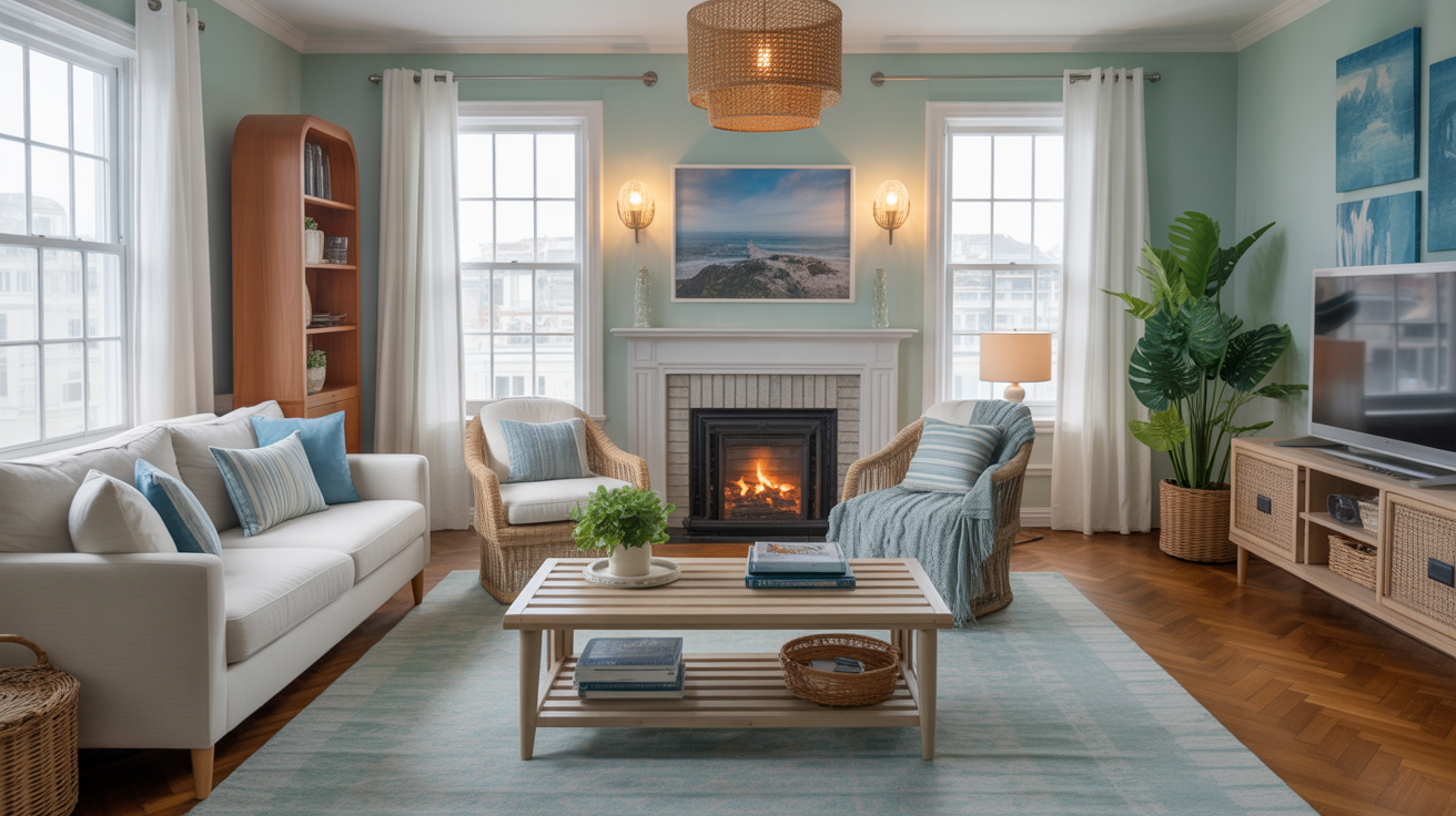
1. Classic Blue & White (Because It Never Fails)
You can’t go wrong with blue and white in a coastal living room. It’s timeless, crisp, and basically screams “I vacation on the coast even if my wallet says otherwise.”
If you ever wonder why this combo works so well, think about it—blue mirrors the ocean, and white balances it with a clean, airy vibe.
Try this:
- White slipcovered sofas
- Navy striped throw pillows
- Soft blue wall art
I used this palette in a rental once, and it instantly made the place feel cleaner than it actually was. Win.
2. Soft Sand + Cream (For That Subtle, Lux Coastal Look)
If you prefer a calm, neutral take on coastal style, go with sand tones and creamy whites. This palette feels warm, sophisticated, and way more polished than its beach shack cousins.
Use:
- Warm beige walls
- Cream upholstery
- Natural woven textures like jute or seagrass
Ever wondered why this combo feels so zen? Because it mimics the beach itself—no ocean needed.
3. Seafoam Green + White (Fresh and Breezy)
I love seafoam green because it brings a breath of fresh air without being loud. Pair it with white for a clean, uplifting vibe.
Add:
- Seafoam throw blankets
- Whitewashed furniture
- Light wood accents
I once painted an accent wall in seafoam on a whim, and it turned into my favorite thing about the room. Zero regrets.
4. Light Gray + Blue Undertones
If you want something coastal but not too on the nose, go with light gray shades that have subtle blue undertones. This palette gives your space that cool, misty morning coastal vibe.
This combo works especially well when you:
- Add driftwood accents
- Choose gray sofas
- Layer blue striped rugs
Ever notice how gray can either look chic or depressing? The trick is choosing one with a little blue in it—trust me.
5. Coral + Soft White (For a Playful Pop)
If you want something a bit more fun, go for soft coral. It adds warmth without being overwhelming.
Try coral in:
- Throw pillows
- Accent chairs
- Abstract art
It’s basically the grown-up version of “I love pink.”
6. Navy + Natural Wood
This color combo hits that perfect “upscale coastal” note. Navy feels rich and grounded, while natural wood brings warmth.
Use:
- Navy walls (if you’re brave)
- Wood coffee tables
- Navy patterned rugs
I once used navy in a tiny living room, and everyone warned me it would look smaller. Spoiler: it didn’t. It looked cozy and intentional.
7. Pale Aqua + White (Instant Calm)
Aqua reminds me of shallow shoreline water—calm, clear, effortless. It works especially well in bright rooms with lots of natural light.
Add:
- Aqua curtains
- White couches
- Light cane furniture
Does this combo ever fail? Nope.
8. Sage Green + Sand Beige
Sage feels coastal without being literal. When you mix sage with sand tones, you get a soft, earthy, organic take on coastal style.
Use this palette when you want something subtle but still beachy.
9. Turquoise + Driftwood Gray
If you want something vibrant yet balanced, pair turquoise with driftwood gray. The turquoise gives energy, while the gray grounds the whole look.
This combo works beautifully with:
- Textured stone décor
- Gray upholstered seating
- Bold turquoise accents
Tell me this doesn’t feel like a vacation house in the best way.
10. Sky Blue + Cloud White
This pair gives you that “wide open sky” vibe in the best possible way. Light, airy, endlessly relaxing.
Use it if your living room feels cramped—you’ll thank me later.
11. Navy + Mint Green
I know this sounds unusual, but navy and mint play incredibly well together in a coastal palette. Navy gives depth; mint brings in lightness.
This combo works great when you want something coastal but still unique enough to feel curated.
12. White + Rattan Tones
White and natural rattan create a bright, minimalist coastal feel. You’ve probably seen this look all over modern coastal homes because it creates such a relaxed, open vibe.
Use:
- Rattan pendant lights
- White sofas
- Coastal art in muted tones
Ever wonder why everyone loves rattan right now? Because it works with literally everything.
13. Oceanic Teal + White
If you want a deeper, moodier coastal look, go with oceanic teal. It still feels coastal but has a more dramatic edge.
Teal + white = classy coastal that doesn’t feel overdone.
14. Warm Taupe + Blue Accents
Warm taupe adds coziness. Blue accents add the coastal connection. Put them together, and you get an elevated, hotel-worthy living room.
Try adding:
- Taupe sofas
- Blue pottery
- Blue-and-taupe rugs
This combo works especially well in cloudy climates.
15. Pale Yellow + Seafoam
Want something cheerful? Combine pale yellow with seafoam green. It feels like sunshine meeting the shoreline.
Use sparingly to avoid the “beach-themed diner” look, though. 🙂
16. White + Soft Terracotta
This is a warm, earthy take on coastal style. Terracotta isn’t a typical coastal color, but paired with crisp white and natural textures, it creates a breezy Mediterranean feel.
Sometimes coastal isn’t just about blues—it’s about warmth too.
17. Peacock Blue + Cream
Peacock blue has richness and depth, but cream keeps things relaxed. It’s a striking combo if you like bold color but still want a coastal vibe.
Use:
- Peacock blue armchairs
- Cream walls
- Gold or brass accents
This combo looks expensive even when your furniture isn’t.
18. Ocean Storm Gray + White
This palette feels dramatic and modern. Ocean storm gray is darker and moodier than typical coastal hues, but white brightens everything up.
Use when you want a chic, magazine-worthy space that still feels approachable.
19. Pale Lavender + Gray Blue
Hear me out—pale lavender paired with blue-gray can give your space that dreamy, foggy coastal aesthetic. It’s soft, unexpected, and perfect for anyone who wants something a little different.
I tried this palette once in a guest room, and it felt like a cool seaside morning—soft, quiet, and peaceful.
How to Choose the Right Coastal Palette for Your Living Room
If you’re thinking, “Okay, great, but how do I actually pick one?” don’t worry—I’ve been there too. Here’s a quick cheat sheet to help you decide.
Ask Yourself These Questions:
- Do I want bold or calm?
Bold = navy, coral, teal.
Calm = beige, white, light blues. - How much natural light do I get?
More light = you can go darker.
Less light = stick to lighter hues. - Do I want tropical, modern, traditional, or relaxed coastal?
Your palette can completely change the vibe. - What’s my existing furniture?
Sometimes the easiest palette is the one that complements what you already own. FYI, this saves so much money.
Tips to Make Any Coastal Palette Look Intentional
1. Mix Textures
Use woven items, wood, linen, cotton, and a little metal. Coastal style is all about layering textures.
2. Keep the Palette Tight
Pick 3–4 main colors max. Trust me, more than that starts to look chaotic fast.
3. Add Natural Elements
Think driftwood, shells, stone bowls, or rattan. You don’t need to turn your house into a souvenir shop—just add touches.
4. Balance Light and Dark
Even coastal rooms need contrast. A bit of navy, charcoal, or deep teal adds depth.
Conclusion
If you want a living room that feels endlessly relaxing, refreshing, and—let’s be honest—like the vacation you always postpone, choosing the right coastal color palette makes all the difference. You don’t need a beach house (I definitely don’t have one :/), but you can build that breezy, calming vibe right where you live now.
Whether you go with classic blue and white or something moodier like ocean teal and cream, your living room can feel like your own personal shoreline.


Leave a Reply