
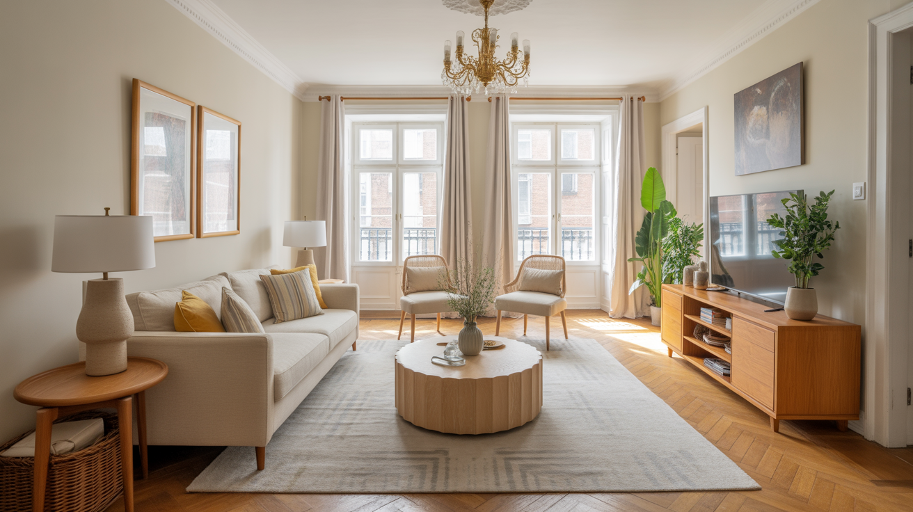
So you want a living room that feels open, fresh, and breezy without spending the next six months repainting, renovating, or searching for magical windows on sale? I’ve been there.
I chased that light-and-airy look for years, and I finally realized something: the right colors do most of the heavy lifting for you.
If you’ve ever walked into someone’s living room and thought, “How does this place feel so big? Are they secretly hiding extra sunlight somewhere?”—you’re not alone.
Color works like a cheat code, IMO. And lucky for you, I’ve rounded up my top 23 light and airy living room color ideas that never fail.
Let’s jump right in, because I know you want inspo—not a novel about my personal journey with beige paint (even though that saga could fill a whole trilogy).
1. Classic Crisp White Walls
Nothing brightens up a room faster than clean white walls.
I know—super revolutionary, right?
White reflects light better than any other color. When I switched to white walls years ago, my tiny living room suddenly stopped looking like a cave. Ever wondered why every fancy coastal home uses white? Because it works.
2. Soft Cream for a Warm Glow
If white feels too stark for you, try cream. It softens up the whole room and makes the space feel cozy but still bright.
I often pair cream walls with natural wood, and the combo reminds me of those dreamy minimalist homes where everything looks curated but also strangely effortless. Why does cream pull that off so well?
3. Pale Gray for a Modern Fresh Finish
You want airy, but you also want modern? Pale gray gives you that effortless “I definitely read interior design blogs” vibe.
It keeps things light while grounding your space just enough.
Pro tip: Choose a gray with warm undertones. Cool grays sometimes lean blue, and not always in a fun way.
4. Light Greige for the Best of Both Worlds
Some people love gray. Some love beige. Greige wins the election every time.
This color looks high-end without trying too hard, and it works with almost any furniture you already own (FYI: that’s a lifesaver when you don’t want to replace everything).
5. Soft Sky Blue for an Airy Coastal Feel
Soft sky blue automatically makes your room feel breezy—as if fresh air magically sneaks in through the walls.
I once painted a rental living room in sky blue, and my landlord thanked me for “brightening the unit’s energy.” Did she secretly hate the old color? Probably.
6. Pastel Mint for a Hint of Freshness
Pastel mint gives you a subtle hit of color while keeping things light.
It makes your living room feel clean and airy—almost spa-like—but without the cucumber water.
Ever wonder why mint feels refreshing even when it’s just on a wall? Color psychology works.
7. Soft Blush Pink for a Gentle Glow
Now before you say “pink?”, hear me out. Soft blush adds warmth without overpowering the room.
I love using blush because it subtly flatters everything around it. Even my beat-up sofa suddenly looked intentional. How does a color do that? I wish I knew.
8. Pale Peach for a Sun-Kissed Look
If you want warmth that still feels bright, pale peach hits the sweet spot.
It creates that sun-soaked feeling—minus needing the actual sun.
It’s the perfect option if white feels cold but you still want brightness.
9. Misty Lavender for a Calm, Dreamy Space
Misty lavender gives you that soft, airy feeling with just a hint of color.
It works great in rooms that don’t get much natural light because the undertones bounce around whatever light you do have.
Is lavender underrated in living rooms? Absolutely.
10. Pale Taupe for a Polished Neutral Look
Taupe walks into a room and says, “I’m neutral, but I’m not boring.”
This is the shade you choose when you want sophistication without sacrificing light.
It’s one of those colors that quietly elevates everything.
11. Warm Sand for a Beachy Tone
If you want that coastal, chilled-out vibe without committing to actual beach decor, try warm sand.
It pairs beautifully with soft whites, woven textures, or anything linen.
Sand tones never fail to make a room feel airy and welcoming.
12. Powder Blue for a Crisp, Clean Finish
Powder blue instantly makes a room feel open and refreshing.
I once used this in a narrow living room, and the space felt wider overnight.
Was it magic or good color selection? I’ll let you guess.
13. Light Sage Green for a Natural Lift
Light sage brings a breath of fresh air—literally. Okay not literally, but emotionally.
This color creates a connection to nature, which always makes a room feel more open.
14. Off-White with Warm Undertones
People underestimate off-white, but trust me, it changes the whole energy of a room.
It’s softer than bright white, which prevents that sterile feeling, but it still keeps the space bright and expansive.
15. Pale Butter Yellow for a Soft Sunshine Effect
You want sunny, but not “you just walked into a lemon factory”?
Go with pale butter yellow.
It adds warmth and gentle light, especially in darker rooms.
16. Light Beige for an All-Purpose Neutral
Beige gets a bad reputation, but only because people overuse boring versions of it.
Choose a light, airy beige, and I promise your space won’t feel dated. Instead, it will feel soft and welcoming.
Why does beige work so well? Consistency. It supports other colors instead of fighting them.
17. Pale Charcoal Tint for a Soft Modern Edge
Hear me out—pale charcoal might sound dark, but when you lighten it enough, it becomes a chic, cloudy neutral.
It adds depth without weighing down the space.
I used this once behind a gallery wall, and the art popped like crazy.
18. Icy Blue-Gray for a Subtle Cool Tone
If you love cool-toned rooms, try icy blue-gray.
It creates a crisp, airy feel that mimics natural light.
Just don’t pair it with overly cool lighting; otherwise, you might get that “ice cave” vibe. And nobody wants that.
19. Linen White for a Textured Neutral Look
Linen white offers a soft, woven-like visual texture without being noisy.
It gives your living room depth and interest while still keeping things airy.
20. Soft Aqua for Breezy Energy
Soft aqua breathes energy into a room while keeping it airy and relaxed.
It feels beachy, youthful, and fresh.
Ever noticed how aqua instantly brightens your mood? Yep—mine too
21. Cloudy Pearl for a Delicate Sheen
Cloudy pearl adds a barely-there shimmer that reflects light beautifully.
It’s a great choice if you want brightness with a touch of luxury without going overboard.
22. Frosted Lilac for a Sophisticated Lift
Frosted lilac mixes cool tones with soft light reflection.
It gives your living room a delicate glow.
If you want something unique but subtle, this color hits the mark.
23. Soft Mushroom for an Understated Modern Neutral
Mushroom shades come back into style every few years, and for good reason.
They offer the perfect blend of warmth and softness, and they make your living room feel light, modern, and collected.
How to Make Any Light Color Even Airier
Because let’s be honest—not every room wins the natural-light lottery.
Use these tricks to boost the “airy factor” instantly:
- Choose matte or eggshell finishes to diffuse light.
- Add plenty of whites in furniture and decor to amplify brightness.
- Use mirrors (the oldest trick in the book—because it works).
- Avoid heavy curtains that block sunlight.
- Layer textures to keep soft colors from looking flat.
Ever wonder why some light rooms still look dull? Usually it’s because they rely only on color and forget texture and contrast.
My Favorite Light-and-Airy Combinations
If you want foolproof pairings, try these:
Soft cream + natural wood
Warm, bright, and cozy.
White + pale blue
Fresh and breezy.
Greige + black accents
Modern without losing softness.
Mint + light oak
Relaxed and refreshing.
Sage + rattan
Soft and natural—my personal fave.
Why do combos work better than single colors? Because they create depth without weighing down the room.
Conclusion: Light and Airy Is Easier Than You Think
Creating a bright, airy living room isn’t about having giant windows or expensive decor.
It’s about choosing colors that lift, reflect, and open up your space.
And honestly, you can transform even the dimmest living room with a smart paint choice. Why do you think designers obsess over undertones?
So pick your favorite from these 23 light and airy color ideas, grab a paintbrush, and get ready to make your living room feel open, fresh, and unbelievably inviting. And if your friends ask how you pulled it off so effortlessly?


Leave a Reply