
Ever walked into a living room and thought, “Wow, this feels… different”? Chances are, it’s the walls.
Walls set the vibe—seriously, they’re not just there to hold up the ceiling.
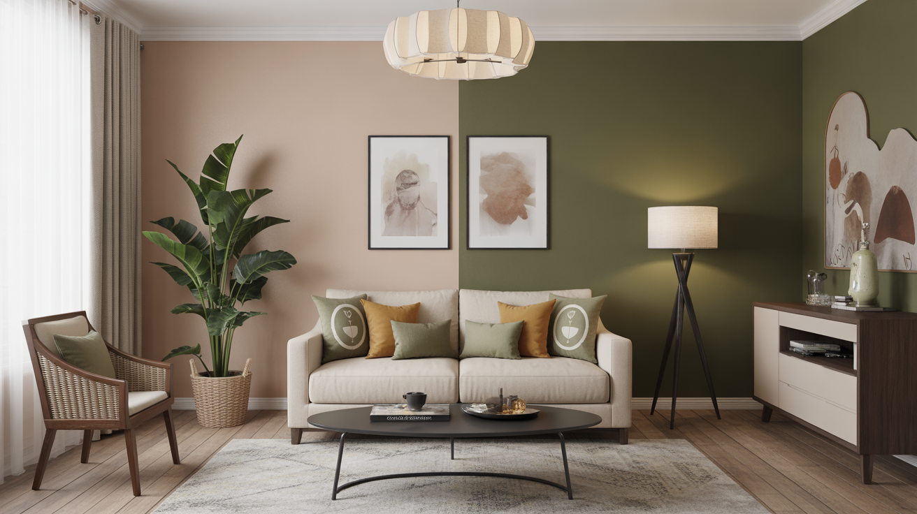
Lately, I’ve been obsessed with two-tone wall designs because they strike that perfect balance between boring single-color walls and overwhelming patterns.
Today, I’m sharing 24 two-tone wall living room ideas that can turn your space from meh to “OMG, I love this!”
Let’s get into it, shall we?
1. Classic Half-and-Half Split
You know the one: bottom half one color, top half another. Simple, elegant, and timeless.
- Best For: Rooms where you want subtle contrast.
- Pro Tip: Use a chair rail to separate the colors—it instantly looks intentional.
- Why It Works: The top color draws the eye up, making the room feel taller.
Personally, I tried light gray on top and white on the bottom, and it made my tiny living room feel like it had a touch of luxury without breaking the bank.
2. Bold Bottom, Neutral Top
Instead of sticking to neutrals everywhere, try a vibrant bottom with a calm top. Think navy and cream, or deep green and beige.
- Why: The bottom-heavy color grounds the space, while the lighter top keeps it airy.
- Tip: Keep furniture neutral if the bottom color is bold, or it might get visually crowded.
3. Diagonal Drama
Why settle for boring horizontal lines? Diagonal splits create movement and energy in a room.
- Best For: Modern or artistic spaces.
- My Experience: I once painted a diagonal teal stripe across a white wall—it looked like a gallery installation. People actually stopped to stare.
4. Ombre-Inspired Two-Tone
Who says ombre is only for hair? Fade one color into another on a wall for a dreamy, soft look.
- Top Tip: Use colors that blend naturally (light blue fading into navy, peach into coral).
- Effect: Creates depth and a gentle gradient, perfect for cozy evenings.
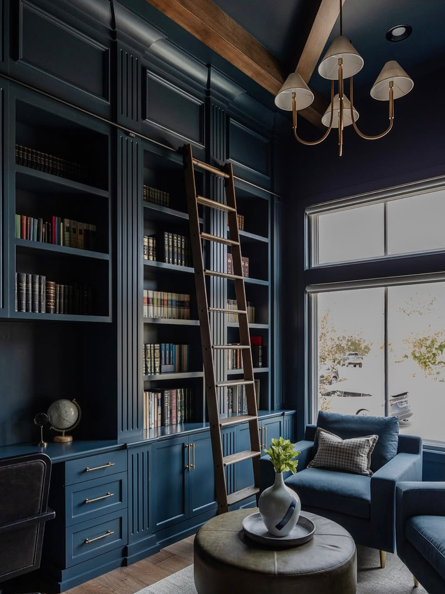
5. Dark Ceiling, Light Walls
Flip the script: paint the ceiling a darker tone than the walls. Sounds scary, but trust me.
- Why It Works: It makes the room feel intimate and stylish, almost like a boutique hotel.
- Pro Tip: Keep walls neutral and furniture light to prevent the room from feeling too cave-like.
6. Horizontal Stripes
Not all stripes are created equal. Two-tone horizontal stripes can widen a room instantly.
- DIY Tip: Use painter’s tape for crisp lines.
- Pro Advice: Alternate between contrasting or complementary colors for the best effect.
7. Vertical Elegance
If your ceiling is low, vertical two-tone stripes can make the room feel taller.
- Favorite Combo: Soft gray with off-white. Works for almost any decor style.
- Bonus: Vertical stripes can hide imperfections better than a flat single-color wall.
8. Two-Tone Fireplace Feature Wall
Want a living room centerpiece? Make your fireplace wall two-toned.
- Tip: Use a darker hue around the fireplace for drama, lighter tones elsewhere.
- Effect: Draws attention to the fireplace without needing fancy decorations.
9. Color Blocking
Go bold. Divide walls into geometric color blocks. Think Picasso meets your living room.
- Best For: Minimalist spaces that need a punch of personality.
- My Take: It’s playful but not childish—just balance colors wisely.
10. Chair Rail Classics
Yes, the old-school chair rail works wonders for two-tone walls.
- How: Bottom half darker, top half lighter. Add molding for extra flair.
- Why It Works: Gives your room a subtle sophistication that never goes out of style.
11. Two-Tone Accent Wall
Not all walls need to play dress-up. Pick one wall and make it the star of the show.
- Idea: Dark teal bottom, muted blush top—suddenly, your living room looks magazine-ready.
- Pro Tip: Keep furniture and accessories simple to let the wall shine.
12. Texture Meets Tone
Combine paint with texture: smooth top, textured bottom (or vice versa).
- Effect: Adds dimension without clutter.
- Example: I added a subtle wood panel effect on the bottom half—OMG, the room instantly felt warmer.
13. Two-Tone Wainscoting
Wainscoting is back, and better than ever. Paint the panels one color, the walls another.
- Why: Adds elegance and a sense of permanence.
- Tip: A matte finish on the panels and satin above works wonders.
14. Pastel Pairings
Pastels don’t have to scream “nursery.” Pair soft pink and mint, lavender and cream, or baby blue and gray for a modern twist.
- Effect: Airy, cheerful, and perfect for spring vibes.
- FYI: Works surprisingly well with wooden floors.
15. Monochrome Magic
Pick two shades of the same color. For example, light gray and charcoal.
- Why: Creates cohesion while adding interest.
- Pro Tip: Add metallic accents for a subtle pop.
16. Two-Tone With Wallpaper
Don’t limit yourself to paint. Top half paint, bottom half wallpaper is a game-changer.
- My Favorite: White top, geometric gray wallpaper bottom. Looks custom, feels expensive.
- Tip: Ensure wallpaper patterns aren’t too busy; balance is key.
17. Two-Tone with Wood Panels
Bring nature indoors: painted upper wall, wood panel lower wall.
- Why: It adds warmth and texture.
- Bonus: Works great in rustic or Scandinavian-style living rooms.
18. High-Contrast Drama
Want a bold statement? Go for black and white.
- Effect: Modern, chic, and slightly edgy.
- Pro Advice: Balance is crucial; too much black can feel oppressive.
19. Soft Neutrals
If drama isn’t your thing, try beige and cream or taupe and ivory.
- Why It Works: Keeps the room light and airy while still adding dimension.
- My Take: Safe, stylish, and surprisingly cozy.
20. Coastal Two-Tone
Think sand and sky—soft blues and warm tans.
- Effect: Instantly relaxed, like you’re on vacation.
- Pro Tip: Add natural fibers like jute rugs or rattan furniture to complete the look.
21. Moody Jewel Tones
If you want serious personality, go for emerald and navy, plum and charcoal, or burgundy and gold.
- Why: Makes the room feel luxurious and curated.
- FYI: Works best in rooms with good natural light.
22. Chalkboard Bottom
Yes, you read that right. Chalkboard paint on the bottom half is practical and playful.
- Why: Perfect if you have kids—or you just like doodling.
- Tip: Keep the top half neutral to balance the look.
23. Soft Gradient Panels
Instead of one solid block, try vertical panels that gradually change tone.
- Effect: Adds subtle sophistication.
- My Take: Looks fancy without feeling over-the-top.
24. Metallic Accents
Finally, spice it up with metallic paints or finishes for one of the two tones.
- Tip: Bronze or gold on top, matte neutral below.
- Effect: Glamorous yet grounded—a tricky combo that actually works.
Wrapping It Up
There you have it—24 two-tone wall living room ideas that range from subtle to statement-making. Whether you’re into pastels, moody jewel tones, or classic half-and-half splits, there’s a style for everyone.
Remember: two-tone walls aren’t just paint tricks. They add personality, depth, and a little “wow factor” to your living space. Pick colors you love, balance boldness with calm, and don’t be afraid to experiment. After all, if your walls could talk, they’d want to brag about this makeover too.
So, what’s stopping you? Grab that roller and brush, and let your walls do the talking.

Leave a Reply