So, you’re staring at your walls wondering why your living room feels… blah.
Maybe it’s not the furniture or decor — it’s the paint. Believe it or not, the right wall color can completely change the vibe of your space — from cozy and warm to fresh and modern.
And because I’ve repainted my home way too many times (seriously, I should own stock in paint companies by now), I’ve learned which shades are total game-changers and which ones are just hype.
If you’re ready to give your walls a fresh start without losing your mind in the paint aisle, here are 23 of the best interior paint colors that can actually transform your space. Grab a coffee (or a paintbrush), and let’s get into it!
1. Swiss Coffee by Benjamin Moore
If you want a warm, cozy white that doesn’t feel sterile, Swiss Coffee is a classic. It has creamy undertones that add warmth without looking yellow. Perfect for creating that soft, welcoming vibe.
Why it works: It’s not too stark and pairs beautifully with natural wood, brass accents, or even black trim for contrast. Ever walked into a home and thought, “This just feels peaceful”? Yeah, this color is why.
2. Repose Gray by Sherwin-Williams
You can’t talk interior paint without mentioning Repose Gray. It’s a true chameleon — sometimes it looks warm, sometimes cool, depending on your lighting.
IMO, it’s one of the most versatile neutrals out there. It’s perfect for open-concept homes or spaces where you want cohesion without everything looking the same.
3. Hale Navy by Benjamin Moore
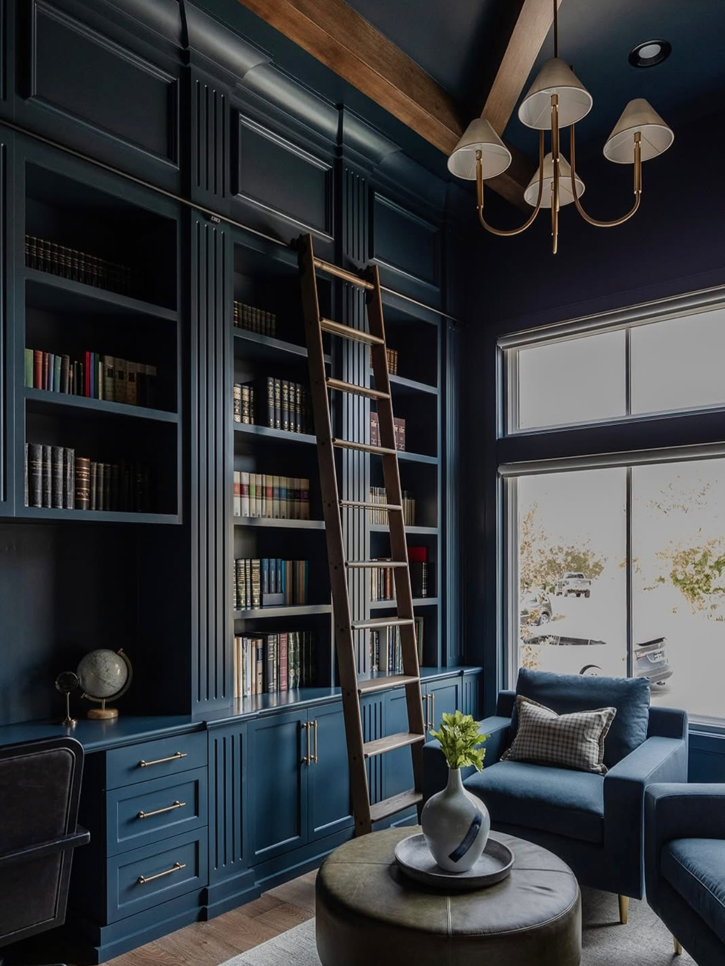
This deep, moody blue is pure sophistication. Hale Navy instantly adds drama and depth. It’s especially stunning in bedrooms, offices, or dining rooms where you want that elegant, cocoon-like feel.
Pro tip: Pair it with crisp white trim and gold hardware. You’ll feel like you’re living in a design magazine.
4. Alabaster by Sherwin-Williams
Alabaster is that perfect white everyone talks about — and for good reason. It’s warm without being creamy, bright without being cold. Basically, it’s the Goldilocks of whites.
Perfect for: Minimalist, farmhouse, or Scandinavian-inspired interiors. It makes your space feel light, airy, and effortlessly clean (even if it’s actually not — I won’t tell).
5. Green Smoke by Farrow & Ball
Want a color that says “I have taste” without actually saying it? Green Smoke is it. This gray-green shade feels vintage and moody but still modern.
It’s especially gorgeous in kitchens, offices, and reading nooks. Pair it with aged brass or natural wood for a Pinterest-worthy moment.
6. Accessible Beige by Sherwin-Williams
Let’s be honest — beige got a bad rap for being boring. But Accessible Beige is not your grandma’s beige. It’s got subtle gray undertones, making it warm but sophisticated.
It’s perfect for those who love neutrals but still want a touch of personality. Add greenery or dark furniture, and it totally pops.
7. Pure White by Benjamin Moore
If you’re after a crisp, clean aesthetic, Pure White is your go-to. It’s bright but not blinding, ideal for modern or minimalist spaces.
It makes small rooms feel bigger and reflects natural light beautifully. Basically, it’s the Instagram filter of paint colors.
8. Black Magic by Sherwin-Williams
Feeling bold? Black Magic is a stunning matte black that’s sleek, moody, and incredibly chic.
FYI, dark walls can actually make a room feel bigger when styled right — especially with contrasting furniture and good lighting. It’s dramatic but not depressing (unlike that one winter I painted my whole bedroom navy blue… mistakes were made).
9. Pale Oak by Benjamin Moore
A soft, warm greige that’s cozy and elegant. Pale Oak is perfect for spaces where you want subtle sophistication.
It’s versatile enough for bedrooms, hallways, or even kitchens. Pair it with creamy whites and soft fabrics, and you’ve got instant calm.
10. Sea Salt by Sherwin-Williams
If you love coastal vibes, Sea Salt will be your new obsession. It’s a muted blue-green that feels fresh but never overwhelming.
It works wonders in bathrooms or bedrooms where you want that spa-like calm. Seriously, it’s like painting your walls with a deep breath.
11. Urbane Bronze by Sherwin-Williams
This one’s rich, moody, and utterly sophisticated. Urbane Bronze gives off those “high-end designer” vibes without the price tag.
It’s a perfect accent color for feature walls, fireplace surrounds, or even kitchen cabinets. Think cozy luxury with a masculine edge.
12. Chantilly Lace by Benjamin Moore
This shade of white is crisp, cool, and timeless. Chantilly Lace leans slightly toward blue undertones, giving your space a fresh, clean finish.
It’s ideal for trim, ceilings, or minimalist interiors where you want clarity and brightness.
13. Edgecomb Gray by Benjamin Moore
Somewhere between beige and gray, Edgecomb Gray is a soft, flexible neutral that works in just about any lighting.
It pairs beautifully with warm wood tones and muted blues, creating a serene, cohesive space. It’s like Repose Gray’s chill cousin who always gets compliments but doesn’t try too hard.
14. Peppercorn by Sherwin-Williams
Dark, smoky, and full of personality — Peppercorn is a deep gray that feels bold yet timeless.
It’s the perfect color for accent walls or modern industrial spaces. Add metallic accents, and you’ve got instant sophistication.
15. Balboa Mist by Benjamin Moore
This light greige is perfect if you’re after a soft, neutral backdrop. Balboa Mist works beautifully in both bright and dimly lit rooms.
Pair it with crisp whites or navy blue for a clean, balanced contrast.
16. Tricorn Black by Sherwin-Williams
If you’ve ever seen those black-and-white minimalist homes on Pinterest, this is that black. Tricorn Black is rich, dramatic, and perfect for making a statement.
It looks amazing on doors, accent walls, or even cabinetry. Bold choice? Yes. Worth it? Absolutely.
17. Classic Gray by Benjamin Moore
This light, elegant gray is ideal for creating soft contrast in bright rooms. Classic Gray works with practically everything — warm tones, cool tones, wood, metal… you name it.
It’s the kind of color that makes your space look effortlessly put together, even when it’s not. 🙂
18. Simply White by Benjamin Moore
A bright, clean white with just a hint of warmth. Simply White keeps things modern and fresh without looking cold.
It’s one of those go-to shades for open spaces or modern interiors where you want maximum light reflection.
19. Aegean Teal by Benjamin Moore
Aegean Teal has a personality. It’s not your everyday blue-green — it’s richer, cozier, and has a timeless elegance.
Use it in kitchens, studies, or accent walls when you want a calming yet colorful feel. It’s a total conversation starter.
20. Agreeable Gray by Sherwin-Williams
This color lives up to its name — it’s agreeable with everything. It’s a warm greige that feels fresh, cozy, and universally flattering.
If you’re indecisive (like me when I stand in front of 500 paint swatches), start here. It’s basically the “can’t go wrong” color.
21. Newburyport Blue by Benjamin Moore
A rich, classic navy that adds instant charm and sophistication. Newburyport Blue works wonders in offices or dining rooms.
Pair it with crisp white trim and warm metallic accents for that “designer home” look without spending thousands.
22. Oxford White by Benjamin Moore
If you’re after a bright white that still feels soft, Oxford White strikes the perfect balance.
It’s ideal for small spaces, giving them a sense of openness and airiness without looking clinical.
23. Evergreen Fog by Sherwin-Williams
Last but not least, Evergreen Fog — a soft, muted green-gray that’s modern yet grounded.
It’s perfect for bedrooms, bathrooms, or entryways when you want that earthy, calm aesthetic. Pair it with natural textures like rattan or linen for a cozy, organic vibe.
How to Pick the Right Paint Color for Your Space
Alright, so you’ve got 23 incredible shades to choose from. But how do you pick the one without going crazy? Here’s the deal:
- Consider lighting. Warm colors shine in natural light; cool tones look sleek in shaded rooms.
- Test samples first. Paint a small swatch on each wall — lighting can totally change how a color looks.
- Think about your vibe. Cozy? Go warm. Modern and sleek? Go cool.
- Don’t forget your decor. Your wall color should complement your furniture, not compete with it.
And if you’re still torn, here’s my golden rule: when in doubt, go neutral. You can always add pops of color through decor later.
Final Thoughts
Choosing paint colors can feel overwhelming (especially when that tiny swatch looks nothing like what ends up on your wall). But trust me — once you find the right shade, it’s like magic.
Whether you’re going bold with Hale Navy, keeping it calm with Sea Salt, or sticking to timeless whites like Alabaster, each of these 23 paint colors has the power to completely transform your space.
So grab that roller, throw on your old paint shirt, and get started. Because a fresh coat of paint doesn’t just change your walls — it changes how your whole home feels.


Leave a Reply