
Let’s be real: the kitchen isn’t just where you cook. It’s where you hang out, gossip, sneak midnight snacks, and sometimes pretend you’re a contestant on a cooking show.
And yet, for some reason, most kitchens still rock those boring beige walls that scream “builder-grade rental.” Yikes.
So, let’s talk about 25 of the best kitchen paint colors that will not only look good on Pinterest but also in real life (because glossy magazine shots don’t always translate to your two-bedroom apartment). Ready? Let’s do this.
1. Classic White
It’s the safe choice, I know. But white kitchens never go out of style. White walls make the room feel brighter, bigger, and way more expensive than it probably is. Pair it with wood accents or black hardware for that crisp, modern farmhouse vibe.
Ever wondered why every celebrity kitchen seems white? Because it photographs perfectly. Just don’t forget: white also shows every splash of spaghetti sauce. 🙂
2. Warm Cream
If you love white but hate how stark it feels, try warm cream. It’s soft, cozy, and forgiving—aka your best friend if you don’t clean the walls every week. Cream pairs beautifully with warm metals like brass or copper.
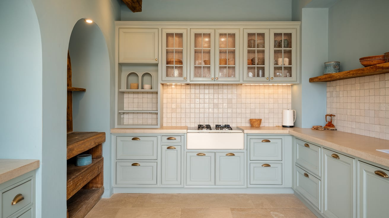
3. Soft Gray
Light gray kitchens have that effortless “I tried but not too hard” vibe. Gray works with literally any cabinet color—white, navy, green—you name it. If you want something timeless but not boring, this is your color.
4. Greige (Gray + Beige)
Yes, “greige” sounds like a made-up HGTV word, but trust me—it’s a lifesaver. It’s neutral enough to go with anything, but warmer than plain gray. IMO, greige is perfect if you like changing your kitchen decor every season.
5. Bold Navy Blue
Want drama? Go navy blue. Navy instantly makes a kitchen feel sophisticated and bold, especially when paired with gold or brass hardware. Just be warned: navy on the walls works best in kitchens with good lighting. Otherwise, you risk a cave situation.
6. Forest Green
Green kitchens are having a moment. Forest green feels earthy and rich, and it pairs beautifully with wood tones. Add a few plants, and suddenly your kitchen looks like it belongs in a design magazine.
7. Sage Green
If forest green feels too moody, sage green gives you a calmer, softer vibe. It’s the perfect color if you want your kitchen to feel fresh and relaxing. Plus, it hides smudges better than white (you’re welcome).
8. Mint Green
Mint green adds a fun retro vibe. It works especially well in smaller kitchens where you want to keep things light and playful. Bonus: it pairs great with white subway tile and black accents.
9. Soft Blue
A pale, soft blue kitchen feels like a breath of fresh air. It’s bright, cheerful, and makes mornings a little less painful when you’re waiting for the coffee to kick in.
10. Deep Teal
Somewhere between blue and green, deep teal screams personality. It’s bold without being overwhelming, and it works with both light and dark cabinets. Pair with gold accents for maximum impact.
11. Pale Yellow
Want sunshine even on gloomy days? Pale yellow will do the trick. It’s cheerful without blinding your guests. Yellow kitchens feel welcoming, and IMO, they make food look more appetizing (science? maybe).
12. Mustard Yellow
If pale yellow feels too “grandma’s curtains,” go bold with mustard yellow. It’s trendy, warm, and surprisingly chic. Pair with dark blue or gray cabinets, and you’ll feel like a design pro.
13. Burnt Orange
Burnt orange isn’t for the faint of heart, but it creates such a unique and cozy vibe. It works best in kitchens with lots of natural light so it doesn’t feel too heavy.
14. Blush Pink
Yes, pink. Blush pink kitchens are surprisingly stylish, especially with white or black accents. It’s soft, unexpected, and perfect if you like a playful yet modern look.
15. Coral
Think of coral as blush pink’s bolder cousin. It adds energy and warmth, making your kitchen feel lively and fun. Perfect if you like hosting parties and want the space to feel vibrant.
16. Charcoal Gray
Charcoal gray gives you drama without going full-on black. It’s sleek, modern, and looks amazing with stainless steel appliances. Add some wood accents to keep it from feeling too cold.
17. Black
Yes, black. Hear me out: black kitchens can look jaw-droppingly chic. Black walls or an accent wall instantly elevate your kitchen into something sleek and luxurious. Just make sure you have good lighting or it’ll feel like a cave.
18. Beige
Not exciting, but beige kitchens feel warm and classic. Beige is like the sweatpants of paint colors: comfortable, easy, and reliable. Pair with white cabinets for a timeless look.
19. Taupe
Taupe is the underrated neutral. It’s warmer than gray but more sophisticated than beige. If you want something subtle but still stylish, taupe is a winner.
20. Terracotta
Bring those Mediterranean vibes home with terracotta walls. It adds instant warmth and pairs beautifully with natural wood and earthy decor. Plus, it makes your kitchen feel cozy year-round.
21. Olive Green
Olive green is moody, earthy, and pairs perfectly with rustic kitchens. It’s less intense than forest green but still adds depth. Pair with brass or black hardware for extra charm.
22. Sky Blue
Want something light and breezy? Sky blue kitchens give you that coastal, carefree feeling. It’s like having a slice of the ocean in your home—without the sand in your shoes.
23. Soft Lavender
Unexpected but gorgeous. Lavender kitchens feel calm, cozy, and a little whimsical. Pair with white or gray for a soft, dreamy vibe.
24. Rich Burgundy
Burgundy adds drama and elegance to any kitchen. It’s bold, moody, and pairs beautifully with gold accents. Just don’t paint every wall burgundy unless you want your kitchen to feel like a wine cellar.
25. Warm Terracotta Pink
Think of this as terracotta’s softer cousin. Warm terracotta pink feels earthy yet chic, giving your kitchen warmth without overwhelming it. Pair with cream cabinets for a stylish, grounded look.
Quick Tips for Choosing the Right Kitchen Paint Color
Alright, so now you’ve got 25 ideas swirling in your head. But how do you actually pick one without regretting it six months later? Here’s the tea:
- Think about lighting. Natural light makes colors look brighter. No windows? Stick to lighter shades.
- Consider your cabinets. The wall color should complement, not clash with them.
- Test before you commit. Paint swatches look totally different on your wall than in the store.
- Match your vibe. Want cozy? Go warm tones. Want sleek and modern? Go cool or dark tones.
- Don’t fear bold colors. A bold accent wall can transform your space without overwhelming it.
Final Thoughts
At the end of the day, your kitchen is your space. Whether you go with a safe white or bold black, the right paint color can totally change how you feel in the room.
Personally, I’m obsessed with sage green right now—it feels calm, modern, and earthy without trying too hard. But hey, maybe you’re a navy-blue-with-gold-hardware kind of person. No wrong answers here.
So, which of these 25 kitchen paint colors are you leaning toward? Don’t overthink it—grab a few samples, slap them on the wall, and trust your gut. Worst case scenario? You repaint. And honestly, that’s half the fun. 🙂


Leave a Reply