Let’s be real: choosing the right paint color for your home can feel like speed dating.
You’ve got commitment issues, too many options, and one wrong move can leave you stuck with walls that scream “regret.”
In this guide, I’ll walk you through 21 of the best paint colors for home—the shades that designers rave about, homeowners swear by, and I personally think will save you from repainting your walls in frustration three months from now. Ready? Let’s roll.
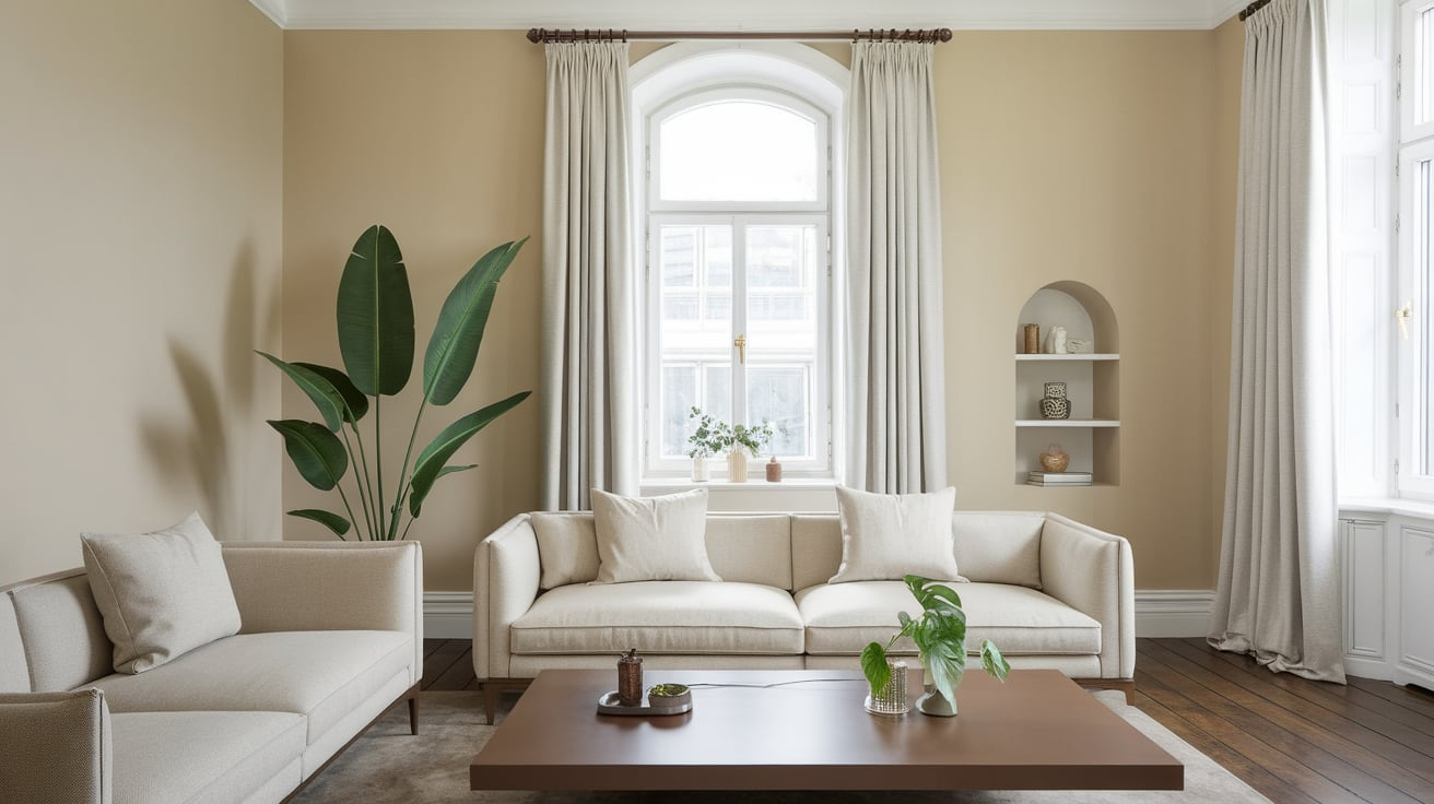
1. Alabaster by Sherwin-Williams
If you want a warm, creamy white that doesn’t feel too yellow or sterile, this is your winner. It works in literally any room—bedrooms, kitchens, living rooms. It’s like the “little black dress” of paint colors: classic, versatile, and always in style.
2. Chantilly Lace by Benjamin Moore
This shade is what I call the “clean sheet white.” It’s crisp, modern, and perfect for homes with a lot of natural light. Ever wanted your space to feel like a Pinterest board come to life? This is the color.
3. Agreeable Gray by Sherwin-Williams
Yep, the name says it all. Agreeable Gray is the go-to greige (gray + beige) that feels warm and welcoming without looking boring. Great for open floor plans.
4. Repose Gray by Sherwin-Williams
Another greige, but slightly cooler than Agreeable Gray. I used this in my hallway, and suddenly, the whole space looked brighter and more put together. FYI: it’s perfect if you hate yellow undertones.
5. Edgecomb Gray by Benjamin Moore
This one leans warmer than most grays, giving your walls a cozy vibe. It’s basically the friendlier, softer cousin of Repose Gray.
6. Hale Navy by Benjamin Moore
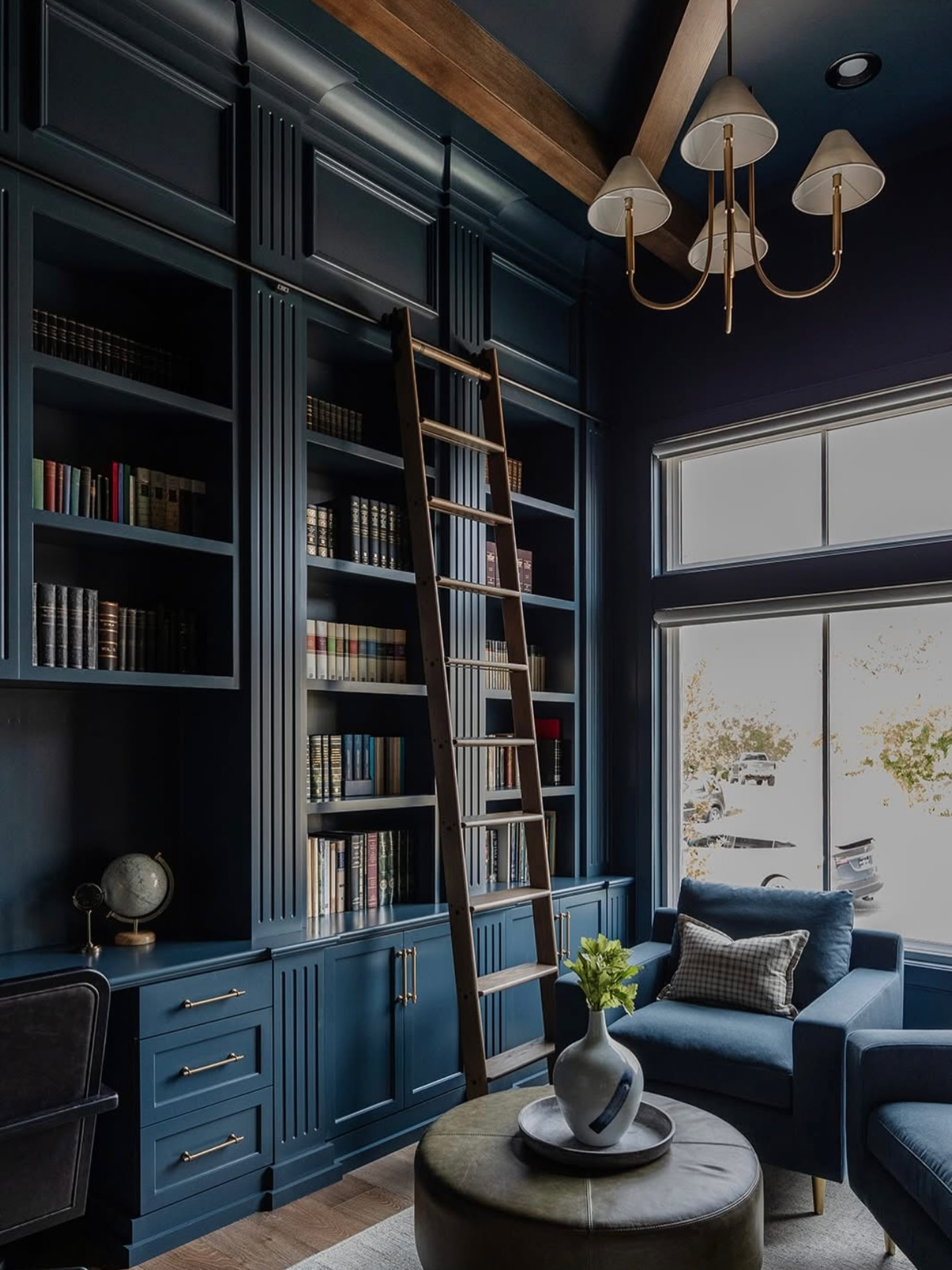
Want drama without being over the top? Hale Navy is bold but still classic. Perfect for accent walls, cabinets, or even a moody bedroom. Pair it with brass hardware, and you’ve got yourself a magazine-worthy space.
7. Naval by Sherwin-Williams
This one’s deeper than Hale Navy, almost like midnight blue. I painted a bathroom vanity with this, and now every guest thinks I hired a designer. Pro tip: it looks amazing with gold or copper accents.
8. Simply White by Benjamin Moore
For those of you who want the clean, bright look of white without feeling cold, Simply White is the answer. It works especially well in kitchens with lots of cabinetry.
9. Pure White by Sherwin-Williams
A slightly softer white than Chantilly Lace but not as warm as Alabaster. This is one of the most balanced whites out there. You honestly can’t go wrong with it.
10. Accessible Beige by Sherwin-Williams
Not too gray, not too beige—it’s the Goldilocks of neutrals. This shade works especially well in rooms with less natural light.
11. Classic Gray by Benjamin Moore
A soft, barely-there gray that almost reads off-white. If you want a neutral that whispers rather than shouts, this is it.
12. Urbane Bronze by Sherwin-Williams
This was actually the Color of the Year not long ago, and for good reason. It’s a deep, moody bronze-gray that feels rich and grounded. Think chic living room or bold office walls.
13. Balboa Mist by Benjamin Moore
If Classic Gray feels too light, Balboa Mist is the slightly deeper, warmer version. I’d call it the “cozy sweater” of paint colors.
14. Iron Ore by Sherwin-Williams
Looking for something bold but not black? Iron Ore is the perfect deep charcoal. It looks insane on exterior trim or as an interior accent wall.
15. Sea Salt by Sherwin-Williams
Now, this one is a cult favorite. It’s a soft, muted green-gray that shifts with the light. Some days it looks green, other days blue, and sometimes just gray. It’s like a mood ring for your walls.
16. Palladian Blue by Benjamin Moore
This is the color you paint when you want your space to feel like a calm spa retreat. A light aqua-blue with green undertones, it works especially well in bathrooms and bedrooms.
17. Revere Pewter by Benjamin Moore
This is one of the OG designer favorites. Revere Pewter is a warm greige that has stood the test of time. Some people say it’s overdone, but IMO, classics never die.
18. Onyx by Benjamin Moore
If you’re feeling bold, Onyx is a true, rich black. It looks amazing on doors, cabinets, or as a dramatic accent wall. Don’t worry—it won’t make your house look like a haunted mansion.
19. Smoky Blue by Sherwin-Williams
This shade sits right between navy and teal. It’s vibrant but not overwhelming, making it perfect for kitchens or statement walls.
20. Swiss Coffee by Behr
Yes, it’s called coffee, but it’s actually a warm, creamy white. It gives a timeless, cozy feel without looking outdated. I’d pick this if you’re going for a classic farmhouse vibe.
21. Evergreen Fog by Sherwin-Williams
Last but not least, this muted green-gray is earthy and soothing. It brings a natural, calming vibe into your home. I’d use it in a living room with wood accents for maximum coziness.
How to Pick the Right Paint Color for Your Home
Okay, so you’ve got the list. But how do you actually choose one? Here are some quick tips I’ve learned (usually the hard way):
- Test Samples First: Paint a big swatch on your wall and live with it for a few days. Colors shift dramatically depending on lighting.
- Consider Undertones: A gray with blue undertones will look totally different than one with beige. Trust me—you don’t want your “neutral” to look baby blue at night.
- Match Your Decor: Think about your furniture, flooring, and overall style. A sleek modern home might love white walls, while a cozy cottage begs for warmer tones.
- Don’t Overthink It: At the end of the day, it’s paint. You can repaint if you really hate it. Worst case, you’ll get an arm workout. 🙂
My Personal Go-To Colors
If I had to pick just three from this list that I’d happily paint over and over, they’d be:
- Alabaster – The perfect white for literally everything.
- Sea Salt – A soft color that feels fresh without being “too much.”
- Hale Navy – Bold, dramatic, and never goes out of style.
Every time I’ve used these, people have asked, “What color is this?!” That’s how you know you nailed it.
Final Thoughts
Choosing the best paint color for your home doesn’t have to feel like rocket science. Whether you want a safe, neutral vibe or something bold and dramatic, the colors on this list are tried-and-true favorites that look good just about anywhere.
So grab a few samples, slap them on your walls, and see what clicks. And remember—paint is one of the easiest (and cheapest) ways to completely change the vibe of your home. Worst case, you hate it, and you get to try again. Best case? You finally walk into your room and think, “Yep, this is exactly what I wanted.”



Leave a Reply