
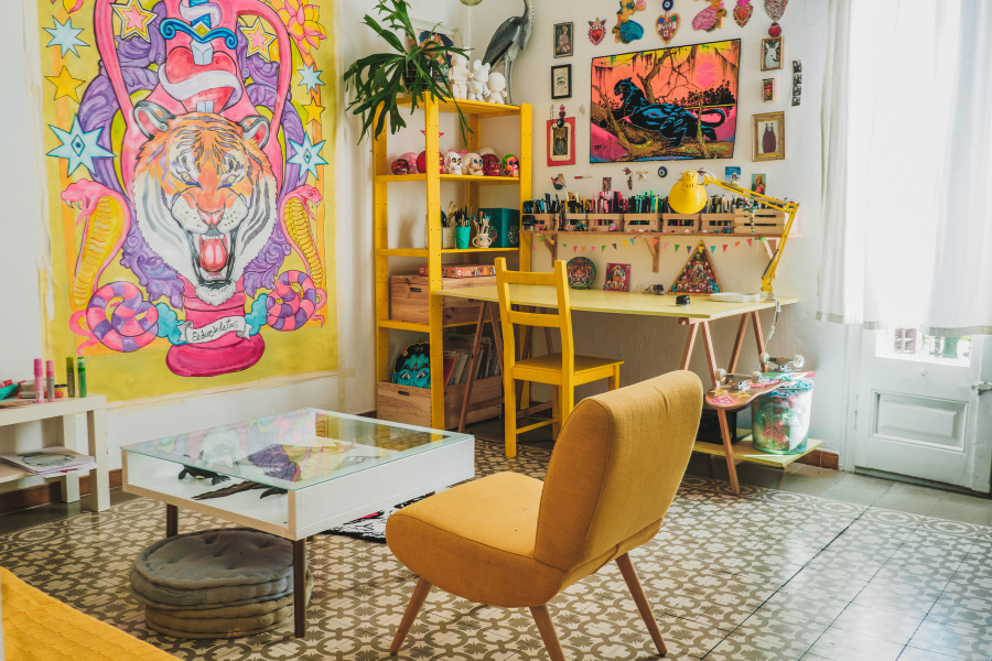
Ever walk into someone’s house and immediately feel a vibe—warm, calm, moody, or modern—and think, “Dang, this place just feels right”? That’s the power of paint.
Seriously, paint color can change everything.
The right shade can make a small room feel bigger, a dark hallway feel brighter, or your whole home feel cohesive and stylish without spending a fortune.
If you’re planning to repaint your entire house and want it to actually flow, you’re in the right place.
I’ve rounded up 26 stunning paint colors for your whole house—from soft neutrals to bold statement shades—that will make your space feel intentional, inviting, and 100% you.
So grab your coffee (or your paintbrush), and let’s talk color.
1. Classic White by Benjamin Moore
Let’s start simple. Classic White is timeless for a reason—it goes with everything. Whether your style is modern farmhouse or minimalistic chic, this color gives your home that clean, airy, and effortless look.
Why it works:
- It reflects light beautifully, making small spaces feel open.
- Works perfectly with both warm and cool accents.
- You can switch décor styles without repainting—because white never quits.
Pro tip: Use a satin finish in high-traffic areas so it’s easier to clean.
2. Repose Gray by Sherwin-Williams
This one’s a cult favorite—and IMO, for good reason. Repose Gray is that perfect greige (gray + beige) that never feels too cold or too warm. It’s neutral but not boring.
It looks elegant in living rooms, hallways, and even bathrooms. Pair it with crisp white trim and watch your walls pop subtly.
Why you’ll love it: It adapts to any light condition, so it’ll look cozy in dim light and fresh in bright daylight.
3. Accessible Beige by Sherwin-Williams
You know how beige used to have a bad rep for being “blah”? Yeah, not this one. Accessible Beige is sophisticated, warm, and plays nicely with other neutrals.
It creates a seamless flow from one room to another, making your home feel cohesive and grounded.
Pro tip: This color shines with natural wood tones or black metal accents.
4. Swiss Coffee by Behr
Sounds like a fancy latte, right? And honestly, it gives your home that creamy, cozy vibe too. Swiss Coffee is a soft, off-white that feels warm and inviting without turning yellow.
It’s perfect for open-concept homes where you want light walls but still crave a hint of warmth.
Bonus: It pairs amazingly with sage greens and soft grays.
5. Hale Navy by Benjamin Moore
Want a bold color that still feels classic? Hale Navy is your guy. It’s rich, deep, and surprisingly versatile. It works beautifully on accent walls, kitchen cabinets, or even exterior doors.
Why it works:
- Adds instant sophistication.
- Pairs well with white, brass, and wood tones.
Ever thought navy could feel cozy? Try it—you’ll be shocked.
6. Edgecomb Gray by Benjamin Moore
This is another perfect whole-house neutral that’s soft and flexible. It has that earthy undertone that feels grounded but fresh.
It’s one of those shades that never looks too beige or too gray—it just works.
Perfect for: Open-plan homes or spaces with mixed lighting.
7. Alabaster by Sherwin-Williams
If you want warmth without yellow undertones, Alabaster is your dream white. It’s creamy and cozy but still bright enough to make a space feel clean and modern.
Joanna Gaines herself loves this one (and if it’s good enough for her, right?).
8. Sea Salt by Sherwin-Williams
Sea Salt is a light, misty green-gray that instantly feels calm and coastal. Even if you live nowhere near the beach, it brings that peaceful vibe indoors.
It’s ideal for bathrooms, bedrooms, and entryways.
Pro tip: Use it with crisp white trim and light wood flooring—it’ll feel like a spa retreat.
9. Simply White by Benjamin Moore
Don’t let the name fool you—this isn’t just “plain white.” Simply White is clean, balanced, and looks amazing in any light.
It’s especially great for homes with modern or Scandinavian interiors.
10. Urbane Bronze by Sherwin-Williams
Feeling bold? Urbane Bronze is a moody, sophisticated mix of brown and gray that screams luxury. It’s a dramatic color, but it doesn’t overwhelm.
Try it: On accent walls, office spaces, or even kitchen islands for an unexpected twist.
11. Agreeable Gray by Sherwin-Williams
This one’s a crowd-pleaser. It’s the ultimate “safe” gray—but in the best way possible. It’s got enough warmth to feel inviting without clashing with other colors.
Use it throughout your home for a polished, cohesive look.
12. Chantilly Lace by Benjamin Moore
If you want pure white with zero undertones, Chantilly Lace is it. It’s crisp, bright, and perfect for trim, ceilings, or that “modern gallery wall” vibe.
FYI: It looks killer paired with dark wall colors for contrast.
13. Dovetail by Sherwin-Williams
For those who love a deeper gray that still feels cozy, Dovetail delivers. It’s got warm undertones that keep it from feeling cold or industrial.
Great for bedrooms, home offices, or even cabinetry.
14. Pale Oak by Benjamin Moore
This soft taupe-gray hybrid adds a gentle warmth that feels both timeless and current. It’s subtle but full of character.
IMO: It’s one of the most underrated whole-house colors out there.
15. October Mist by Benjamin Moore
This muted sage green has serious charm. It’s earthy, calm, and gives your space a refreshing natural feel.
Use it in kitchens, bathrooms, or anywhere you want a hint of color without going overboard.
16. Pure White by Sherwin-Williams
Pure White is a designer favorite for a reason—it’s versatile, elegant, and plays well with both warm and cool tones.
Use it as your go-to trim color or even as the main wall color for a minimalist home.
17. Coventry Gray by Benjamin Moore
This cool gray has blue undertones that feel modern and crisp. It’s perfect for contemporary homes and pairs beautifully with black or navy accents.
18. Soft Chamois by Benjamin Moore
Warm, creamy, and inviting—Soft Chamois feels like sunlight in a can. It’s amazing in living rooms or bedrooms where you want a soft, glowy look.
19. Mindful Gray by Sherwin-Williams
Another versatile neutral, Mindful Gray is a touch darker than Repose Gray, giving it a richer, more grounded feel.
Tip: Use it in areas that get plenty of natural light—it really shines there.
20. Smoky Blue by Sherwin-Williams
For a touch of drama that doesn’t overwhelm, Smoky Blue is perfect. It’s calm yet moody—ideal for a home office or dining room.
Pair it with gold or wood accents for a classy look.
21. Natural Linen by Sherwin-Williams
As soft and cozy as it sounds, Natural Linen gives your home a warm, lived-in vibe. It’s great for spaces where you want warmth without going full beige.
22. Anew Gray by Sherwin-Williams
This is one of those flexible colors that looks different in every light (in a good way). It’s a great whole-house color if you want something that feels dynamic yet neutral.
23. Cloud White by Benjamin Moore
A creamy, cozy white that works in any space. It’s softer than pure white but still bright enough to keep things light and airy.
Best for: Living rooms, kitchens, and trim.
24. Iron Ore by Sherwin-Williams
Dark, moody, and totally stunning. Iron Ore is the perfect near-black that adds drama without feeling harsh.
It looks amazing on doors, cabinets, and accent walls.
25. Grant Beige by Benjamin Moore
This warm beige-gray combo feels timeless and elegant. It’s one of those shades that quietly elevates your home without trying too hard.
26. Silver Strand by Sherwin-Williams
Last but not least—Silver Strand is a gorgeous mix of gray, blue, and green. It’s soothing, sophisticated, and looks incredible in bathrooms and bedrooms.
Bonus: It pairs perfectly with white trim and brushed nickel fixtures.
Final Thoughts
Choosing paint colors for your whole house can feel overwhelming, right? There are just so many shades of gray, white, and beige (who knew?). But the key is to pick a palette that feels cohesive—not necessarily identical, but complementary.
If you’re unsure, start with a versatile neutral like Repose Gray or Swiss Coffee, then add depth with accent colors like Hale Navy or Urbane Bronze. Remember, your home’s paint should reflect you—your mood, your style, and how you want to feel in your space.


Leave a Reply