
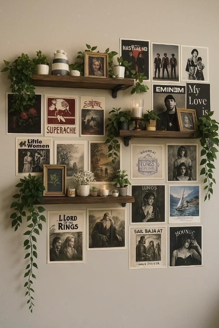
I hung my first gallery wall completely wrong. I bought 12 frames in one trip, nailed them up in a straight grid, and it looked like a hotel hallway.
It took me almost a year — and a lot of patching nail holes — to figure out that a good picture frame wall isn’t about how many frames you own, it’s about the plan you make before a single nail goes in the drywall.
If you’re standing in front of a blank wall right now with a stack of frames and no idea where to start, that’s exactly where I was.
This list covers real layouts I’ve built, ones friends have sent me photos of, and a couple of genuinely smart ideas I picked up from comments on my own Pinterest posts.
Some of these are commitment-free — command strips, no drilling, fully renter-friendly.
Others need a level, a stud finder, and an afternoon you’re not going to get back if you rush it. I’ll tell you which is which.
By the end, you should have a real sense of which layout actually fits your wall, your frame collection, and how much patience you have for a level.
First: Figure Out Which Layout Category Fits Your Wall
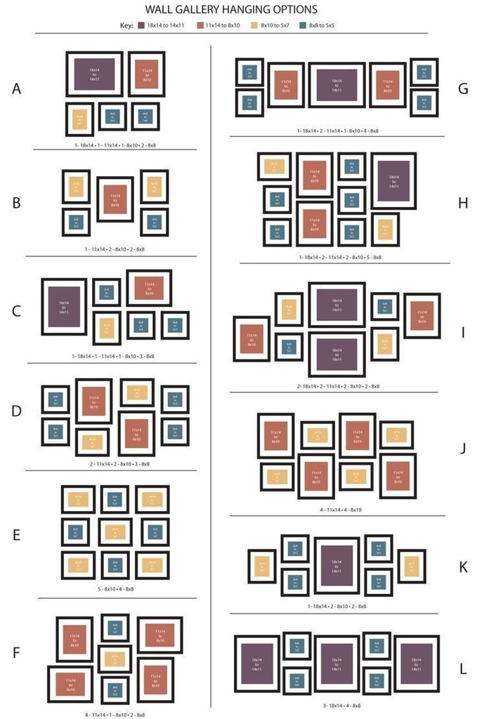
Before the individual ideas, it helps to know which broad approach you’re working with, because “gallery wall” covers a few genuinely different styles with different tools and different commitment levels.
| Layout Style | Best Wall Shape | Commitment Level | Tools Needed |
|---|---|---|---|
| Grid layout | Wide, rectangular walls | Low — very forgiving to plan | Level, tape measure |
| Salon-style (mixed sizes) | Any wall, especially awkward or narrow ones | Medium — needs a paper template first | Level, kraft paper, painter’s tape |
| Line/linear layout | Staircases, hallways | Low | Level, string line |
| Shelf-based (no nails) | Any wall, renter-friendly | Very low | Floating shelf, no wall damage |
1. The Kraft Paper Template Method (Do This Before Anything Else)
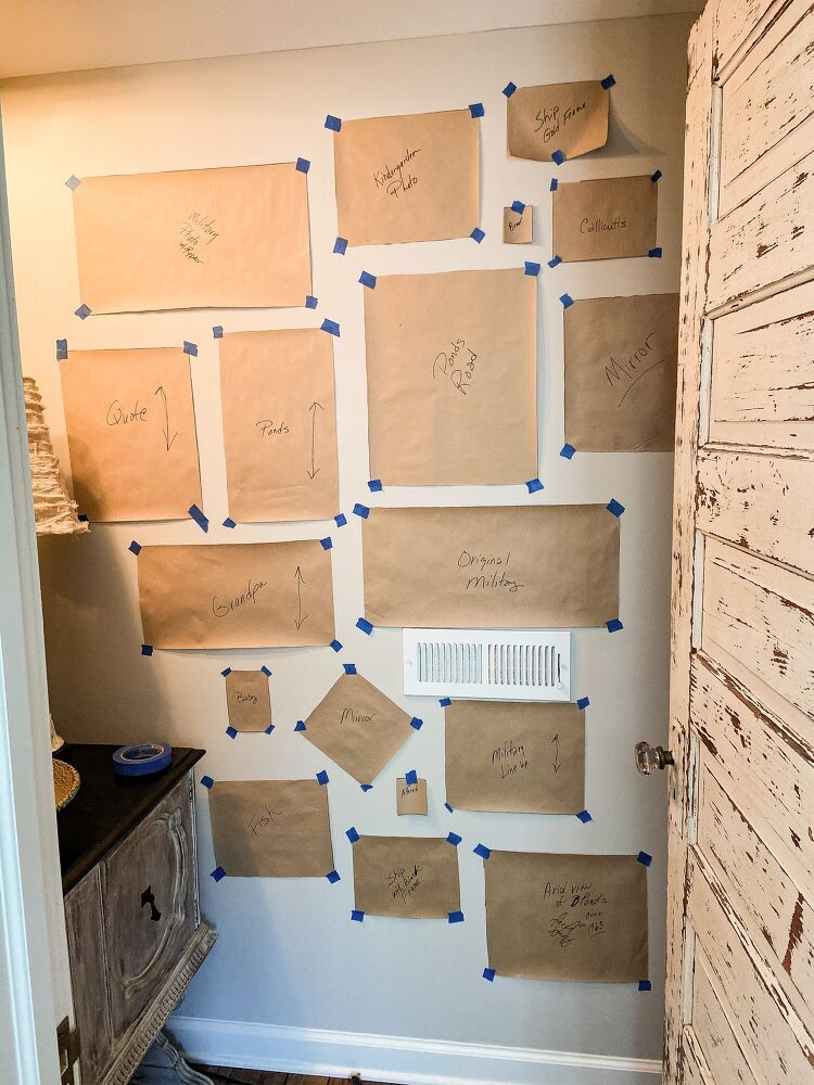
Why it matters: This isn’t technically a “layout,” it’s the method that makes almost every other layout on this list actually work without turning your wall into Swiss cheese.
How to do it: Trace each frame onto kraft paper, cut the shapes out, and tape them to the wall in your planned arrangement before you commit to a single nail.
Pro tip: Once you like the arrangement, leave the paper templates up and hammer the nail straight through the paper into the marked spot, then tear the paper away. It sounds obvious once you’ve done it once, but almost nobody figures this out on their first gallery wall — I certainly didn’t.
2. The Even Grid
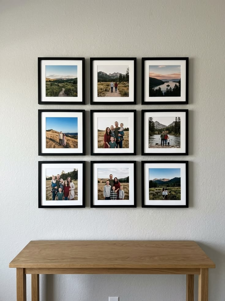
Why it matters: If your frame collection is already the same size and style, a grid is the layout that makes that consistency actually read as intentional instead of accidental.
How to do it: Keep spacing between frames identical — I use 2 to 3 inches — and measure from a fixed anchor point (usually the top-left frame) so error doesn’t compound across the row.
Trade-off worth knowing: A grid needs genuinely matching frame sizes to look good. Mixing in even one differently sized frame breaks the whole effect, unlike salon-style, which is built to absorb mismatched sizes.
3. The Asymmetrical Salon Wall
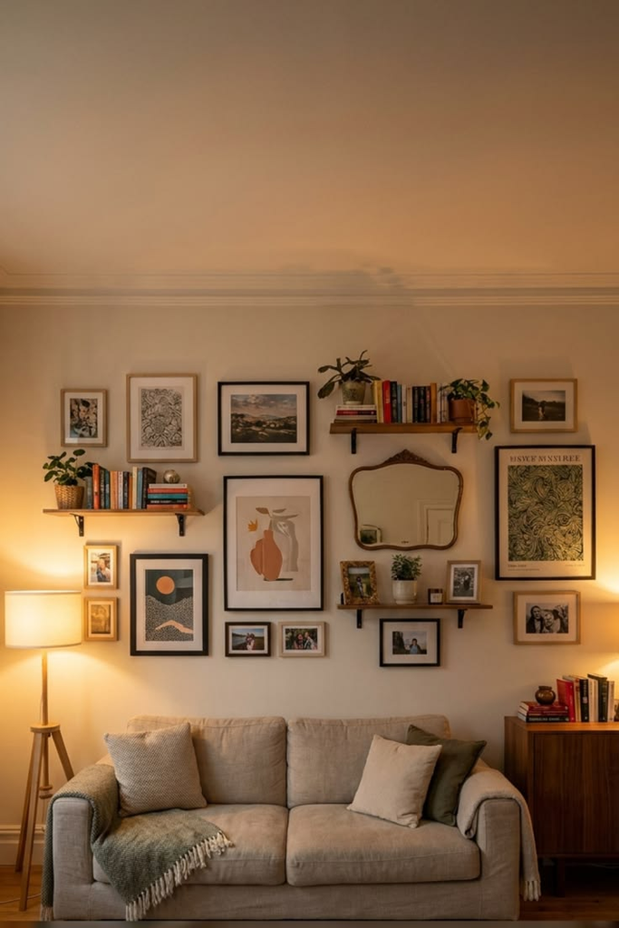
Why it matters: This is the layout for people whose frame collection is a mismatched pile from thrift stores, hand-me-downs, and impulse buys — which, honestly, is most of us.
How to do it: Start with your largest frame slightly off-center, then build outward in a rough oval or diamond shape, alternating sizes so no two similarly sized frames sit directly next to each other.
Pro tip: Keep the visual “weight” balanced left to right rather than symmetrical — meaning if you’ve got a big dark frame on the left, put a similarly bold piece somewhere on the right, even if the exact size and shape don’t match.
4. The Staircase Line

Why it matters: Most people either skip staircase walls entirely because the angle intimidates them, or hang frames straight across and end up with a row that visually tilts against the stair line.
How to do it: Run a string from the bottom of the stairs to the top at the same angle as the stair incline, then hang each frame’s center point along that line rather than trying to keep frames level with the floor.
Trade-off worth knowing: This is genuinely one of the harder layouts to get right on the first try. Budget extra time for the string-line setup — rushing this step is where most staircase walls go visibly crooked.
5. The Single Statement Row
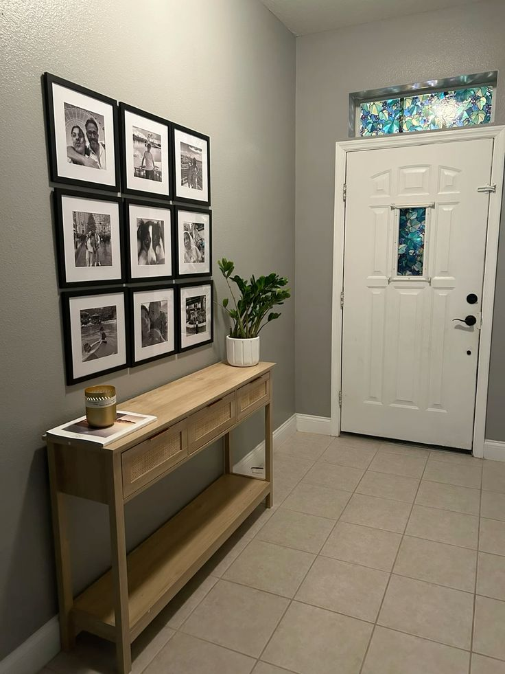
Why it matters: Not every wall needs a dozen frames. A single evenly spaced row of 3 to 5 frames reads as more curated in a narrow hallway or above a console table than a dense cluster would.
How to do it: Center the row on the furniture or architectural feature below it, keep frame heights matched, and space evenly using a spacer block cut to your chosen gap width.
Pro tip: Hang the row at eye level for the room’s average adult, not centered on the wall itself — most people default to centering on the wall and end up hanging the row a few inches too high.
6. The Floating Shelf Ledge (Zero Nail Holes Per Frame)
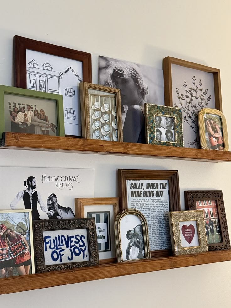
Why it matters: If you rent, or you just want to change your arrangement on a whim without repatching drywall every time, this is the layout that actually lets you do that.
How to do it: Mount one or two floating picture ledges, then lean frames against the wall on the shelf rather than hanging each one individually, overlapping edges slightly for depth.
Pro tip: Add small museum putty dots to the back bottom corners of each frame so they don’t slide when a door slams or the house settles. I learned this after one too many frames ending up face-down on my hardwood floor.
7. The Corner Wrap
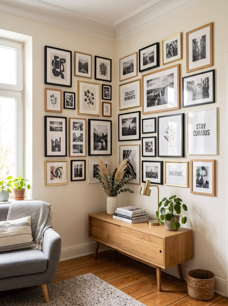
Why it matters: Most gallery walls stop at the corner of a room, which leaves an awkward dead zone that never quite gets addressed.
How to do it: Let your arrangement continue around an inside corner, treating the wall as one continuous surface rather than two separate ones, keeping the spacing logic consistent as it turns.
Trade-off worth knowing: Depth perception gets tricky here — a frame on the perpendicular wall reads slightly different in scale than one on the wall you’re facing. Stand back and check from a few angles before finalizing.
8. The Color-Blocked Frame Wall
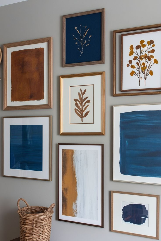
Why it matters: If your frames themselves are mismatched styles — some wood, some metal, some ornate — painting them all one unified color before hanging solves the cohesion problem without buying anything new.
How to do it: Lightly sand each frame, prime if it’s a glossy finish, then spray paint all of them the same color, whether that’s matte black, brass, or a soft white.
Pro tip: Don’t paint over the glass — pop it out first if you can, or mask it thoroughly. Overspray on glass is a pain to fully remove and it shows in direct light.
9. The Shadowbox Mix-In
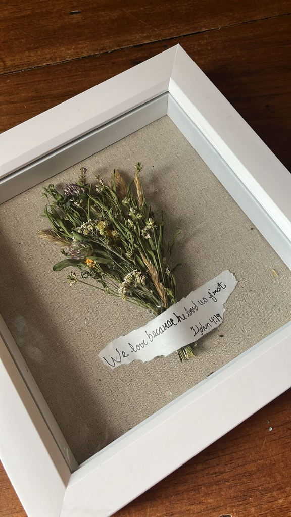
Why it matters: A wall of only flat photo frames can start to feel one-note. Mixing in one or two shadowbox frames with a small dried flower arrangement, a pressed leaf, or a small keepsake adds texture without adding more photos.
How to do it: Treat the shadowbox as your visual anchor — usually centered or placed at the arrangement’s focal point — and build the flatter frames around it.
Trade-off worth knowing: Shadowboxes are deeper than standard frames, so double-check they won’t collide with a door swing or furniture if you’re working in a tight space.
10. The Family Timeline Wall
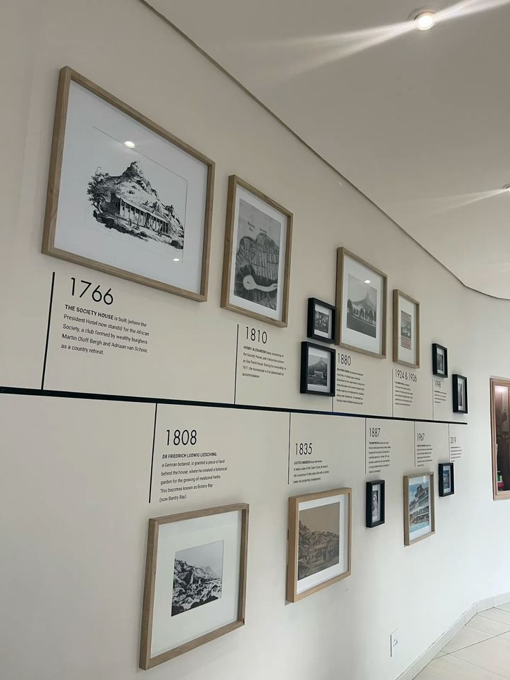
Why it matters: This turns a gallery wall into something with an actual narrative instead of just a decorative cluster — genuinely one of the more meaningful versions of this idea.
How to do it: Arrange photos chronologically left to right or top to bottom, using consistent frame sizes so the timeline reads clearly rather than getting visually lost in mismatched shapes.
Pro tip: Add small printed date labels or a thin metal number plate at the bottom of each frame — my sister did this for her stairwell and it turns what could be a confusing cluster into something guests actually stop and read.
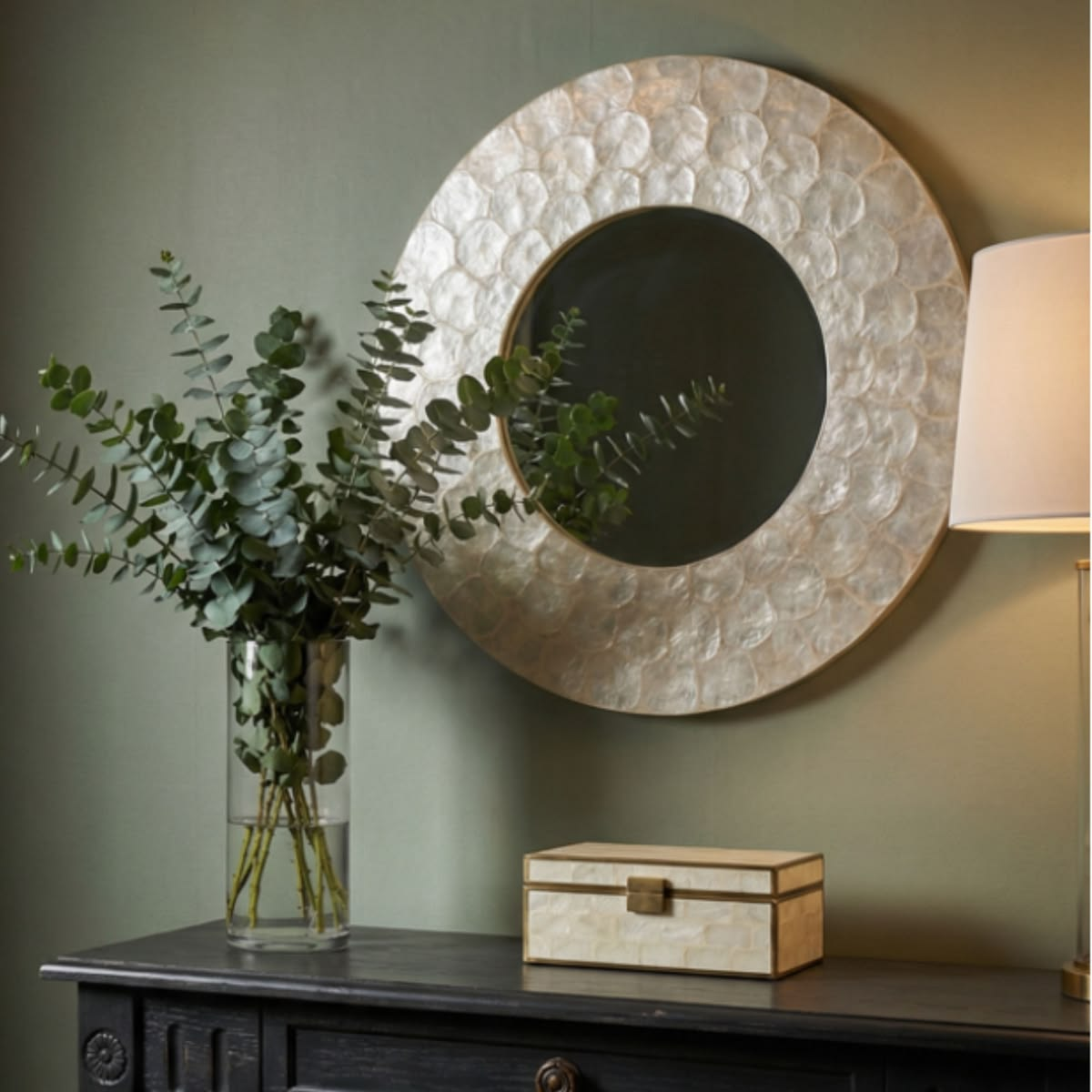
11. The Mirror-and-Frame Combo
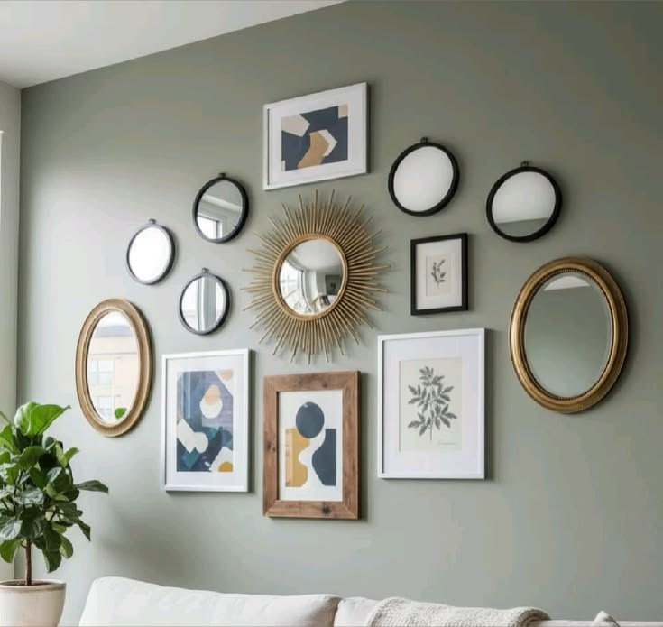
Why it matters: Mixing in one or two mirrors bounces light around the arrangement and breaks up a wall that would otherwise be entirely flat, matte photo surfaces.
How to do it: Place the mirror off-center rather than as the dead-center focal point, and choose a mirror frame style that matches the finish of your photo frames so it reads as part of the set, not a separate addition.
Trade-off worth knowing: Mirrors reflect whatever’s across from them, so check what that actually is before committing — a mirror that reflects a cluttered closet doorway undercuts the whole effect.
12. The Open Frame (No Photo) Layer

Why it matters: Empty, open frames — just the frame itself mounted flat against the wall with nothing inside — add architectural texture between your photo frames without competing for visual attention.
How to do it: Mix in 2 to 3 empty frames of varying sizes among your photo frames, ideally in a finish that matches or intentionally contrasts with the rest.
Pro tip: This is a specific, small trend I’ve watched pick up steam on my own Pinterest boards over the last several months — not “trending” in some vague sense, but specifically as a way to add negative space to an otherwise dense salon wall without leaving an actual gap.
13. The Ledge-and-Hang Hybrid
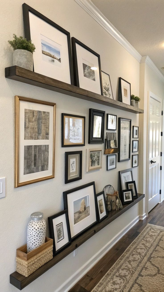
Why it matters: Combining a floating ledge at the bottom with hung frames above it gives you layered depth and lets you rotate the ledge frames seasonally without touching the hung ones.
How to do it: Hang your permanent, larger frames first in a loose arrangement, mount the ledge below at a comfortable eye-level height, then style smaller or rotating frames along the ledge.
Trade-off worth knowing: This needs more wall height than a single-layer approach — measure the full vertical span before committing, especially if you’re working under a sloped ceiling or a low doorway.
14. The Circular/Oval Cluster
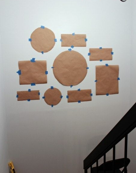
Why it matters: A rounded cluster shape softens a room that’s otherwise full of hard rectangular furniture lines — couches, bookshelves, coffee tables.
How to do it: Use your kraft paper templates to build outward from a center frame in a rough circle, letting the outer frames get progressively smaller as they near the edge of the circle.
Pro tip: This shape is genuinely harder to plan on the wall directly than a grid or a line — do the full paper template first, no exceptions, or you’ll end up patching more holes than any other layout on this list.
15. The Bookshelf-Adjacent Wall
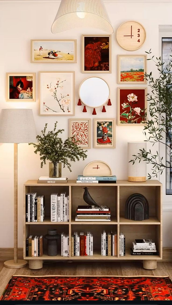
Why it matters: If you’ve got an open bookshelf next to a blank wall, treating them as one combined display — frames on the wall, frames leaning on the shelves — reads as more considered than either done alone.
How to do it: Lean 2 to 3 frames against books or a shelf backing, then let your wall arrangement’s edge overlap visually with the shelf’s top corner so the eye reads them as connected.
Trade-off worth knowing: Leaned frames on open shelving are more prone to getting knocked over by kids or pets than hung ones — worth considering if that’s a real risk in your house.
16. The Black-and-White Photo Wall
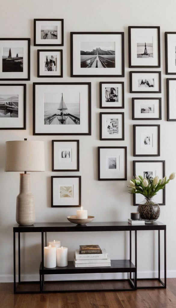
Why it matters: Converting every photo to black and white before printing removes the visual noise of mismatched photo eras, lighting, and color casts, so the arrangement feels cohesive even with photos spanning decades.
How to do it: Convert images to black and white in whatever editing app you already have before sending them to print — most drugstore photo kiosks and online print services also offer a black-and-white filter at checkout.
Cost angle: Standard 4×6 prints run about 15-30 cents each at most drugstore kiosks, so a 20-photo black-and-white wall is genuinely one of the cheapest versions of this entire idea, frames aside.
17. The Herringbone Frame Arrangement
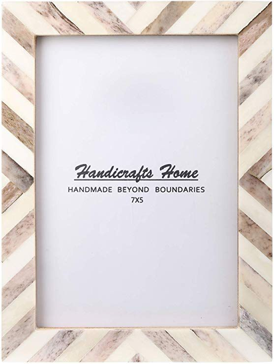
Why it matters: A herringbone or chevron-inspired layout — frames angled in a repeating diagonal pattern — gives you visual movement that a straight grid or scattered salon wall doesn’t.
How to do it: This works best with same-size, same-orientation frames, angled consistently at roughly 45 degrees in an alternating up-down pattern that mimics a herringbone floor pattern.
Trade-off worth knowing: This layout eats up more wall width than height for the same number of frames, so measure before you commit — it doesn’t suit a narrow hallway the way a vertical line does.
18. The Family Crest / Monogram Anchor Wall
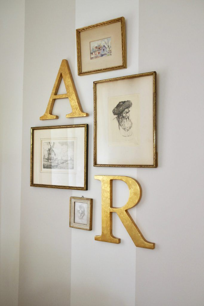
Why it matters: Adding one non-photo anchor piece — a monogram letter, a small family crest print, a meaningful quote in a frame — gives the whole wall a focal point that pure photos sometimes lack.
How to do it: Place the anchor piece dead center or at the natural visual weight point of your layout, then build photo frames outward from it in whichever style (grid, salon, line) fits your collection.
Pro tip: Keep the anchor piece’s frame finish consistent with the rest, or it reads as a separate decor item that got hung in the wrong spot rather than part of the set.
19. The Windowpane Grid (Same Frame, Repeated)
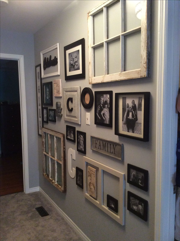
Why it matters: Buying one frame style in bulk and repeating it in a tight, uniform grid is one of the most budget-friendly versions of a gallery wall, because you’re only ever price-comparing one frame, not a dozen different ones.
How to do it: Pick a single frame size and finish, buy enough for your full grid in one order (often cheaper per-unit than buying individually over time), and hang with identical spacing throughout.
Cost angle: Buying 12 matching frames in one multi-pack order typically runs noticeably cheaper per frame than buying mismatched frames individually over several shopping trips — worth checking bulk listings before assembling a salon wall piece by piece.
20. The Seasonal Rotation Wall
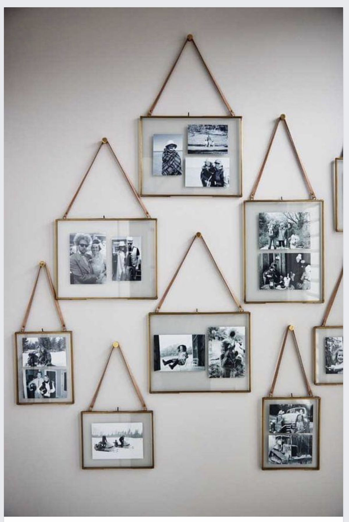
Why it matters: If you get tired of the same photos after a few months (I do), building the wall around easily swappable inserts means you’re not repainting or rehanging anything to refresh it.
How to do it: Use frames with quick-release backs or clip-style fronts rather than screw-back frames, so swapping a photo takes seconds instead of a screwdriver.
Pro tip: I keep a small labeled folder of “next up” prints sized to match my frames, so rotating the wall for a new season takes ten minutes instead of turning into an afternoon project.
21. The Vertical Narrow-Wall Stack

Why it matters: Tall, narrow wall sections — beside a doorway, between two windows — need their own layout logic, because a wide grid or salon shape just won’t physically fit.
How to do it: Stack 3 to 5 frames in a single vertical column, using identical widths even if the heights vary slightly, so the column reads as one continuous unit.
Trade-off worth knowing: Keep the column no wider than the narrowest point of the wall space, including door trim clearance — I’ve seen more than one narrow-wall stack clip a door frame because that measurement got skipped.
22. The Textile-and-Frame Mix

Why it matters: Adding one woven wall hanging, a small tapestry, or a textile art piece into an otherwise all-frame wall adds texture that flat glass surfaces can’t.
How to do it: Treat the textile piece like an oversized frame in your layout plan — give it roughly the visual weight of your two largest photo frames combined, and position it as an anchor rather than an afterthought squeezed into a gap.
Pro tip: Textiles read visually “heavier” than their actual size, so leave a bit more breathing room around them than you would around a same-sized frame.
23. The Kids’ Art Display Wall (With Rotating Clip Frames)
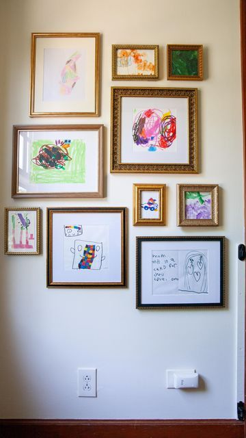
Why it matters: If you’ve got a kid who brings home a new drawing weekly, a dedicated display wall with swap-friendly frames solves the “where does all this artwork go” problem without it ending up in a drawer.
How to do it: Use clip-front or spring-clip frames rather than backed ones, arranged in a simple grid at a height your kid can actually see and eventually swap themselves.
Trade-off worth knowing: Clip frames don’t protect artwork from fading in direct sun the way UV-glass frames do, so keep this wall out of a spot that gets hard afternoon light if you want pieces to last.
24. The Gallery Wall With Built-In Shelf Lighting
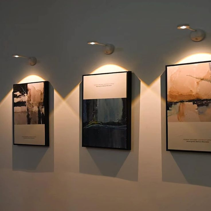
Why it matters: Adding small picture lights or a thin LED strip above or below the arrangement changes the whole wall after dark, which most gallery wall posts don’t mention at all because it’s an electrical step, not just a hanging one.
How to do it: Battery-powered puck lights or stick-on LED strips are the no-wiring option — mount them along the top edge of your arrangement, angled slightly downward.
Pro tip: Warm white (around 2700K) reads far more flattering on photos than cool white or daylight bulbs, which can wash out skin tones in family photos. I made this mistake once and every photo under those lights looked slightly off until I swapped the bulbs.
What I’d Actually Do First
If I were starting over on a totally blank wall, I wouldn’t jump straight to buying frames.
I’d do the kraft paper template first, every time, even for something as simple as the single statement row — it’s the one step that turns “I think this will look good” into “I know this will look good” before a single nail goes into the wall.
After that, I’d start with whichever layout actually matches the frames I already own rather than the one that photographs best, because a salon wall built from a mismatched thrift-store collection looks a lot more like a real person’s home than a perfectly matched grid ordered all at once ever does.
Either way, the wall doesn’t need to be finished in a weekend. Mine wasn’t, and it’s better for it.


Leave a Reply