
Let’s be honest—color can make or break a bedroom. You can have the most expensive furniture on earth, but if your color palette looks like it came from a 90s sitcom set, you’re doomed.
That’s where analogous color schemes swoop in to save the day.
These palettes blend colors that sit next to each other on the color wheel, creating a smooth, harmonious vibe that feels natural and visually soothing.
I’ve played with analogous colors in my own rooms before (some wins, some tragic flops), and trust me, when you get it right, it feels like living inside a design magazine.
So, whether you’re redecorating your master suite or giving your guest room a glow-up, here are 19 analogous color bedroom ideas that’ll make your space look effortlessly cohesive—and seriously stylish.
1. Blue, Teal, and Green: Ocean Breeze Vibes
This combo feels like a weekend getaway to the coast—minus the sand in your sheets. Soft blues, rich teals, and gentle greens flow perfectly together, creating a calming space that’s ideal for relaxation.
Add white bedding or light wood accents to keep it airy. Bonus tip? A teal velvet pillow or sea-green rug instantly adds depth without overwhelming the palette.
2. Pink, Coral, and Orange: Sunset in a Room
Want a bedroom that feels warm and romantic but not over-the-top? Pair soft pink walls, coral bedding, and burnt orange decor. These shades melt together like a sunset.
Keep the balance by grounding everything with neutral curtains or a beige headboard. Ever wondered why this combo feels so comforting? It mimics the natural colors your brain associates with warmth and light.
3. Lavender, Lilac, and Magenta: The Modern Romantic
Purple tones can get tricky—too much and it screams “Barney,” too little and it looks washed out. But lavender, lilac, and magenta hit that sweet spot.
Go for lavender walls, lilac bedding, and a few magenta accents like throw pillows or wall art. The result? A cozy yet elevated space that feels chic and slightly mysterious.
4. Olive, Moss, and Mustard: Earthy and Elegant
This palette is for the nature lover who also appreciates a little luxury. Olive and moss greens paired with muted mustard create a warm, grounded atmosphere.
Throw in rattan furniture or bronze lighting for an organic yet sophisticated look. IMO, this one looks stunning with textured fabrics—linen, jute, and velvet, anyone?
5. Navy, Sky, and Turquoise: Deep and Dreamy
Blue lovers, this one’s for you. Blend navy walls, sky-blue bedding, and turquoise accessories for a layered, oceanic look.
To keep it from feeling too dark, bring in light wood tones or white textiles. Ever notice how blue shades always feel clean and expansive? That’s why they’re perfect for smaller bedrooms.
6. Red, Coral, and Peach: Warmth Without the Drama
Not into firetruck red? Don’t worry—coral and peach soften the boldness while still giving you warmth and character.
Use peach bedding, coral throw pillows, and maybe a rust-red accent wall if you’re feeling brave. This combo feels like a cozy hug from your room—minus the awkwardness.
7. Forest, Emerald, and Mint: The Botanical Escape
If you love greenery but don’t want your bedroom to look like a jungle, this palette nails it. Forest green walls, emerald bedding, and mint accents create balance and freshness.
Layer in brass decor or cream linens to keep it polished. This scheme looks incredible with natural light, so keep those windows uncovered as much as possible.
8. Cream, Beige, and Caramel: Understated Luxury
For those who crave serenity (and hate visual clutter), neutral analogous tones are gold. Literally.
Combine cream walls, beige bedding, and caramel decor for a warm, minimalist aesthetic that still feels cozy. Add gold hardware or soft lighting for an elegant touch. Ever walked into a high-end hotel room and felt instantly relaxed? That’s this combo in a nutshell.
9. Aqua, Seafoam, and Lime: Fun, Fresh, and Fearless
Feeling adventurous? This trio bursts with personality. It’s perfect for a guest room or creative space that needs energy without chaos.
Go easy on the lime—use it as an accent, not the main act. Pair with white furniture to keep the look crisp and modern.
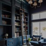
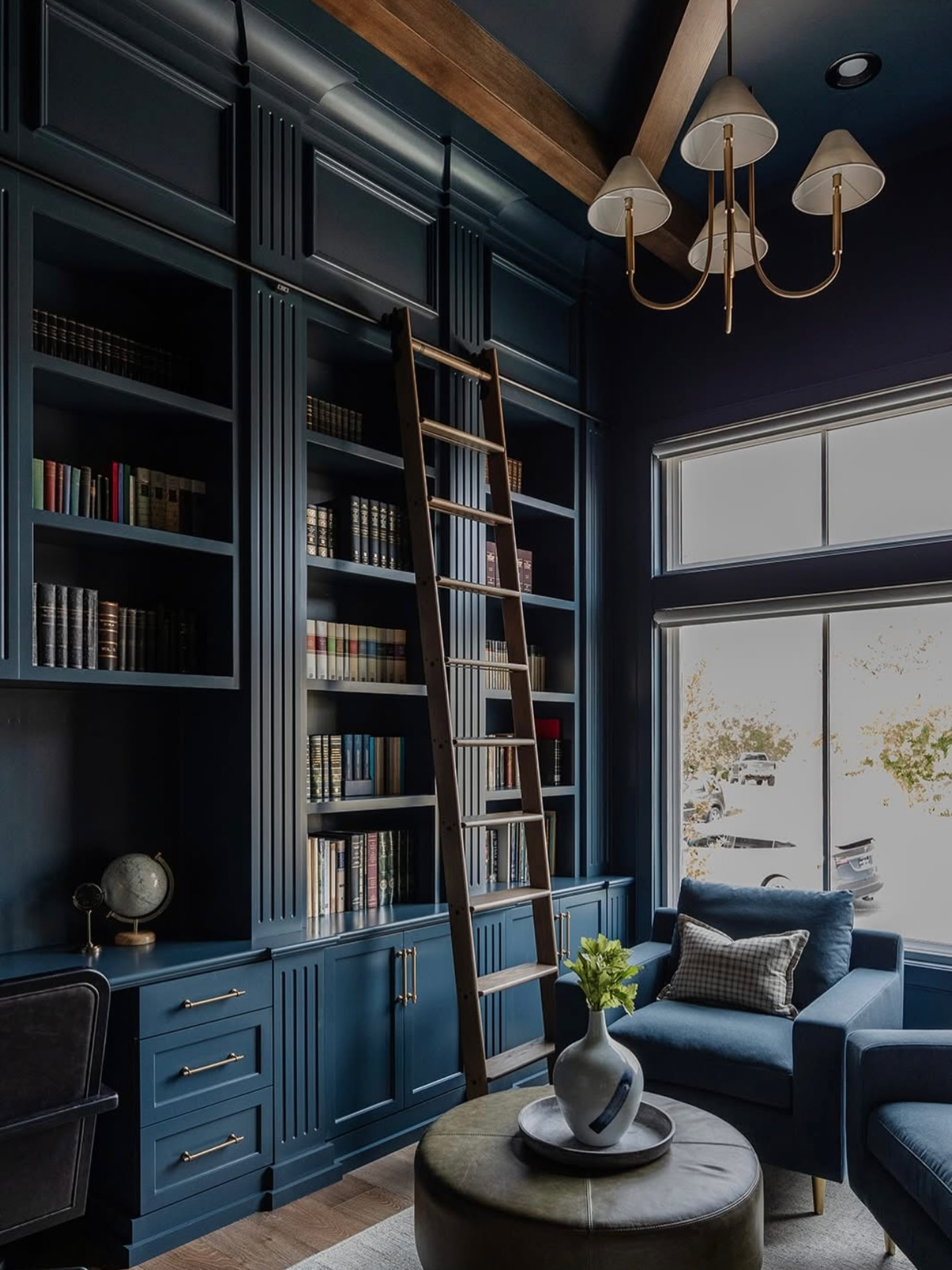
10. Charcoal, Slate, and Steel Blue: Moody and Modern
Dark, moody bedrooms are having a major moment. If you’re into sleek sophistication, go for charcoal walls, slate bedding, and steel blue accents.
This combo oozes confidence without feeling cold. Use matte finishes or soft textures (like velvet curtains) to warm it up.
11. Mustard, Amber, and Burnt Orange: Cozy Autumn Haven
This palette screams fall—without the pumpkin spice overdose. Think mustard walls, amber pillows, and burnt orange throws.
Add a wooden headboard and some copper lighting for that earthy, golden glow. It’s basically the color version of wrapping yourself in a blanket with a cup of chai.
12. Sage, Pistachio, and Olive: Calming and Organic
These muted greens work wonders if you’re chasing a spa-like vibe. Use sage paint, pistachio textiles, and olive decor.
Add some white ceramics or woven baskets for an airy, balanced feel. FYI, green shades reduce stress levels—so this one’s both pretty and practical.
13. Blush, Mauve, and Burgundy: Soft Yet Striking
This combo strikes the perfect balance between feminine and sophisticated. Start with blush walls, layer in mauve bedding, and finish with burgundy accents.
Mix in metallic touches (rose gold or brushed brass) to keep things modern. It’s romantic but not overly sweet—a solid win for adult bedrooms.
14. Taupe, Sand, and Dusty Rose: Desert-Inspired Serenity
Want something warm but understated? Taupe and sand tones form the base, while dusty rose accents add a gentle blush.
Think linen sheets, textured throws, and clay pottery. This look feels effortlessly chic, like something you’d find in a California boutique hotel.
15. Sky Blue, Periwinkle, and Lavender: Light and Airy
Perfect for smaller rooms, this palette feels open and breezy. Sky blue walls, periwinkle bedding, and lavender decor give off soft, dreamlike energy.
Use sheer curtains to enhance the lightness and add silver accents for a touch of cool sophistication. Ever wanted your bedroom to feel like a cloud? Yeah, this is it.
16. Terracotta, Rust, and Brown: Warm Earthy Comfort
If you love cozy, grounded interiors, this is your match. Pair terracotta walls, rust textiles, and brown wooden accents.
It’s timeless, organic, and inviting. Add plants and woven rugs for a rustic finish. Just be careful not to go overboard, or you’ll cross into “Tuscan restaurant” territory.
17. Mint, Aqua, and Sky Blue: Fresh Morning Energy
This light, refreshing palette works beautifully for a kids’ room or summer-inspired space. Mint walls, aqua bedding, and sky-blue accents create a cheerful yet calm ambiance.
Mix in white or gray furniture to keep things soft and balanced. It’s like waking up to sunshine—even on Mondays. 🙂
18. Plum, Wine, and Rose: Sophisticated Glamour
These rich tones bring instant luxury. Go for plum bedding, wine-colored curtains, and rose-toned decor.
Use gold or crystal lighting for that elegant, high-end touch. This combo is perfect if you want a moody, romantic space that still feels cozy.
19. Cobalt, Indigo, and Royal Blue: Bold and Balanced
Want drama without chaos? Cobalt and indigo give depth, while royal blue keeps it dynamic.
Accent with white linens and metallic decor to prevent visual overload. This combo makes a strong statement—ideal for anyone who likes bold design choices that still look intentional.
Tips for Nailing Analogous Color Schemes
Before you run off to paint your walls three shades of green, keep a few key principles in mind:
- Pick one dominant color for the walls or largest surface.
- Use the second color for mid-sized elements (like bedding or curtains).
- Reserve the third color for small accents (pillows, art, decor).
- Balance bold shades with neutrals to avoid overwhelm.
- Test samples first! Colors shift dramatically under different lighting.
And for the love of good design, don’t just grab random “matching” colors at the paint store. Analogous palettes work best when the undertones align—warm with warm, cool with cool.
Why Analogous Colors Work So Well
Ever notice how nature always gets color combinations right? Think sunsets, forests, or beaches. Analogous schemes mimic those natural transitions, so they naturally feel cohesive and relaxing.
They also make decorating so much easier. Once you choose your base color, you already know which direction to go next—no second-guessing whether teal clashes with mustard (spoiler: it does).
Final Thoughts
Analogous color schemes are like the unsung heroes of interior design—subtle, seamless, and foolproof. They let you play with color while keeping things harmonious and inviting.
Whether you go for earthy greens, romantic purples, or cool ocean blues, the secret is balance. Start simple, experiment with tones, and trust your instincts.
At the end of the day, your bedroom should make you feel good every time you walk in. If it does that, you’ve already nailed it. And hey, if you accidentally end up repainting three times before getting it right? Welcome to the club.

Leave a Reply