
So you want to bring some retro color into your living room, but you don’t want it to look like a time capsule your aunt refuses to update? I get it.
I’ve experimented with retro palettes for years, and trust me, some color combos hit hard… while others feel like you accidentally walked into a 1970s basement where the carpet never recovered.
You want the good retro — the stylish kind.
The kind that feels nostalgic without looking dated.
The kind that makes people go, “Wait… why does this look amazing?”
So let’s jump into 20 retro color living room ideas you can actually pull off at home.
I’ll break everything down in a friendly, honest way — IMO the only way design talk makes sense — and I’ll toss in some personal takes along the way. Ready?
1. Burnt Orange + Chocolate Brown
You can’t talk retro colors without mentioning burnt orange. It carries huge 70s energy, but when you pair it with chocolate brown, it suddenly feels cozy, warm, and surprisingly sophisticated.
Ever notice how this combo feels like fall, but in a good way instead of the pumpkin-spice overwhelmingly basic way? Yeah, that.
Why it works:
- Creates depth and warmth
- Pairs beautifully with wooden furniture
- Makes neutrals look richer
Pro Tip: Keep the brown matte so the orange does the talking.
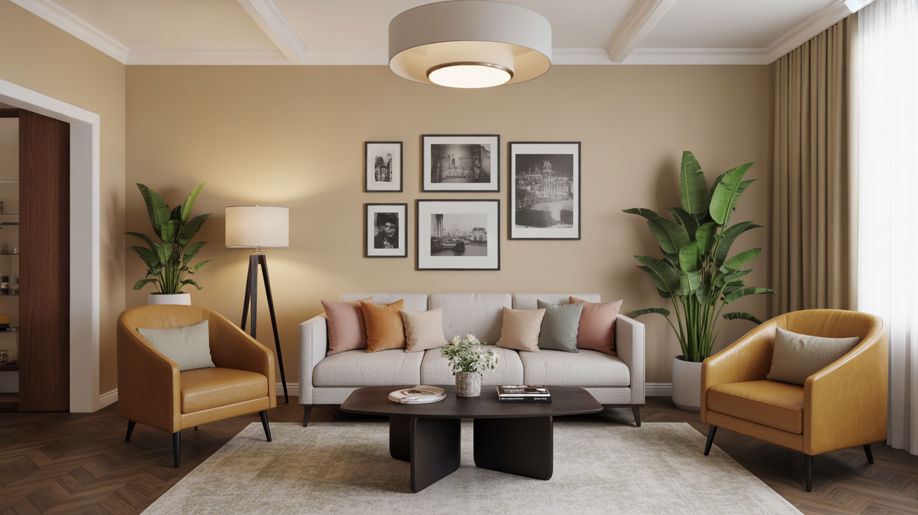
2. Avocado Green + Mustard Yellow
I know what you’re thinking. “Avocado? Really?” Yes, really. I used to hate this combo… until I actually tried it.
The surprising thing? It feels bold without being loud. Kind of like the friend who talks a lot but says interesting things.
Why it works:
- Gives your space an instant retro punch
- Works great with rattan and brass
- Brings in earthy warmth without neutrals
3. Teal + Walnut
Teal adds that rich retro punch without overwhelming your space. Pair it with walnut wood, and you instantly get mid-century vibes that don’t feel forced.
Bonus: Teal looks amazing in natural light. Ever noticed that?
4. Rust Red + Cream
I love how rust red feels old-school yet cozy. When you mix it with cream, you balance warmth with softness — like vintage diner colors, but make it classy.
Best for:
- Vintage rugs
- Patterned throw pillows
- Rooms with a lot of character
5. Sky Blue + Tangerine
This combo feels playful without turning your living room into a kid’s cartoon set. You get the crispness of sky blue with the punch of tangerine, and the result looks lively, fresh, and very retro.
Ever wondered why old-school packaging used these colors so much? Because the combo works — even now.
6. Mustard Yellow + Charcoal
When you want retro but still want to look like an adult with responsibilities (:/), this combo nails it. Mustard brings the vintage vibe, while charcoal keeps things grounded.
Why I love it:
It’s bold but not chaotic. You can keep your sanity and your style.
7. Olive Green + Terracotta
Olive and terracotta carry major 60s and 70s charm. They feel earthy, rich, and grounded.
Make it work with:
- Clay décor
- Vintage planters
- Brass lamps
I once painted a whole feature wall in olive, and it completely transformed the room — no regrets.
8. Pastel Pink + Warm Wood
If you want a softer retro palette, this one feels sweet without feeling sugary. The warm wood tones balance out any bubblegum vibes.
Ever seen those 50s diners and wondered why pastel works so well? Because the combos were intentional — and now you can steal them.
9. Navy + Marigold
This combination gives you a bold mid-century vibe without feeling overly retro. Navy anchors the room, and marigold brings the energy.
Use it when:
- You want something dramatic
- You like contrast
- You hate boring living rooms
10. Mint Green + Cherry Red
Mint and cherry red bring that diner-style retro punch in the best way possible.
Think vintage appliances… but make it modern.
Why it feels fresh:
The cool mint balances the bold red perfectly.
11. Forest Green + Gold
This combo feels luxurious but still vintage. You get a retro hotel-lobby vibe without making your house feel like, well… a hotel lobby.
Add gold accents and rich fabrics, and you basically win at décor.
12. Mustard + Navy + White (Triple Combo)
This is one of my favorites when you want retro flair that still feels balanced. It’s bold, stylish, and ridiculously easy to pull off.
Key Tip:
Use white as a buffer so the mustard and navy shine.
13. Peach + Olive
Peach and olive hit that sweet spot where colors feel soft and warm but still retro. Peach adds sweetness, olive adds depth, and together… they’re perfect.
14. Burgundy + Cream
This color combo screams retro glam. Burgundy feels dramatic and vintage, while cream lightens everything up so it doesn’t feel heavy.
Best for:
- Velvet sofas
- Statement rugs
- Cozy lighting
15. Slate Blue + Mustard Accents
Slate blue offers a vintage softness that pairs perfectly with mustard accents. You get calm with a punch — my favorite kind of design balance.
Ever tried blue walls? They work almost too well.
16. Espresso Brown + Burnt Sienna
If you love deep, rich tones, this combo brings the warm, moody vibe that defined many retro homes.
Where it shines:
- Wood-panel rooms
- Dimly lit spaces
- Homes with vintage character
17. Turquoise + Crisp White
This combo instantly feels mid-century without trying too hard. Turquoise brings the retro color identity, and white keeps everything clean and modern.
Why it works so well:
Turquoise carries a natural nostalgic charm. You barely need décor.
18. Emerald + Brass
This is retro luxury at its peak. Emerald gives you richness, brass adds glam, and together they feel bold and timeless.
Use it sparingly:
Bold greens make a big impact, so you don’t need to drown the room in color.
19. Coral + Navy
Coral adds a vintage pop of fun, while navy grounds it. This combo works when you want something retro but not too on-the-nose.
Try it in:
- Curtains
- Wall art
- Accent chairs
20. Soft Yellow + Warm Gray
If you’re scared of committing to bold retro colors (no judgment), this combo gives you that gentle vintage feel without overwhelming your space.
It’s subtle. It’s charming. And it actually works in almost any living room.
How to Make Retro Colors Look Modern
You can throw retro colors on the walls all day, but if the space doesn’t feel balanced, it’ll look messy. Here’s how to make those palettes feel stylish and updated:
Use Neutrals as Anchors
You don’t need a full rainbow to get the retro feel. Use brown, cream, charcoal, or white as balancing colors.
Add Texture
Retro isn’t just about colors — it’s about texture too.
Try:
- Bouclé
- Velvet
- Woven rattan
- Brass finishes
Mix Old and New
A modern sofa with retro colors looks infinitely cooler than an all-retro setup. Balance matters.
Bring Patterns Into the Mix
Think geometric prints, bold stripes, and vintage florals.
But, you know… not all at once unless you enjoy chaos.
Final Thoughts
Retro color palettes make your living room feel warm, lively, and full of personality. Whether you go bold with burnt orange or soft with pastel pink, the key is balance and intention.
And don’t worry — you don’t need to commit your entire life to retro décor. A few colors, a few accents, and suddenly your living room feels stylish, nostalgic, and honestly way more interesting than the usual beige-everything trend.
FYI, the best retro rooms come from experimenting. So try a palette, adjust it, play with it… you’ll get there. And if someone tells you retro colors are outdated? Just smile and remind them that design trends always circle back around


Leave a Reply