So, you’re thinking about jazzing up your living room with tetradic colors? I get it—color schemes can be intimidating.
You want something vibrant, balanced, and not “clashing disaster.”
Don’t worry, I’ve been there, and today we’re going to chat about 20 creative ideas for using tetradic color palettes in your living space.
By the end, you’ll feel confident enough to tell anyone, “Yes, my living room rocks a tetradic scheme, thank you very much.”
What’s the Deal with Tetradic Colors Anyway?
Before we dive in, let’s clarify what we’re talking about. A tetradic color scheme uses four colors arranged into two complementary pairs. Think of it as a color square on the color wheel. It’s bold, lively, and—honestly—way more fun than the usual “safe” combos.
Why does this work? Because it balances contrast and harmony. You get variety without chaos, which is perfect for a living room that’s lively but still inviting.
Ever tried mixing four colors and ended up with something that looks like a toddler went wild with markers? Yeah, I’ve been there. Stick to the rules I’ll share, and you’ll avoid that.
1. Classic Blue + Orange + Green + Red
Start with a classic tetradic palette. Blue and orange complement each other, as do green and red.
- Use blue for walls or a statement sofa.
- Orange cushions or throws can add warmth.
- Green plants give life without screaming “look at me!”
- Red accents like artwork or rugs tie it all together.
This combo is bold, but if you play with saturation (muted vs. bright), it’s surprisingly cozy.
2. Mustard + Teal + Coral + Navy
This one’s for when you want retro vibes.
- Mustard chairs pop beautifully against teal walls.
- Coral accessories keep it cheerful.
- Navy elements like a rug or curtains ground the room.
IMO, this is perfect if you want color without it feeling like a circus.
3. Emerald + Lavender + Gold + Dusty Pink
Feeling fancy? This combo feels luxurious but approachable.
- Emerald sofa = instant drama.
- Lavender walls soften the bold green.
- Gold accents = glamour points.
- Dusty pink touches = subtle warmth.
Fun fact: This palette works beautifully with marble or wood textures.
4. Forest Green + Rust + Sky Blue + Cream
Nature-inspired tetradic scheme alert!
- Forest green walls set a grounding tone.
- Rust-colored chairs or pillows add warmth.
- Sky blue accessories = unexpected pop.
- Cream furniture balances everything out.
This one’s super approachable if you’re wary of color overload.
5. Navy + Tangerine + Lime + Soft Gray
Okay, this is a high-energy combo. Perfect if your living room doubles as a social hub.
- Navy walls = cozy base.
- Tangerine and lime accents = playful energy.
- Soft gray furniture = calming factor.
Trust me, it feels lively without being obnoxious if you balance the intensity.
6. Charcoal + Burgundy + Olive + Blush
This one’s sophisticated.
- Charcoal walls = chic backdrop.
- Burgundy sofa = statement piece.
- Olive décor items = earthy touch.
- Blush accents = subtle lift.
If you’re aiming for a modern, elegant vibe, this combo nails it.
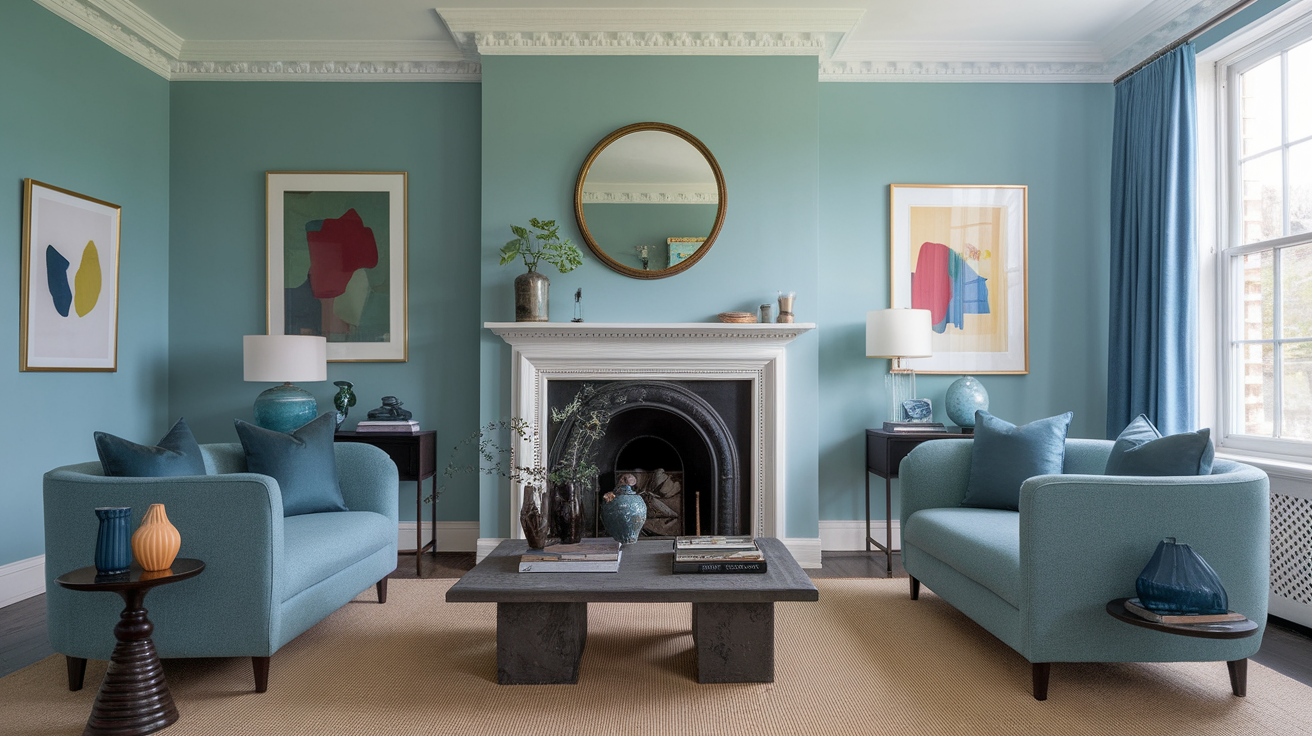
7. Aqua + Coral + Mustard + Slate
This palette screams mid-century modern.
- Aqua walls or rugs = fresh base.
- Coral accents = warmth.
- Mustard armchairs = retro chic.
- Slate furniture = neutral anchor.
IMO, this is playful yet surprisingly timeless.
8. Teal + Marigold + Rose + Charcoal
Bold, but balanced.
- Teal sofa = statement anchor.
- Marigold cushions = happy vibe.
- Rose accents = softness.
- Charcoal elements = sophistication.
I love this combo for open-plan living rooms where you want color without overwhelming.
9. Plum + Sage + Tangerine + Cream
Slightly unexpected, slightly cozy.
- Plum walls = moody elegance.
- Sage furniture = earthy calm.
- Tangerine décor = small pops of energy.
- Cream touches = balance.
Ever notice how small accent colors can make or break a room? This is why.
10. Sky Blue + Lemon + Coral + Navy
Bright, sunny, and cheerful.
- Sky blue walls = airy.
- Lemon accents = zing!
- Coral pillows = warm touch.
- Navy furniture = anchors the palette.
If you want your living room to feel like a vacation spot, this combo works magic.
11. Olive + Rust + Soft Pink + Teal
Earth tones with a twist.
- Olive walls = grounding.
- Rust cushions = warmth.
- Soft pink accents = subtle brightness.
- Teal décor = fun contrast.
This palette is super cozy for fall vibes, FYI.
12. Coral + Mint + Gold + Charcoal
Modern and stylish.
- Coral walls or chairs = bold start.
- Mint accents = calming effect.
- Gold décor = subtle luxury.
- Charcoal furniture = neutral anchor.
IMO, if you want Instagram-worthy interiors, this is a great starting point.
13. Eggplant + Mustard + Teal + Soft Gray
Dramatic yet approachable.
- Eggplant sofa = statement piece.
- Mustard pillows = warmth.
- Teal accents = energy.
- Soft gray walls/furniture = balance.
It’s bold, but not intimidating. Perfect for someone ready to experiment a little.
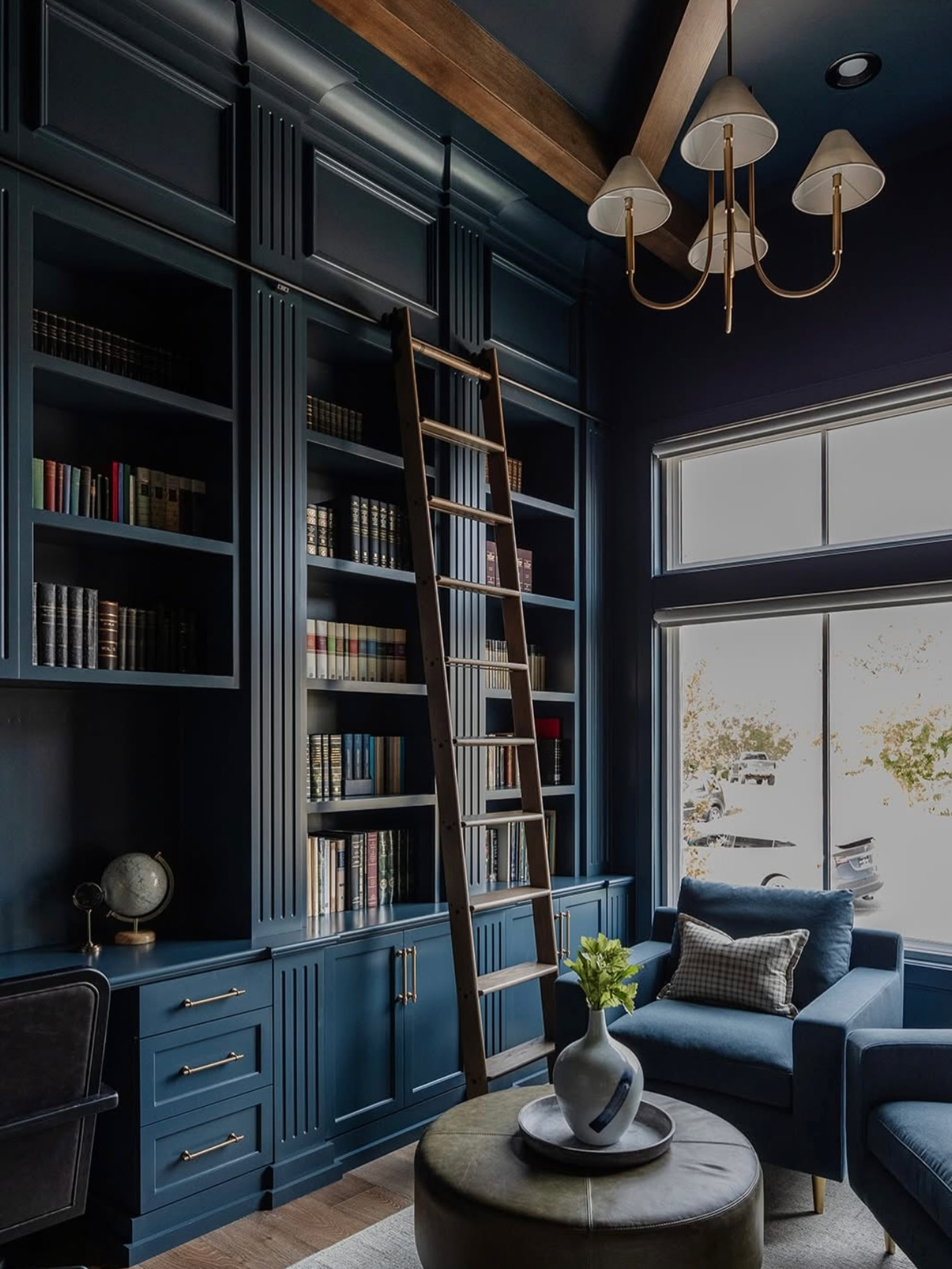
14. Navy + Blush + Olive + Rust
Classic tetradic elegance.
- Navy sofa = anchor.
- Blush cushions = gentle lift.
- Olive décor = earthy tone.
- Rust accents = grounding warmth.
This combo works in both modern and traditional interiors, which is rare.
15. Turquoise + Tangerine + Lime + White
High-energy and cheerful.
- Turquoise walls = bold base.
- Tangerine + lime accents = playful pops.
- White furniture = keeps it from feeling chaotic.
Honestly, it’s hard not to smile when you walk into a room like this.
16. Chocolate Brown + Teal + Coral + Cream
Warm, inviting, and stylish.
- Chocolate brown walls or furniture = cozy base.
- Teal cushions or throws = cool contrast.
- Coral accents = unexpected warmth.
- Cream touches = balance.
IMO, this is perfect for family rooms where comfort is king.
17. Charcoal + Mustard + Aqua + Soft Pink
Balanced, vibrant, and chic.
- Charcoal walls/furniture = grounding.
- Mustard accents = warmth.
- Aqua décor = cool contrast.
- Soft pink touches = gentle lift.
This combo feels sophisticated yet playful, which is hard to pull off, but doable.
18. Emerald + Tangerine + Violet + Cream
Luxe with a bit of wow factor.
- Emerald sofa or walls = dramatic elegance.
- Tangerine accents = energy.
- Violet décor = richness.
- Cream touches = soft balance.
Ever walk into a room and think, “Wow, this is fancy but fun”? That’s this combo.
19. Navy + Lime + Coral + Soft Gray
Bright but grounded.
- Navy sofa = anchor.
- Lime accents = playful energy.
- Coral décor = warmth.
- Soft gray walls/furniture = balance.
IMO, this works especially well in modern or eclectic interiors.
20. Dusty Pink + Olive + Mustard + Teal
Earthy yet lively.
- Dusty pink walls or décor = soft and welcoming.
- Olive furniture = grounding.
- Mustard accents = warmth.
- Teal touches = contrast and freshness.
This one’s my personal favorite—cozy, cheerful, and totally livable.
Tips for Pulling Off a Tetradic Living Room
Before you rush out and paint your walls four different colors (trust me, resist the urge), here are some pro tips:
- Pick a dominant color – Usually 40-50% of your room.
- Use a secondary color – About 30% of the room for balance.
- Accent colors – 10-15% each. Less is more.
- Textures matter – Wood, metal, or fabric can soften or amplify colors.
- Lighting is everything – Colors look different in natural vs. artificial light.
Trust me, a tetradic palette can either elevate your living room to Pinterest-level fabulous or make it feel like a color tornado. Stick to balance and proportion.
Final Thoughts
Tetradic color schemes are fun, dynamic, and expressive. They give you a chance to show personality in your living room without going full rainbow chaos. The key is to balance boldness with subtlety, and always use at least one neutral anchor.
So, whether you’re going for retro vibes, cozy earth tones, or high-energy pops, there’s a tetradic palette out there for you. My advice? Experiment, have fun, and don’t be afraid to mix bold with calm. Your living room deserves it .


Leave a Reply