
So you want a living room that actually feels alive, right? I get it.
I chased “neutral perfection” for years, and my home looked like a beige rental catalog. The day I finally played with complementary colors, everything changed.
Suddenly the room felt bold, intentional, and honestly way more fun. Ever wondered why opposite colors on the color wheel look so good together?
They balance each other out like the perfect duo—kind of like peanut butter and jelly, but you know, for your walls.
If you’re curious about how to use bold and balanced color combos without making your living room look like an art teacher’s midlife crisis, I’ve got you.
Here are 26 complementary color living room ideas that actually work in real homes, not just Pinterest fantasy land. Let’s get into it. 🙂
1. Classic Blue and Orange Contrast
Blue and orange create that energetic, modern look you see in designer magazines. I tried this in my own space once, and honestly, I felt like I walked into my own mini boutique hotel.
Use a deep blue sofa with burnt orange pillows, or flip the script with orange accents against a navy backdrop.
Tip: Stick with muted shades for a calmer vibe.
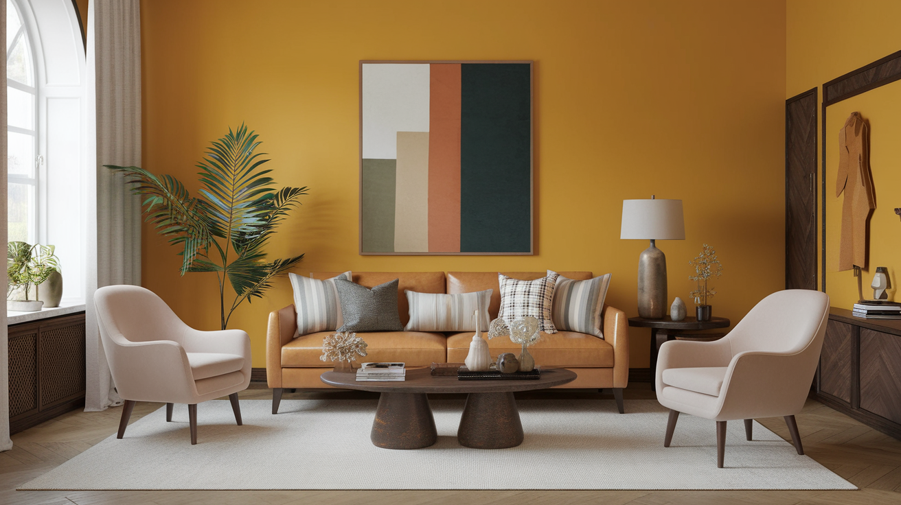
2. Rich Purple and Yellow Accents
This combo scares people, but trust me—it works. Ever seen a sunset? Mother Nature knows what she’s doing.
Use mustard yellow accessories against plum purple furniture for a warm, cozy feeling.
3. Green and Red Done the Right Way
I’m not talking about Christmas décor 2.0. I mean earthy reds with muted greens.
Try olive green walls with brick-red cushions. You’ll feel calm but energized—sounds impossible, I know, but it works.
4. Aqua and Coral for a Fresh Look
Ever wanted your living room to feel like a breezy beach house without the sand between your toes?
Aqua and coral create a clean, uplifting vibe that’s perfect for small rooms.
5. Black and Gold with Complementary Pops
Black and gold always look luxurious, but pair them with unexpected complementary schemes like teal and orange accents to add depth and personality.
Why choose one when you can layer all the drama?
6. Teal and Rust Harmony
If you love warm tones but don’t want your space to feel overly orange, rust paired with teal gives off a modern, artsy vibe.
7. Mint Green and Soft Pink
This feels playful and vintage without going full 1950s diner.
Try a mint green wall with subtle pink throws or ottomans.
8. Bold Yellow and Deep Blue Furniture
A golden armchair against a navy wall? Yes, please.
This pairing looks cinematic and instantly brightens any space.
9. Terracotta and Sage Complementary Touches
Sage green softens the heat of terracotta, creating a grounded, earthy style.
Ever walked into a space and just instantly relaxed? That’s what this combo does.
10. Lavender and Soft Gold Accents
Lavender brings calm; gold brings glam. Together, they create a balanced yet beautiful room.
IMO, this combo feels like grown-up luxury without the stuffy energy.
11. Burnt Orange and Slate Blue
Burnt orange gives warmth; slate blue cools everything down.
You’ll get a mature look that screams intentional design.
12. Forest Green and Wine Red
This combo feels rich and moody.
If you want to make your living room feel like an intimate lounge, this pairing nails that vibe.
13. Soft Peach and Navy
Peach keeps things sweet; navy gives it structure.
Use navy furniture and peach décor for a well-balanced look.
14. Golden Yellow and Eggplant Purple
Yes, it sounds bold. But trust me—the contrast feels designer-level.
Add gold metal décor for extra shine.
15. Warm Beige with Complementary Blue-Orange Art
If you still love your beige (no shame), use a bold complementary color art piece to liven things up.
FYI: This keeps things neutral but never boring.
16. Coral and Turquoise Energy
This combo feels happy—like a summer vacation distilled into a color scheme.
Use coral pillows and turquoise vases for a lively setting.
17. Deep Burgundy and Forest Green
This is another combo that screams “library chic.”
Pair dark woods with these hues for a moody, expensive-looking result.
18. Chartreuse and Royal Blue
Chartreuse adds a punch; royal blue grounds it.
Use chartreuse accents sparingly unless you want your room to shout.
19. Blush Pink and Hunter Green
You get romance meets sophistication.
Blush softens hunter green, making the combo elegant and modern.
20. Coral Red and Aqua Blue
This combination works surprisingly well in smaller rooms because it feels breezy and optimistic.
Use aqua walls with coral accessories for a quick transformation.
21. Tangerine and Sky Blue
This combo looks bright and playful.
Perfect for a family living room where personality matters.
22. Plum and Mustard Yellow
One of my personal favorites.
Try a plum sofa with mustard throw blankets for instant drama.
23. Soft Green with Complementary Pink-Toned Wood
If you want something subtle, pair pale green walls with rosewood pieces.
The wood’s pink tones act as a muted complementary hue.
24. Black Walls with Complementary Color Pops
Yes, black walls. They look amazing.
Add pops of complementary colors like orange-and-blue décor to keep the room lively.
25. Warm Red with Cool Blue Art
If you don’t want to commit to a full complementary palette, let your art do the work.
A red feature wall paired with bold blue artwork creates instant balance.
26. Sunset Yellow and Violet Highlights
This combo looks magical.
Use violet lamps, pillows, or rugs against soft yellow walls for a warm, whimsical look.
Ever wondered why sunset colors look so good? This is the indoor version.
Final Tips for Using Complementary Colors
Here are a few quick rules I always stick to when playing with these bold hues:
- Use one dominant color and the complementary shade as an accent.
- Choose muted versions of primary complementary pairs if you want a softer look.
- Layer textures to avoid the colors looking too flat.
- Keep lighting warm to balance high-contrast hues.
A little personal note: I once painted an entire room deep purple and paired it with bright yellow accessories. Did I go too far? Probably. Did it look unforgettable? Absolutely. Sometimes you need to experiment to find what actually feels right for your space. :/
Conclusion
Complementary colors bring life, balance, and personality to any living room. Whether you want something subtle and earthy or bold and dramatic, these color duos can completely transform your home. Remember, you don’t need to follow every design rule—just trust your instincts and have fun with it.
And who knows? You might surprise yourself with a combo you never expected to love. Now go play with color—you deserve a living room that actually feels alive.


Leave a Reply