
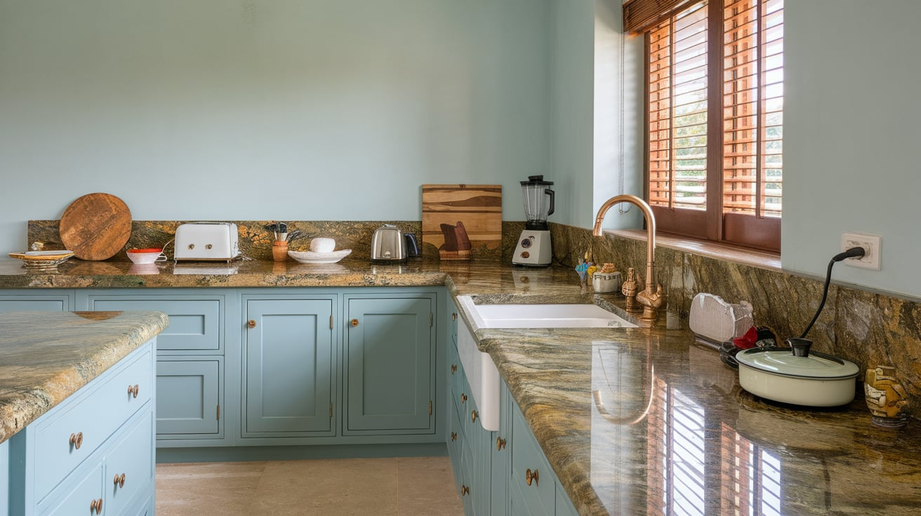
So, you’ve fallen in love with Venetian Gold granite? I get it. That warm mix of golden, cream, and gray tones makes it one of the most versatile granites out there.
The real question is: what paint colors actually make this stone shine in your home? I’ve tested (and obsessed over) this pairing more times than I can count, and let’s just say—some colors make it pop, while others… well, let’s politely say they belong in the “what was I thinking” category.
Let’s break them down in a way that feels less like a boring design lecture and more like chatting with a friend who’s been through it.
1. Soft Cream
Venetian Gold already has creamy undertones, so soft cream walls bring out that warmth. It creates a seamless flow without feeling too heavy. Perfect if you want a cozy, sunlit vibe.
2. Warm Taupe
Taupe is like that dependable friend who gets along with everyone. Against Venetian Gold granite, warm taupe balances the gold and gray without stealing the spotlight.
3. Light Gray
Want something modern? Light gray paint with cooler undertones tones down the gold flecks in the granite and creates a chic, contemporary backdrop.
4. Greige
Greige = gray + beige. Sounds boring, right? Wrong. It’s actually magic with Venetian Gold because it ties in both the warm and cool tones of the stone.
5. Buttery Yellow
Okay, hear me out—yellow can go horribly wrong. But when you pick a soft buttery shade, it plays up the warmth of Venetian Gold without looking like a highlighter exploded in your kitchen.
6. Sage Green
Earthy greens like sage create a grounded, natural pairing with the granite. It works especially well in kitchens with lots of wood cabinetry.
7. Olive Green
If sage feels too light, try olive green for a bolder, earthy contrast. Venetian Gold can handle it—it’s a granite that loves warm tones.
8. Dusty Blue
Blue might not be the first color you think of, but trust me: a muted, dusty blue makes the gold sparkle while calming down the warmth. It’s an underrated combo.
9. Navy Blue
For drama lovers, navy blue walls next to Venetian Gold granite = instant sophistication. Great in dining rooms or as an accent wall.
10. Chocolate Brown
Want a rich, cozy vibe? Chocolate brown walls deepen the warmth of the granite and look luxe, especially with gold hardware.
11. Warm White
Sometimes simple wins. Warm white paint keeps everything crisp while letting the granite shine. No clashing, no fuss.
12. Charcoal Gray
Need a bold, modern edge? Charcoal gray walls bring out the specks of gray in Venetian Gold, giving your space a sleek, grounded look.
13. Terracotta
Think Mediterranean villa vibes. Terracotta pairs with the golden tones beautifully and gives the room a rustic, earthy feel.
14. Soft Peach
For a softer look, peach tones complement the gold without overpowering. Perfect in bathrooms or cozy bedrooms.
15. Beige
Yes, beige can be boring. But with Venetian Gold granite, beige is a timeless match that feels harmonious and classic.
16. Deep Burgundy
Want drama with a side of elegance? Deep burgundy walls create a bold contrast with Venetian Gold, especially in formal spaces.
17. Warm Greige with Green Undertones
This might sound overly specific, but greige with a subtle green base is ridiculously good with Venetian Gold. It tones down the yellow while still blending with the warmth.
18. Mustard Gold
If you’re not afraid of color, mustard tones echo the golden veins in the granite without being too matchy-matchy.
19. Slate Blue
Softer than navy but richer than dusty blue, slate blue creates a calm but stylish contrast with Venetian Gold countertops.
20. Mocha
For kitchens, mocha paint balances rich cabinets and granite without feeling heavy. It’s warm, inviting, and just plain delicious-looking.
21. Soft Lavender
Lavender? Yep. A muted lavender paint softens the warmth of Venetian Gold and brings a surprising freshness. IMO, it’s especially gorgeous in bathrooms.
22. Black
Go bold or go home, right? Black walls next to Venetian Gold granite look modern, dramatic, and high-end. Just don’t overdo it unless you like the “bat cave” aesthetic.
23. Forest Green
And finally, deep forest green is a total showstopper. It’s dramatic, earthy, and makes Venetian Gold look like the star of the room.
Tips for Choosing the Right Paint
Picking the “perfect” paint color for Venetian Gold granite doesn’t have to feel like rocket science. Here are a few quick tips I’ve learned (the hard way):
- Test samples first. Paint looks totally different on the wall than it does on a swatch.
- Check in different lighting. Venetian Gold shifts tones depending on natural vs. artificial light.
- Balance warm and cool. If your granite leans warm, try cooler paints to balance—or double down on warmth for a cozier feel.
- Think about the room’s vibe. Do you want calm and airy, bold and dramatic, or cozy and rustic? The paint color sets the mood.
My Personal Favorites
If I had to pick just three Venetian Gold granite paint matches, I’d go with:
- Greige (because it works everywhere and feels timeless).
- Navy Blue (for drama and contrast).
- Sage Green (for a natural, earthy balance).
Those combos never fail, and I’ve used them in multiple projects with happy results.
Final Thoughts
Venetian Gold granite is like the little black dress of natural stone—it goes with almost anything, but the right pairing makes it unforgettable. From soft creams and warm taupes to bold navies and forest greens, there’s a paint color here for every style and mood.
At the end of the day, trust your gut. If you love how a color looks with your granite, that’s what matters. After all, you’re the one who’ll be living with it, not the paint company or some random designer on Pinterest.
So, grab a few samples, slap them on your wall, and see what makes your Venetian Gold countertops sparkle. Who knows—you might even surprise yourself with a color you never thought you’d try.


Leave a Reply