
Choosing paint colors for west facing rooms can feel like solving a tricky puzzle.
In the morning, these rooms can seem muted and shadowy, but by late afternoon they’re glowing with a golden, almost fiery warmth from the setting sun.
Let’s dive into the 24 best paint colors for west facing rooms that actually work, complete with practical tips, personal insights, and stats about why light affects color the way it does.
1. Understanding the Unique Light in West Facing Rooms
West facing rooms catch the intense golden rays of the afternoon sun, which means they often feel warm and glowing in the evening but somewhat flat or shadowy in the morning.
According to interior design studies, light orientation can change the perceived temperature of a color by up to 20%, which explains why some colors look perfect in the store but completely off once on your walls.
If you’ve ever painted a soft beige and found it looked almost pinky-orange at 5 PM, you’ve experienced this firsthand.
My own living room (a west-facing one, of course) looked great in the morning but turned into what I jokingly called “pumpkin soup beige” at night. Lesson learned: undertones matter more than anything in west-facing spaces.
2. Why Undertones Are the Secret Weapon
The sun pouring in from the west exaggerates warm undertones like red, orange, and yellow. That means if you pick a color with even a hint of these, expect it to double down in the evening. The trick? Lean into cooler undertones to balance the warmth.
Designers often recommend colors with blue, green, or gray undertones for west-facing rooms. These create harmony, keeping the space grounded instead of overly heated. But that doesn’t mean you should avoid warm colors altogether—when chosen carefully, they can work beautifully.
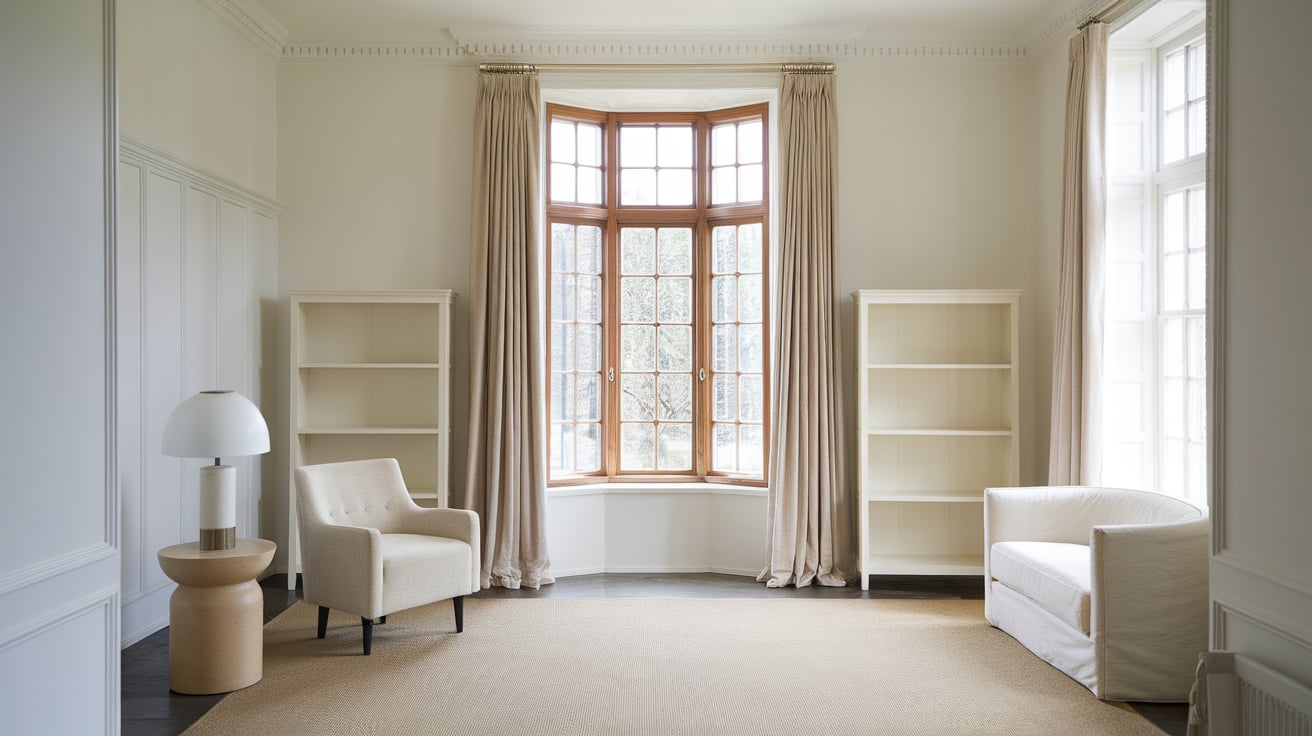
3. Soft Neutrals for a Balanced Base
Neutral shades are a safe yet versatile choice. In west facing rooms, neutrals with subtle gray undertones help avoid that dreaded “too warm” effect.
- Sherwin-Williams Repose Gray – A classic greige that shifts gracefully between gray and beige. In the morning, it looks calm and muted; by evening, it picks up just enough warmth to glow without overwhelming.
- Benjamin Moore Classic Gray – Despite the name, it’s more of a soft, warm off-white with balanced undertones. Perfect if you want a barely-there backdrop that plays nice with natural light.
- Farrow & Ball Ammonite – This one’s sophisticated and never feels heavy. It has that magical chameleon quality west facing rooms love.
Neutrals are like the bread in a sandwich—they hold everything together but don’t shout for attention.
4. The Power of Soft Blues
Blues are an absolute lifesaver in west facing rooms because they naturally counterbalance the strong orange-red tones of the afternoon sun.
- Benjamin Moore Palladian Blue – A dreamy mix of blue and green with a soft, airy vibe. It makes the room feel like a gentle seaside escape.
- Sherwin-Williams Sea Salt – Technically a green-gray, but it reads as a light, tranquil blue under warm evening light. Designers love it because it feels spa-like without being sterile.
- Farrow & Ball Skylight – Light and fresh, this is the kind of blue that doesn’t scream “nursery” but still feels comforting.
I painted my west-facing guest bedroom in Sea Salt, and guests always comment on how calm the space feels even as the sun sets. It’s like a cold glass of lemonade on a hot day—refreshing and perfectly timed.
5. Greige – The Unsung Hero
If neutrals are too plain and blues too cold for your taste, greige is your golden ticket. It blends the grounding nature of gray with the warmth of beige, adapting like a chameleon.
- Sherwin-Williams Agreeable Gray – The most popular greige for a reason. It’s warm without going yellow, cool without being flat.
- Benjamin Moore Edgecomb Gray – Softer and more muted, this one works great if you want your west-facing room to feel cozy yet airy.
- Behr Silver Drop – Budget-friendly and incredibly versatile, it works equally well in living rooms and bedrooms.
Think of greige as the Switzerland of paint colors—always neutral, never offensive, and somehow perfect in almost any situation.
6. Earthy Greens for a Natural Touch
Greens thrive in west-facing rooms because they hold their ground against the warm glow without getting too harsh.
- Benjamin Moore Saybrook Sage – A timeless sage that feels grounded and organic. Perfect for creating a nature-inspired space.
- Sherwin-Williams Evergreen Fog – Named the Color of the Year 2022, this muted green adds sophistication without being loud.
- Farrow & Ball Green Smoke – Richer and moodier, great for creating depth in cozy west-facing dining rooms or offices.
There’s something magical about sitting in a west-facing room painted in sage green. As the sun sets, it feels like your walls are whispering, “Relax, you’re in nature now.”
7. Warm Whites That Don’t Overheat
White might seem like the obvious choice, but in west facing rooms, undertones make or break it. Too creamy, and it’ll look yellow-orange by sunset. Too cool, and it’ll feel flat in the morning.
- Benjamin Moore White Dove – A designer favorite with soft warmth that never turns garish.
- Sherwin-Williams Alabaster – Cozy but balanced, making it perfect for family rooms and bedrooms.
- Farrow & Ball Wimborne White – Just the right touch of warmth to avoid sterility without drifting into cream.
I once painted a west-facing kitchen in a pure stark white, and by 6 PM it felt like being inside a box of orange Tic Tacs. Never again. Warm whites with subtle balance are the way to go.
8. Dusty Pinks for Subtle Elegance
Before you roll your eyes at pink, hear me out. The trick is choosing muted, dusty pinks that read sophisticated rather than bubblegum.
- Benjamin Moore First Light – A pale blush that feels airy and refined.
- Farrow & Ball Pink Ground – Warm but understated, perfect for dining rooms where you want a soft glow.
- Sherwin-Williams Rosé Tan – Earthy with beige undertones, so it never feels too sweet.
In west facing rooms, these tones create a romantic, sunset-kissed vibe without going overboard.
9. Soft Grays with Depth
Not all grays are created equal. Some can look icy in the morning, but the right gray can create depth that shifts beautifully throughout the day.
- Benjamin Moore Stonington Gray – A true gray with blue undertones, perfect for balancing that fiery evening glow.
- Sherwin-Williams Light French Gray – Calm and elegant, especially in living rooms.
- Behr Dolphin Fin – Affordable, versatile, and works beautifully with both modern and classic décor.
Grays are like the denim jeans of paint colors—they go with everything and never feel out of place.
10. Cozy Beiges Done Right
Beige gets a bad rap, but when chosen wisely, it’s a timeless choice for west-facing spaces. Look for cool or gray undertones.
- Benjamin Moore Manchester Tan – Classic and not too yellow, it adapts gracefully.
- Sherwin-Williams Accessible Beige – Modern and subtle, one of the best-selling beiges for a reason.
- Farrow & Ball Jitney – Warm but sophisticated, perfect for creating a cozy vibe.
In a west-facing room, these shades feel like wrapping yourself in a soft wool blanket on a breezy evening.
11. Navy for Drama
If you’re craving boldness, navy blue is a stunning choice. It holds its depth regardless of lighting, and the evening glow makes it feel rich and luxurious.
- Benjamin Moore Hale Navy – Iconic, versatile, and always classy.
- Sherwin-Williams Naval – A deep, timeless navy perfect for accent walls.
- Farrow & Ball Hague Blue – Moody, dramatic, and unforgettable.
I painted my dining room Hague Blue, and let me tell you—every dinner party feels like it’s happening in a chic downtown restaurant.
12. Warm Terracotta Tones
Terracotta shades are trending, and in west-facing rooms, they come alive under the golden evening light.
- Benjamin Moore Terra Cotta Tile – Bold yet earthy.
- Sherwin-Williams Cavern Clay – A rich, inviting shade that was once Color of the Year.
- Behr Moroccan Spice – Budget-friendly and vibrant.
These colors make a west-facing space feel like a sunset in Tuscany every single day.
13. Deep Charcoal for Modern Edge
Dark, moody shades can work surprisingly well in west facing rooms, giving them drama and sophistication.
- Benjamin Moore Kendall Charcoal – Strong but not overwhelming.
- Sherwin-Williams Peppercorn – Sleek and modern, perfect for accent walls.
- Farrow & Ball Down Pipe – Famous for its chic, moody vibe.
Pair charcoal with light furnishings for balance, and you’ll have a room that feels like a tailored suit—sharp, sleek, and confident.
14. Why Sampling Paint Is Non-Negotiable
No matter how many reviews or Pinterest boards you browse, paint swatches behave differently in every home. Experts recommend testing at least 3-5 colors in various spots of your room, viewing them at different times of the day.
Here’s a quick pro tip: paint large poster boards instead of tiny swatches. Move them around your west-facing room and check them in morning, afternoon, and evening light. You’ll be amazed at how dramatically they shift.
15. Using Trim and Ceiling Colors to Balance
Paint isn’t just about walls. The trim and ceiling colors can either amplify or soften undertones. For west-facing rooms, crisp whites for trim can help balance stronger wall shades, while warmer whites make the space feel cohesive if you’ve chosen cooler wall colors.
For ceilings, avoid bright stark whites—they can feel jarring. Instead, use softer off-whites to keep the mood consistent.
16. Pairing Paint with Furnishings
The best paint color can still flop if your furnishings fight against it. In west-facing rooms:
- Pair cooler wall colors with warm-toned furniture (think walnut wood, terracotta textiles).
- Pair warmer wall colors with lighter, airier furniture to prevent heaviness.
Think of it as creating a yin-yang balance between your walls and your décor.
17. Small Rooms vs. Large Rooms
In smaller west-facing rooms, light colors with cool undertones help expand the space and prevent it from feeling like a sun-drenched shoebox. In larger rooms, you can afford to go darker or moodier since there’s more air to balance the effect.
18. Psychological Impact of Colors
Colors do more than decorate; they affect your mood. Studies show that blue and green tones reduce stress by up to 60%, while warm oranges and reds can increase energy and appetite. That’s why you’ll often see sage greens in bedrooms and terracotta tones in dining areas.
When choosing paint, think not just about looks but about how you want the room to feel at 7 AM and again at 7 PM.
19. Lighting Fixtures Make a Difference
Artificial lighting can either complement or clash with west-facing natural light. Warm LEDs can exaggerate evening warmth, while cool LEDs can balance it. Investing in dimmable bulbs allows you to control the vibe.
20. Accent Walls vs. Full Coverage
Not sure about committing to a bold color? Try an accent wall. In west-facing rooms, this technique works especially well since the changing light highlights that wall in dramatic ways.
21. The Role of Flooring in Color Choice
Your floor color is a silent but powerful player. Warm-toned hardwoods will enhance warm wall shades, while cooler tiles or light carpets pair better with cooler walls. Never pick paint in isolation—always factor in flooring.
22. Seasonal Shifts in West Facing Rooms
Remember, the angle of the sun changes with seasons. A color that feels cozy in winter may feel too intense in summer. This is why balanced undertones and test swatches are so crucial.
23. Popular Color Palettes Designers Love
Designers often recommend ready-made palettes for west facing rooms:
- Cool + Neutral Palette: Repose Gray + White Dove + Hale Navy
- Nature-Inspired Palette: Evergreen Fog + Saybrook Sage + Alabaster
- Warm and Modern Palette: Cavern Clay + Kendall Charcoal + Accessible Beige
These combinations keep harmony across all times of the day.
24. Common Mistakes to Avoid
- Picking colors directly from a small swatch.
- Ignoring undertones.
- Using pure white without testing.
- Forgetting how furniture and flooring impact perception.
- Not testing at different times of the day.
Trust me, skipping these steps is like cooking spaghetti without tasting the sauce first—you’ll regret it later.
Conclusion On 24 Best Paint Colors for West Facing Rooms
West facing rooms are unique because they live two lives in one day—calm and shadowy in the morning, glowing and fiery by evening. The key to making them shine is understanding undertones, testing thoroughly, and choosing colors that adapt gracefully. Whether you lean toward calming blues, sophisticated greiges, nature-inspired greens, or dramatic navies, there’s a shade that can make your west-facing space feel intentional and inviting.
At the end of the day, the best paint color isn’t just about design trends—it’s about how you want your space to make you feel every time you walk in. If you keep the unique light of west-facing rooms in mind, you’ll end up with a home that feels warm and welcoming without ever tipping into “pumpkin soup beige.”


Leave a Reply