
Let’s be real—your living room probably needs a little refresh. We all say we’ll “get to it” someday, but then Netflix drops a new series, and suddenly painting that one wall doesn’t sound so exciting anymore.
But here’s the thing: choosing the right accent wall color can completely transform your living room without a full-on renovation.
1. Soft Sage Green
Ever notice how stepping into nature instantly calms you down? That’s what sage green does for your walls. It’s subtle, relaxing, and pairs well with everything from cream sofas to rustic wood furniture. Honestly, it’s like a spa day for your living room.
2. Warm Terracotta
This shade has been having a serious moment lately. Terracotta feels earthy yet cozy, and it’s perfect if you want your space to feel grounded. Pair it with plants, woven textures, and maybe a candle or two—suddenly, your living room says, “I’m stylish, but I don’t try too hard.”
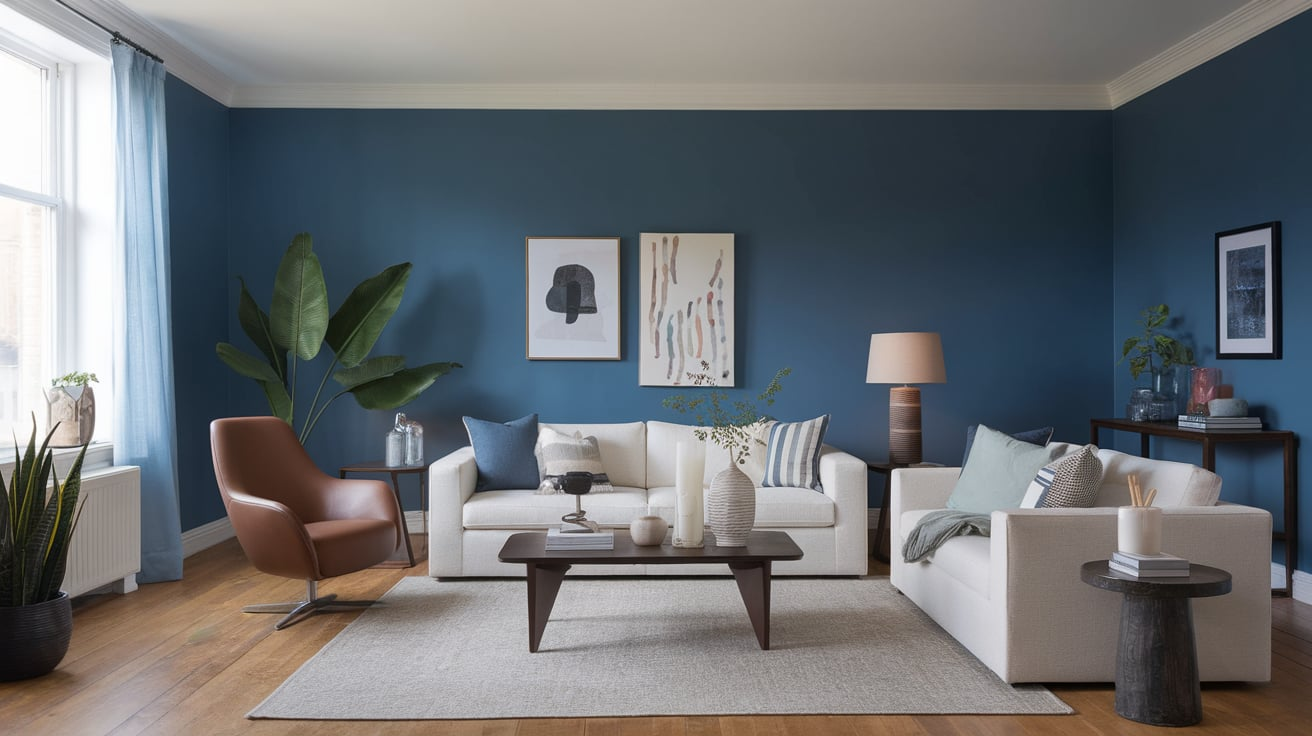
3. Deep Navy Blue
Want drama without chaos? Navy’s your color. It adds depth, sophistication, and instantly makes your space feel more curated. Add brass accents, and you’ll feel like you’re living in a chic hotel lounge. Ever wanted your home to scream “grown-up” without being boring? This is it.
4. Muted Lavender
Lavender doesn’t just belong in grandma’s perfume bottle. A muted, dusty lavender creates a peaceful and dreamy vibe. Pair it with cream or light gray furniture, and suddenly your living room feels like a sanctuary.
5. Creamy Off-White
Yes, white can be an accent wall—if you pick the right shade. Off-white with warm undertones creates a soft backdrop that highlights artwork, plants, or even your favorite gallery wall. It’s not boring; it’s intentional minimalism.
6. Charcoal Gray
If black feels too harsh, charcoal gray strikes the perfect balance. It’s bold without being overpowering, and it makes lighter furniture pop. IMO, this is one of the most versatile accent colors—you can go modern, industrial, or cozy cottage with it.
7. Dusty Rose
Before you roll your eyes at “pink,” hear me out. A dusty rose accent wall doesn’t scream Barbie Dreamhouse—it whispers elegance. Pair it with gold accents and plush fabrics, and suddenly it’s chic and calming.
8. Olive Green
Olive is warm, earthy, and timeless. It brings a cozy yet elevated feel to your living room. I’ve used it in my own home, and trust me—it makes wooden furniture look way richer.
9. Soft Taupe
Not a fan of loud colors? Soft taupe is a warm neutral that adds just enough depth without overwhelming the space. Plus, it looks good in literally every season.
10. Rich Burgundy
Feeling bold? Burgundy is deep, luxurious, and perfect for creating a moody oasis. Add some velvet throw pillows and a glass of red wine, and you’re basically living in a magazine spread.
11. Coastal Blue
Think light, airy, and beachy without going full nautical. Coastal blue works wonders if you want your living room to feel refreshing and open. Pair it with whites and sandy neutrals for that breezy coastal vibe.
12. Mustard Yellow
Okay, I know what you’re thinking: “Yellow? Really?” But hear me out. Mustard yellow is warm, retro, and surprisingly calming when paired with muted tones. It’s like instant sunshine without being blinding. 🙂
13. Soft Peach
Peach adds warmth and lightness while still feeling subtle. It’s especially great if your living room doesn’t get tons of natural light—it brightens the whole space.
14. Teal Blue
Teal is bold, but not in-your-face. It brings energy and calmness at the same time. Ever notice how jewel tones just make everything look richer? That’s teal for you.
15. Light Gray
Light gray is the perfect compromise between white and color. It feels fresh, modern, and creates a peaceful backdrop for literally anything—plants, art, or even bold furniture pieces.
16. Forest Green
Want drama that still feels natural? Forest green is deep, moody, and instantly creates a cozy cocoon effect. Throw in a leather sofa and warm wood, and you’re golden.
17. Blush Pink
Blush is soft, sophisticated, and surprisingly versatile. It works with modern, boho, or classic styles. And no, it won’t make your living room look like a teenager’s bedroom—it’s chic when done right.
18. Burnt Orange
This shade feels warm, bold, and a little retro. Burnt orange pairs beautifully with neutral furniture and wood tones, giving your living room a cozy, autumnal vibe year-round.
19. Soft Beige
Beige gets a bad rap, but hear me out—it’s all about choosing the right undertone. A warm, sandy beige makes a space feel welcoming and calm, especially if you’re into minimalist design.
20. Cobalt Blue
Want something striking? Cobalt blue is bold, vibrant, and makes your living room pop. Just balance it with neutral décor, and you’ll avoid the “this is too much” vibe.
21. Mocha Brown
Mocha brown is warm, rich, and grounding. It works especially well in large living rooms that need a cozy touch. Bonus: it hides scuffs and fingerprints, which IMO is a lifesaver if you have kids.
22. Classic White
Yes, white again—but the crisp, pure kind this time. A bright white accent wall can actually highlight architectural details or create a gallery-style vibe for your favorite artwork. Sometimes, simple really is best.
Quick Tips for Picking Your Perfect Accent Wall Color
Choosing your accent wall shade isn’t just about what looks good on Pinterest. Here are a few things to keep in mind:
- Consider natural light. Dark shades look best in well-lit rooms, while lighter tones brighten up dim spaces.
- Match the vibe. Want cozy? Go warm. Want fresh? Go cool. Want drama? Go bold.
- Test samples first. Paint swatches look completely different in-store than they do on your wall.
- Think long-term. Pick a color you’ll love for years, not just one season.
Final Thoughts
There you have it—22 accent wall colors that can completely transform your living room into a peaceful oasis. From earthy greens to moody blues and warm neutrals, there’s a shade here for every vibe and every personality.
So, what’s stopping you? Grab that paintbrush, put on your old T-shirt, and give your living room the glow-up it deserves. Worst case, you hate the color, and hey—paint is the cheapest mistake you’ll ever fix. Best case? You’ll never want to leave your living room again.


Leave a Reply