
Ever looked at a wall and thought, “Wow, this is… boring”? Yeah, me too. Sometimes a solid paint color just doesn’t cut it. That’s where two-tone paint ideas come in.
It’s the perfect way to give your space some personality without going full-on mural mode. The best part? You don’t need to be a professional painter to pull it off.
A little creativity, some painter’s tape, and maybe a podcast to keep you company—and you’re golden.
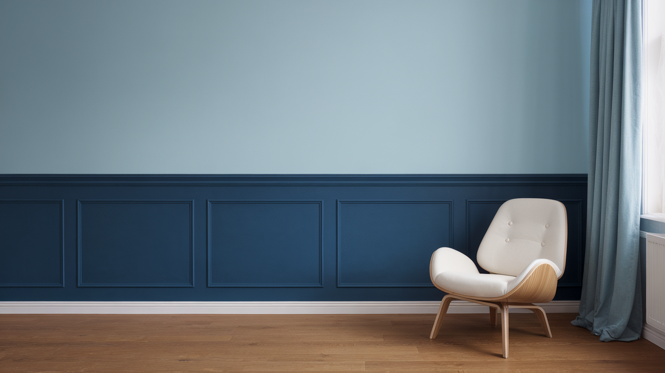
1. Classic Half-and-Half Walls
This one’s the OG of two-tone painting. You paint the bottom half of your wall a darker shade and keep the top light.
Why it works:
- Makes rooms look taller
- Hides scuff marks on the bottom half
- Easy to DIY without fancy tools
Pro tip: I once did this in my hallway using navy blue on the bottom and crisp white on top. Not to brag, but it looked like a magazine spread.
2. Bold Ceiling Contrast
Who said ceilings must stay white? Paint your ceiling one shade and your walls another.
Example: White walls with a deep emerald ceiling. Sounds weird until you see it—then you’ll want to do it in every room.
3. Vertical Split Walls
Instead of the usual horizontal division, try splitting the wall vertically. One side dark, one side light.
It works great in bedrooms where you want a little drama behind the bed without committing to wallpaper.
4. Neutral Meets Bold
Pairing a bold color with a soft neutral instantly balances the space. Think charcoal gray with blush pink.
It’s like wearing jeans with a bright top—effortless and cool.
5. Dark Trim, Light Walls
Paint the trim a bold shade instead of leaving it white. Imagine white walls with black trim—it’s chic, edgy, and way less predictable.
6. Two-Tone Doors
Doors get ignored, but they don’t have to. Paint the outside one color and the inside another. Every time you open it, it’s like a surprise party for your eyes.
7. Ombre Fade
Okay, this one’s for the adventurous painter. Blend two shades so they fade into each other. It works beautifully in nurseries or creative studios.
Is it harder than a straight split? Yes. Worth it? Absolutely.
8. Navy and White Classic
This combo never fails. Navy adds depth, white keeps it fresh. It works in bedrooms, dining rooms, and even tiny bathrooms.
9. Pastels with Gray
Pastels can look too sugary on their own, but pair them with gray and you’ve got a grown-up vibe. Mint green + gray? Chef’s kiss.
10. Earthy Greens and Beige
Want a cozy, nature-inspired space? Go with olive green on the bottom and beige or cream on top. It feels grounded but still fresh.
11. Black and White Drama
High contrast lovers, this one’s for you. Black and white never go out of style. Just keep the black on the lower half so the room doesn’t feel like a cave.
12. Terracotta and White
Terracotta has a warm, earthy vibe. Paired with white, it feels like a Mediterranean vacation spot—minus the plane ticket.
13. Color-Blocked Corners
Instead of doing a whole wall, paint just a section in a contrasting color. It creates an accent spot for furniture like a reading nook.
14. Warm and Cool Combo
Pair a warm tone (like mustard yellow) with a cool tone (like teal). The contrast makes everything pop.
Yes, it’s bold, but sometimes bold is the point.
15. Gray and Yellow Cheer
Yellow brings energy, gray keeps it grounded. I used this combo in my kitchen, and suddenly my mornings feel less grumpy. Coincidence? I think not.
16. Color on the Bottom, Wallpaper on Top
Mix two-tone paint with wallpaper. Paint the lower section in a solid shade and let patterned wallpaper shine up top.
Perfect for dining rooms where you want a little flair without overwhelming the whole wall.
17. Cozy Browns with Cream
Brown gets a bad rap, but when you pair it with cream, it feels like coffee with whipped cream. Warm, cozy, and inviting.
18. Kids’ Room Fun
Use two bright colors (like sky blue and sunshine yellow) to make a playful space. Bonus: You’ll never notice crayon marks on the wall again.
19. Rustic Reds and Neutrals
Deep red on the bottom with beige or taupe on top creates a rustic vibe. Works beautifully in dining rooms where you want a warm, inviting feel.
20. Accent Two-Tone Wall
Not ready to commit to all four walls? Just pick one and give it the two-tone treatment. Behind a couch or bed, it creates a focal point without too much work.
Tips for Pulling Off Two-Tone Walls
Before you start taping up your walls, here are some quick tips to keep things looking polished:
- Use painter’s tape for crisp lines. Don’t freehand unless you enjoy regret.
- Test your colors with sample swatches first. Paint looks different in natural vs. artificial light.
- Decide your dividing line carefully—higher lines make the room look taller, lower ones add coziness.
- Keep furniture in mind. That bold bottom color shouldn’t clash with your couch.
Why Two-Tone Works So Well
You might wonder: why not just stick with one color? Fair question. Here’s why two-tone paint works wonders:
- Adds dimension without the hassle of wallpaper.
- Highlights architecture like wainscoting, crown molding, or alcoves.
- Lets you experiment with bold shades without overwhelming the whole room.
- Budget-friendly makeover. Paint is cheaper than new furniture, IMO.
My Favorite Combo (and Why I’ll Defend It Forever)
If I had to pick one combo to use forever, it’d be navy and white. It’s classic, it’s crisp, and it never goes out of style. I once painted my bathroom with navy on the bottom half and white on top—instantly felt like a high-end spa. And trust me, that bathroom was NOT fancy before.
FAQs About Two-Tone Paint Ideas
1. Do two-tone walls make a room look bigger?
Yes! A darker color on the bottom with a lighter top makes the ceiling feel higher and the room more spacious.
2. What’s the easiest two-tone style for beginners?
The classic half-and-half wall. Straight line, two colors, done.
3. Can I do two bold colors together?
Absolutely, but keep balance in mind. Think teal + mustard, not neon pink + lime green (unless you’re designing a candy shop).
4. Do I need special tools?
Nope. Just painter’s tape, rollers, and brushes. Maybe a level if you want perfectly straight lines.
5. Should the darker shade always go on the bottom?
Not always, but usually. Darker shades on the bottom keep the room grounded and less top-heavy.
6. Can I mix two finishes (like matte and gloss)?
Yes! That’s actually a cool trick to add subtle contrast without using totally different colors.
7. How do I pick the right color combo?
Start with one shade you love, then look at the color wheel for complementary or contrasting tones. Or just steal one of the 20 ideas above.
8. What rooms work best for two-tone walls?
Any! Living rooms, bedrooms, kitchens, even bathrooms. Honestly, the smaller the room, the bigger the impact.
9. Is it trendy or timeless?
Both. Trends come and go, but two-tone walls have been around forever. Choose classic combos (like navy and white) if you want longevity.
10. Can renters try this without losing their deposit?
Check with your landlord first. If not, you can always fake the look with peel-and-stick paint panels or removable wallpaper.
Final Thoughts
Two-tone paint ideas aren’t just about slapping two colors on a wall—they’re about creating personality, depth, and style in your space. Whether you go bold with black and white, soft with pastels and gray, or earthy with greens and beiges, you’ll transform your room with minimal effort.
And honestly, paint is the easiest (and cheapest) way to make a dramatic change. So grab that roller, pick your two favorite shades, and go for it. Worst case? You repaint. Best case? Your friends walk in and say, “Wow, this looks amazing—did you hire a designer?” And you can just smile and say, “Nope, just me and a can of paint.” 🙂


Leave a Reply