
So you want a living room that actually feels alive, not another beige-on-beige situation you silently regret every time you walk past it? I get you.
Triadic color schemes bring life, balance, and that perfect mix of contrast without chaos.
And trust me, once you try triadic colors in your living room, you won’t want to go back to the land of “neutral everything.”
I’ve played with triadic color palettes more times than I care to admit, and every time, the results turn heads.
Ever wondered why a space instantly feels more intentional when the colors don’t look like they were picked at random? That’s the magic of triads.
Let’s talk about 22 triadic color living room ideas that actually work—no fluff, no design BS, just ideas you can use today. Ready?
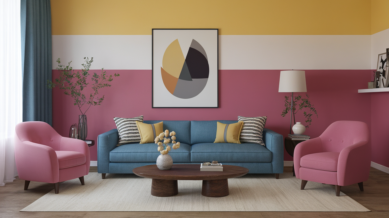
1. Classic Red, Blue, and Yellow That Actually Looks Chic
I know what you’re thinking: kindergarten classroom vibes. But hear me out.
I love pairing a muted navy sofa with mustard throw pillows and small red accents. It looks grown-up, not cartoonish. Ever tried mixing primaries in softer tones? It changes everything.
2. Teal, Coral, and Mustard for a Warm-Cool Balance
This combo gives your space a vibrant yet cozy feel.
I once used this palette in an apartment with zero natural light, and it instantly livened things up—no sun required, thankfully.
3. Forest Green, Burnt Orange, and Plum
This one feels rich and dramatic.
If you love moody spaces, this palette hits the sweet spot. Your guests will think you hired an interior designer (you didn’t, obviously).
4. Navy, Rust, and Olive
If you’re scared of bold colors, start here.
These deeper tones stay grounded while still forming a triadic harmony. It works especially well with leather furniture.
5. Lavender, Mint, and Peach
Want a soft, dreamy vibe? Go for these pastels.
I tested this combo in a small room and the space felt bigger, not smaller. Why? Pastels reflect more light.
6. Magenta, Emerald, and Gold
This combo screams confidence.
Ever wanted a living room that feels like a boutique hotel lobby? This is your sign.
7. Turquoise, Tangerine, and Brown
You get vibrance without losing earthy grounding.
Pro tip: Use brown as your base and layer turquoise and tangerine as accents so the look stays balanced.
8. Charcoal, Mustard, and Deep Teal
This palette works beautifully in modern spaces.
I once used this in a loft with exposed brick, and the colors looked like they were made for each other.
9. Cobalt, Tomato Red, and Soft Yellow
Bold, bright, and lively.
Want a living room your guests can’t ignore? This is the palette.
10. Sage, Terracotta, and Denim Blue
This one feels earthy but polished.
The cool blue keeps the warm terracotta from overwhelming the room.
11. Fuchsia, Lime, and Sky Blue
Yes, it sounds wild. But when you tone each shade down a notch, it becomes a fun and youthful combo.
Perfect for creative personalities or anyone tired of “safe” décor choices.
12. Black, Cyan, and Marigold
You probably haven’t tried this, but you should.
Black anchors the palette, cyan adds freshness, and marigold brings warmth. Bold and clean—my favorite combo.
13. Olive, Burgundy, and Mustard
This one feels warm and autumnal.
Ever needed a palette that makes your sofa look more expensive? Burgundy does the job.
14. Dusty Pink, Moss Green, and Slate Blue
Soft but sophisticated.
IMO, this palette works best with Scandinavian or minimalist furniture.
15. Orange, Purple, and Green
This is the official triadic color combo for the color wheel purists.
Use muted versions to avoid a Halloween-gone-wrong moment.
16. Seafoam, Tangerine, and Violet
This pairing looks playful without feeling childish.
It’s perfect for small living rooms because the contrast draws the eye upward.
17. Indigo, Mustard, and Burgundy
Rich, mature, and dramatic.
Whenever I see these three together, I instantly feel like I should sip wine and pretend to read something intellectual.
18. Emerald, Coral, and Navy
This palette feels refreshing yet grounded.
Coral adds just the right amount of brightness without going into neon territory.
19. Mint, Sunshine Yellow, and Powder Blue
Soft, cheerful, and breathable.
If you want your living room to feel like a crisp spring morning, this is your trio.
20. Terracotta, Teal, and Soft Purple
Unexpected yet beautiful.
This combo works especially well with natural materials like jute, wood, and linen.
21. Maroon, Olive, and Burnt Yellow
Warm, vintage-inspired, and incredibly cozy.
I love how this palette makes a room feel collected over time.
22. Slate, Mustard, and Brick Red
Masculine but inviting.
These shades look amazing with industrial furniture and metal accents.
How to Make Triadic Colors Actually Work (Without Losing Your Mind)
You’ve seen the ideas, but how do you stop triadic palettes from looking chaotic? Good question, because I’ve definitely messed this up a few times—learn from my mistakes.
Keep One Color Dominant
Use one shade for 70% of the room, the second for 20%, and the third for 10%.
Trust me, this keeps things balanced. Ever walked into a room where everything screams at you at once? Yeah… don’t do that.
Use Muted Versions of Bold Colors
You don’t need neon lime and electric violet to make a statement.
Muted tones give you sophistication without sacrificing vibrance.
Repeat Colors at Least 3 Times
The eye loves patterns.
Throw pillows, art, and accessories help repeat the palette so it feels intentional.
Keep Neutrals in Play
You don’t need to abandon neutrals completely.
Crisp white, soft gray, and warm beige can help tie everything together.
Quick Accessories to Pull Your Palette Together
Sometimes the easiest change makes the biggest difference. Here are some ideas:
- Throw pillows
- Accent chairs
- Vases and ceramics
- Wall art
- Area rugs
- Curtains
FYI, rugs are the MVP in tying a triadic palette together. They quietly do all the work.
My Personal Favorite Triadic Combo (Because You Asked… or Not)
Okay, you didn’t ask, but I’ll tell you anyway.
My absolute favorite triadic palette is navy, mustard, and terracotta. It looks warm, rich, modern, and welcoming. Whenever I use it, the room instantly feels more grown-up but still fun. And yes, I’m slightly obsessed.
If you’re on the fence about triadic colors, start with that combo and thank me later 🙂
Final Thoughts: Ready to Try a Triadic Living Room?
Triadic color schemes look bold, intentional, and beautifully balanced when you use them right. They push you out of your comfort zone just enough without sending you into design panic. Ever wanted a living room that feels more “you”? Triads can do that.
Pick a dominant shade, layer the other two thoughtfully, and let the colors do the heavy lifting. And hey, if your living room starts turning heads, you can totally say you figured it out yourself. I won’t snitch :/
Enjoy designing—and don’t be afraid to play with color. Your living room will thank you.


Leave a Reply