
Ever looked at a color wheel and thought, “Okay, this looks cool… but how on earth am I supposed to use this in my bedroom?” Yeah, been there.
Triadic color schemes sound fancy, but in simple terms, they’re just colors evenly spaced around the color wheel — think red-yellow-blue or purple-green-orange.
When done right, they create balanced, lively spaces that feel energetic without going full circus tent.
If you’ve been bored of monochrome bedrooms or tired of “safe” beige, this is your sign to go bold.
I’ve rounded up 25 triadic color bedroom ideas that’ll make your space feel fun, fresh, and surprisingly cohesive. Grab a coffee (or something stronger), and let’s get into it.
1. Classic Red, Yellow, and Blue — But Make It Grown-Up
Sure, this combo screams “primary school,” but with the right shades, it’s pure sophistication. Go for navy blue walls, mustard bedding, and rust-red accents. Add a neutral rug to calm things down, and you’ve got a space that’s colorful without being chaotic.
Pro tip: Keep the tones muted — bright primary colors can look too intense in a bedroom unless you’re five years old.
2. Coral, Teal, and Mustard
This trio is bold but surprisingly cozy. Teal gives depth, mustard adds warmth, and coral brings that fun pop of personality. Think teal headboard, coral throw pillows, and mustard curtains — total mood.
Why it works: The colors balance each other beautifully while keeping things cheerful.
3. Olive Green, Burnt Orange, and Navy
If you want something earthy yet colorful, this combo hits just right. Olive keeps it grounded, burnt orange adds comfort, and navy gives structure.
Add linen textures and wood furniture for that effortlessly chic vibe — perfect for anyone who loves color but still wants calm energy.
4. Lavender, Mint, and Peach
Now this one’s soft and dreamy. Perfect for a boho or feminine space. Lavender walls, a mint comforter, and peachy decor create a peaceful retreat.
Ever wonder why this combo feels so relaxing? It’s because all three are low-saturation colors, so they don’t compete for attention.
5. Burgundy, Forest Green, and Gold
Rich, dramatic, and a little moody — like your favorite Netflix antihero. Burgundy brings passion, forest green adds depth, and gold finishes the look with a touch of luxury.
Use this combo in a velvet-heavy setting for ultimate sophistication.
6. Aqua, Coral, and Sunshine Yellow
Think beachy vacation vibes — without the sand in your sheets. Aqua walls with coral pillows and yellow lamps make the space feel fun, tropical, and full of personality.
Add some white accents to keep it from getting overwhelming.
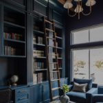
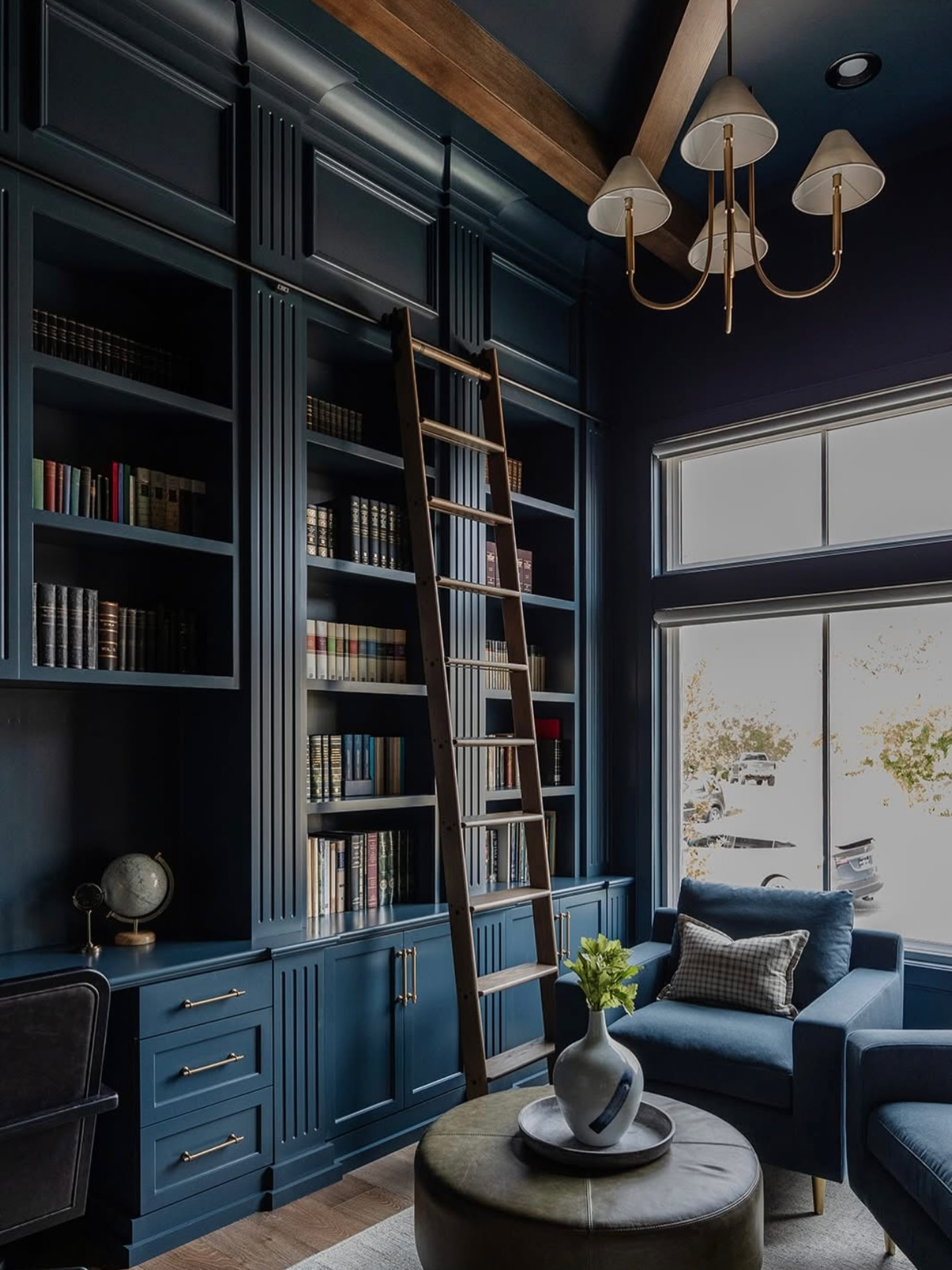
7. Navy, Mustard, and Rust
For a cozy fall-inspired palette, you can’t go wrong here. Navy walls make everything feel grounded, mustard adds warmth, and rust brings character.
It’s like wrapping your bedroom in your favorite flannel shirt — warm, comfy, and effortlessly cool.
8. Mint, Coral, and Navy
Light and playful with a bit of structure. The mint gives freshness, coral keeps it vibrant, and navy ties it all together.
FYI: This combo is perfect for smaller bedrooms — the lighter shades make your space feel larger, while navy adds just enough contrast.
9. Terracotta, Sage, and Slate Blue
This one feels organic but still colorful. Terracotta brings that earthy warmth, sage softens it, and slate blue adds cool contrast.
It’s like walking into a Mediterranean Airbnb that you never want to leave.
10. Mauve, Olive, and Amber
This unexpected mix looks incredible with rattan furniture or brass lighting. Mauve keeps it romantic, olive gives balance, and amber adds warmth.
Want to elevate it further? Add texture-heavy fabrics like velvet or linen for extra depth.
11. Plum, Olive, and Mustard
This one’s a little artsy, a little vintage. Plum sets a dramatic base, olive cools it down, and mustard livens it up.
Ever walk into a room that just feels creative? This color combo does exactly that.
12. Navy, Coral, and Cream
Here’s one for the minimalists who still crave a little color. Coral keeps things fun, navy grounds it, and cream keeps it from feeling too bold.
Add a textured white duvet and coral art prints for that perfect balance.
13. Emerald, Ruby, and Sapphire
Basically, your bedroom as a jewelry box — in the best way possible. This one’s luxe, rich, and absolutely stunning when paired with gold accents.
Just don’t go overboard — pick one dominant shade and let the others play supporting roles.
14. Mustard, Teal, and Blush Pink
This mix is vibrant but surprisingly soft. Blush keeps things gentle, mustard adds contrast, and teal makes it pop.
I used this combo in a guest room once, and everyone thought I’d hired a designer. (Spoiler: I hadn’t.)
15. Rust, Navy, and Sage
The perfect “grown-up color” combo. Rust brings warmth, sage softens, and navy grounds everything.
Throw in a woven rug and textured throws to make it feel layered and inviting.
16. Aqua, Tangerine, and Lilac
Unexpected? Definitely. Gorgeous? Also yes. This combo feels like a spring day bottled up — energetic but not loud.
Use aqua as your base, tangerine for small pops, and lilac to tie it together.
17. Taupe, Olive, and Coral
Neutral lovers, this one’s for you. Taupe keeps it subtle, olive adds depth, and coral gives just enough excitement.
It’s basically the “I want color, but not too much” color palette.
18. Periwinkle, Chartreuse, and Terracotta
Periwinkle (a fancy word for blue-purple) feels whimsical, chartreuse is bold, and terracotta grounds it all. Together, they’re surprisingly harmonious.
Just don’t overuse chartreuse — a little goes a long way, trust me.
19. Charcoal, Mustard, and Teal
If you like moody vibes but still want color, this is a solid pick. Charcoal walls look sleek, mustard brightens things up, and teal adds energy.
Add brass light fixtures for an elegant finish.
20. Blush, Olive, and Navy
Soft yet structured — that’s the vibe here. The blush makes it romantic, olive gives earthiness, and navy keeps it balanced.
Perfect for couples who can’t agree on “light vs dark.” (You’re welcome.)
21. Burnt Sienna, Moss Green, and Denim Blue
Rustic and cozy with a touch of denim charm. This combo feels lived-in, comfortable, and timeless.
Add leather furniture or woven accents for an organic touch.
22. Mint, Mustard, and Coral
This one’s bright and full of energy — great for a cheerful guest room. Mint keeps things fresh, mustard warms it up, and coral adds life.
Pair it with white or light wood furniture for a breezy feel.
23. Lilac, Sky Blue, and Lemon
Soft, pastel, and cheerful. Perfect for a youthful or airy bedroom. Lilac and sky blue blend beautifully, and lemon adds a sunny contrast.
IMO, this combo works best in rooms with lots of natural light.
24. Sage, Terracotta, and Navy
An all-around winner for earthy color fans. Sage is calm, terracotta adds coziness, and navy makes it feel modern.
Add textured neutrals and ceramic accents for a designer-worthy finish.
25. Indigo, Marigold, and Moss Green
Bold, confident, and a little daring — just like the person who chooses it. Indigo feels dramatic, marigold adds joy, and moss grounds the palette.
If you’re feeling adventurous, paint your ceiling indigo and keep the walls light. You’ll thank me later.
Quick Tips for Using Triadic Colors in Bedrooms
If your head’s spinning from all these color combos (been there), here are a few quick tips:
- Stick to one dominant color. Use the others for accents — pillows, rugs, or wall art.
- Keep balance in mind. Too much of each color can make your space feel loud.
- Use textures and neutrals to soften bold tones.
- Lighting matters. Natural light changes how colors look — always test swatches first.
And if you’re wondering, “Can I mix in metallics?” Absolutely. Gold warms things up; silver adds cool sophistication. Just don’t mix all three — this isn’t a disco ball situation.
Final Thoughts
So there you have it — 25 triadic color bedroom ideas that prove you can play with color and still have a stylish, relaxing space. The trick isn’t about cramming in every shade possible; it’s about balance, tone, and personality.
At the end of the day, your bedroom should feel like you. Whether you lean toward moody jewel tones or soft pastels, don’t be afraid to experiment. Worst case? You repaint. Best case? You end up with a space that makes you smile every morning.


Leave a Reply