
If you’ve ever walked into a soft pastel living room and thought, “Wow, why does this feel like a warm hug?”—you’re not alone.
I fell into the pastel trap years ago, and honestly, I never crawled out. The colors just work.
They relax your brain, brighten your space, and make guests think you actually know what you’re doing with décor. Ever wondered why pastels look good in literally any lighting?
Let’s break it all down and get into 26 soft pastel color living room ideas that will totally change your space—IMO
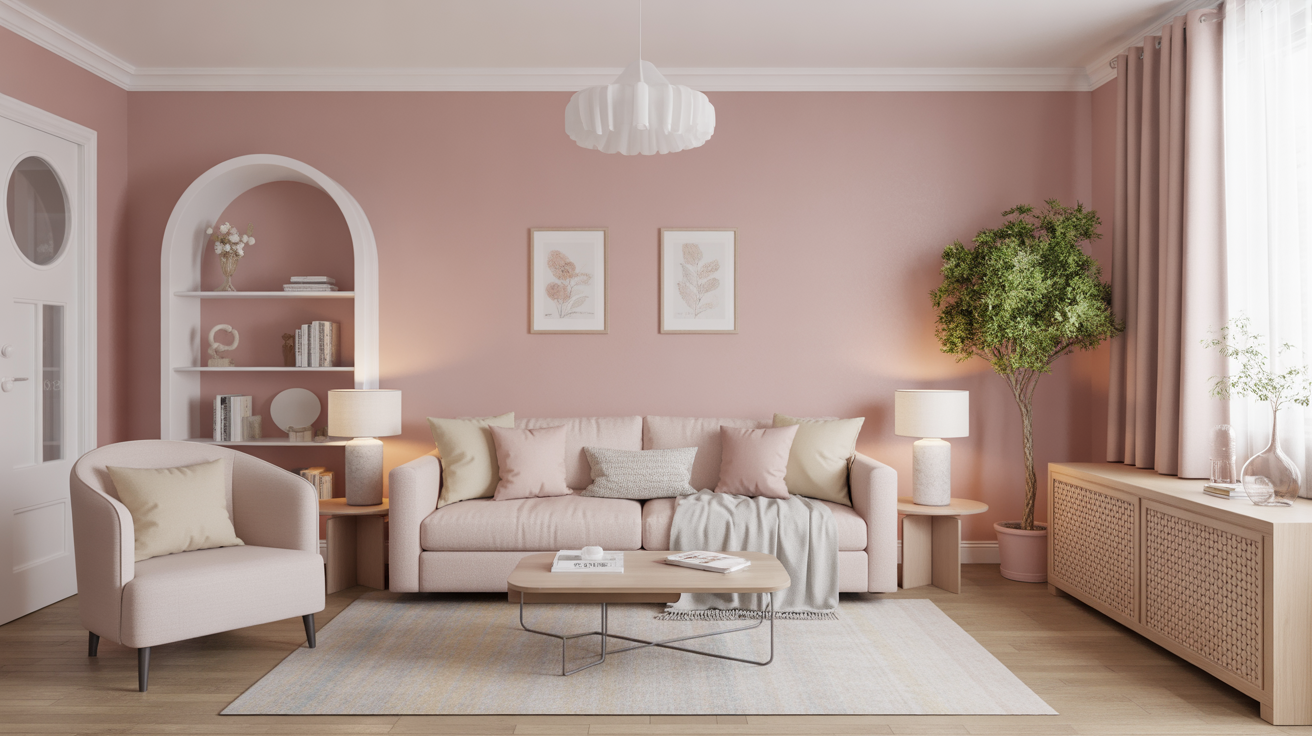
1. Soft Blush Walls for an Effortlessly Warm Glow
Soft blush brings instant warmth without screaming “I love pink.”
I used this in a rental once, and my landlord asked for the paint code—so yes, it’s that good.
Why it works:
- It softens harsh architectural lines.
- It pairs beautifully with gray, beige, or creamy neutrals.
- It creates a cozy vibe without looking sugary.
Pro tip: Add gold accents if you want a barely-there glam moment.
2. Powder Blue Accents That Calm the Entire Room
Powder blue never fails. Ever noticed how it instantly creates that airy, fresh feeling?
I swear this color can lower your stress levels faster than meditating.
Try adding it through:
- Throw pillows
- Vases
- Light wood frames
Keep the rest of your palette neutral to let the blue shine.
3. Sage Green Everything (Yes, Everything)
Sage green might be the unofficial color of “my house is peaceful now.”
I love how it brings nature indoors without acting like it’s trying too hard.
Why sage always wins:
- It balances warm and cool tones.
- It works with boho, modern, traditional—literally all styles.
- It feels earthy and soothing.
Ask yourself: have you ever seen an ugly sage living room? Exactly.
4. Warm Peach for a Soft, Sunny Atmosphere
A peach-toned wall or sofa brightens any space.
It gives you warmth without going full orange, which can look… a bit Halloween-y, you know?
Use peach when you want:
- Soft sunlight vibes even on gloomy days
- A warm undertone that doesn’t clash with natural wood
- A cheerful but mature look
5. Lavender Accents for a Hint of Dreaminess
Lavender feels whimsical without giving Disney-princess energy.
I once added a lavender rug to a client’s living room, and suddenly she started hosting tea parties. Coincidence?
Pair lavender with:
- White
- Silver
- Soft oak
The combo feels clean and chic.
6. Muted Mint for Crisp Freshness
Mint keeps a room looking fresh, but muted mint? Even better.
It gives your living room that subtle “just cleaned” feeling—even when you didn’t. FYI, lifesaver.
Try muted mint on:
- Cabinets
- Accent chairs
- Curtains
7. Light Coral for an Understated Pop
Coral creates the cutest glow without overwhelming your space.
It works best when you want color that whispers, not shouts.
Coral looks great with:
- Rattan or cane furniture
- Warm white walls
- Soft gold décor pieces
8. Pastel Yellow to Spread Feel-Good Energy
Pastel yellow basically smiles at you.
Use it when your living room feels dull or cold.
Great uses:
- A yellow throw blanket
- Pale yellow drapes
- Soft yellow art prints
Ever wondered why yellow brightens moods? Because your brain thinks it’s sunlight.
9. Pastel Teal for Cool, Relaxed Sophistication
Pastel teal carries this quiet confidence I love.
It’s soft, but also refined—kind of like that friend who always looks put-together without trying.
Use pastel teal on:
- Cabinets
- Accent walls
- Small décor pieces
10. Cloud Gray for a Soft, Muted Base
Yes, gray counts as pastel when it’s warm and milky.
It creates the ideal foundation for layering all your soft pastel accents.
Benefits of cloud gray:
- It makes the room feel bigger
- It never clashes with other colors
- It allows other pastels to pop
11. Baby Blue + White: The Cleanest Combo Ever
This duo always looks fresh and breezy.
Sometimes simplicity just works, right?
Best places to use the combo:
- Curtains
- Sofa cushions
- Area rugs
12. Soft Mauve for a Romantic Touch
Mauve gives you that charming in-between of purple and pink.
I love it for rooms that need instant warmth and depth.
Use it in:
- Velvet textiles
- Throws
- Curtains
13. Pistachio Green for a Playful Vibe
Pistachio looks quirky but in the chic, Pinterest-y way.
Try it if sage feels too serious for your taste.
Pistachio pairs with:
- White oak
- Cream
- Light rust
14. Barely-There Pink for a Soft, Neutral Base
This shade barely registers as pink—and that’s the point.
It just makes the room look happier without revealing its secret identity.
Use it on:
- Walls
- Rugs
- Large furniture pieces
15. Soft Pastel Rainbows (But Make Them Classy)
I’m not saying paint your living room like a nursery.
You can layer multiple pastels and still look grown-up.
Try combinations like:
- Sage + peach + lavender
- Mint + blush + powder blue
- Mauve + cream + soft yellow
Keep your lines clean, and your space will look curated, not chaotic.
16. Pastel Artwork for Visual Interest
If you feel scared to commit to pastel paint, start with art.
I love oversized pastel abstracts—they make any space feel elevated.
Great art options include:
- Watercolor prints
- Geometric pastel designs
- Minimalist line art with soft backgrounds
17. Pastel Patterned Rugs for Layered Warmth
A rug can change everything.
A pastel rug? Even better.
Look for:
- Soft geometric patterns
- Faded medallion designs
- Chunky woven textures
It grounds your space while tying your color palette together.
18. Pastel Throw Blankets & Pillows for Easy Styling
If you’re decorating on a budget, start here.
Throw pillows basically do 90% of the visual work—no joke.
Use mixes of:
- Blush
- Mint
- Mauve
- Soft yellow
Pile them on your sofa for instant dimension.
19. Light Wood Furniture to Enhance Pastels
Light wood works like a diffuser for pastel colors.
It softens everything while adding warmth.
Great pieces include:
- Oak side tables
- Pine consoles
- Birch shelving units
20. Pastel Curtains for Soft Window Framing
The right pastel curtains bring a gentle glow to your living room.
I love sheer pastel panels—they add color without blocking light.
21. Pastel Ottomans or Accent Chairs to Add Personality
A pastel accent chair might be the easiest way to upgrade your space.
It looks intentional without dominating the entire room.
Best shades for chairs:
- Powder blue
- Sage
- Blush
- Lavender
22. Pastel Books & Decorative Objects for Styled Shelves
Shelf styling becomes easier when you add soft pastel accessories.
I use pastel ceramic vases and books because they look tidy, not cluttered.
23. Pastel Lighting Fixtures for a Subtle Glow
Pastel lamp bases or shades add color without shouting.
A pastel glass lamp can soften your whole room at night.
24. Pastel Accent Walls for a Focal Point
Not ready to commit to a full pastel room?
An accent wall gives you color and balance without the overwhelm.
Top colors:
- Peach
- Powder blue
- Mint
- Lavender
25. Layering Textures in Pastel Shades
Texture keeps pastels from looking flat.
I mix materials constantly because it makes the room feel intentional.
Try mixing:
- Velvet
- Linen
- Woven cotton
- Soft boucle
26. Add Metallics to Balance the Softness
Pastels + metallics = perfection.
Gold warms things up, while silver keeps things crisp.
Use metallics through:
- Picture frames
- Mirrors
- Table legs
- Lamps
Ever wondered why metallics and pastels pair well? Because opposites attract—cheesy but true :/
Conclusion
Soft pastel living rooms never go out of style because they create calm, warmth, and personality without demanding attention. You can go bold with a pastel feature wall or stay subtle with pillows, rugs, or art. The trick lies in choosing shades that complement your space and layering textures, materials, and tones to keep everything balanced.
If you’re ready to refresh your living room, start with one pastel piece and build from there. Trust me—you’ll end up creating a space that feels soothing, stylish, and totally “you.” And who doesn’t want a living room that feels like a breath of fresh air?


Leave a Reply