
So you want a living room that feels soft, stylish, and downright gorgeous—but you don’t want anything stuffy or old-fashioned.
I get it. I’ve experimented with feminine color palettes more times than I’d like to admit, and IMO, nothing transforms a space faster than the right shade on the walls, furniture, or decor.
Ever wondered why some rooms instantly feel cozy and elegant while others look like they’re trying a little too hard? Let’s fix that 🙂
Below, I’ll walk you through 23 feminine color living room ideas that actually work in real homes, not just Pinterest-perfect setups.
I’ll share what I’ve tried, what I’ve seen flop, and what I seriously recommend if you want a living room that feels warm, welcoming, and beautifully feminine—without feeling sugary or cliché.
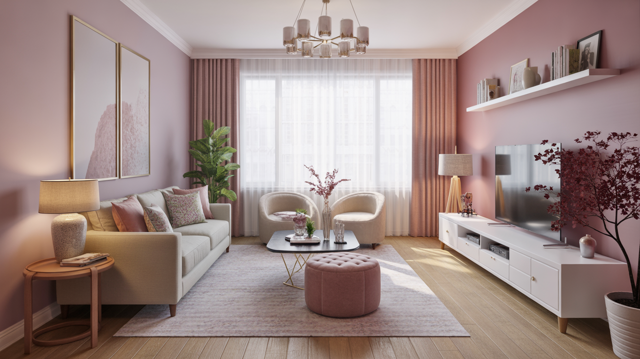
1. Soft Blush Walls for a Gentle, Dreamy Backdrop
I love how soft blush adds warmth without overwhelming your space. It creates that barely-there pink hue that flatters everything from modern decor to cozy cottage style.
Ever walked into a room and instantly felt calm? That’s the power of blush.
- Works with warm neutrals
- Softens bold furniture pieces
- Reflects natural light beautifully
Tip: Go for a matte finish for an elevated look.
2. Lavender Accents for a Breezy, Calming Feel
Lavender never fails me when I want something feminine but not overly “pink.” I’ve tossed lavender pillows onto a grey sofa, and the combo always looks effortlessly chic.
Try lavender in:
- Throw blankets
- Floral arrangements
- Area rugs
It adds charm without shouting for attention.
3. Peach Tones for a Fun, Youthful Vibe
If you want your living room to feel fresh, peach tones do the job. They glow in daylight and make everything feel uplifting.
I once painted an accent wall in a muted peach tone, and even my friends who “don’t do color” asked for the paint name.
Bold takeaway: Peach brightens your room instantly.
4. Mauve for a Sophisticated, Feminine Edge
Mauve sits in that perfect space between pink and purple. It gives your living room a mature, elegant feel.
Ever wondered why designers love it? It feels historic and modern at the same time.
Pair mauve with:
- Brass fixtures
- Velvet upholstery
- Cream walls
5. Rose Gold Accents for a Touch of Glam
I know rose gold had its “trendy era,” but honestly? It still looks amazing done right.
Use it sparingly:
- Picture frames
- Floor lamps
- Side tables
A little goes a long way.
6. Cream and Pink Combinations for Classic Feminine Charm
You can’t beat the combination of soft pink + creamy neutrals. It feels like a warm hug after a long day.
I’ve styled this combo more times than I can count because it works in:
- Scandinavian decor
- Farmhouse living rooms
- Minimalist spaces
FYI: Light woods tie the look together beautifully.
7. Powder Blue for a Feminine-but-Fresh Look
Powder blue isn’t just for nurseries. When paired with gold or brass, it becomes instantly chic.
I love using it in:
- Curtains
- Armchairs
- Area rugs
Ever thought blue could look feminine? Now you know.
8. Dusty Rose Furniture for a Soft, Luxe Appeal
A dusty rose sofa can change your entire living room. I once bought one impulsively (yes, I make questionable decisions sometimes), and it became the star of the room.
Why dusty rose works:
- It hides stains better than lighter pinks
- It matches neutrals easily
- It feels elevated
9. Warm Neutrals with Pink Undertones
Sometimes you want feminine without going pink everywhere. I’ve used warm neutrals like beige or taupe that subtly lean rosy.
This creates a:
- Cozy
- Soft
- Harmonious
environment without being bold.
10. Coral as a Statement Color
Coral adds energy and brightness without looking too intense. I like coral decor pieces when I want a playful vibe.
Try coral in:
- Artwork
- Throw pillows
- Accent chairs
You’ll feel the difference instantly.
11. Plum for a Bold, Feminine Drama
If you love drama (the stylish kind, not the life kind), plum works beautifully.
Pair plum with:
- Cream
- Charcoal
- Metallic accents
It turns your living room into a bold yet feminine sanctuary.
12. Pastel Green for a Soft Botanical Touch
I’ve always loved how pastel green brings nature inside. It feels fresh and feminine without relying on pinks.
Use pastel green for:
- Wall paint
- Lampshades
- Plant pots
Ever seen a pastel green sofa? Pure perfection.
13. Champagne Tones for a Glamorous Neutral
Champagne adds a soft shimmer that feels luxe but subtle. It works especially well with feminine color palettes.
Try:
- Champagne curtains
- Metallic cushions
- Soft beige paired with gold accents
14. Pale Yellow for a Cheerful, Feminine Glow
Pale yellow always surprises me with how soft and inviting it looks in a living room.
It works great when you want:
- Warmth
- Soft color
- Light reflection
Bold note: Avoid overly bright yellows unless you want your living room to scream at you.
15. Soft Terracotta for Earthy Femininity
Terracotta adds warmth and character. When you choose softer terracotta tones, they look beautifully feminine.
I once used terracotta throw pillows with blush tones, and the combo felt warm and grounded.
16. Warm Greige with Rose Accents
Greige (grey + beige) might sound boring, but when you pair it with rose-colored decor, the combo becomes incredibly soft and elegant.
Works well for:
- Minimalist homes
- Rental apartments
- Small living rooms
17. Pink-and-Gold Pairings for an Instant Glow-Up
Gold loves pink. Pink loves gold. End of story.
Try:
- Gold coffee table
- Pink velvet sofas
- Brass lighting
Whenever I use this pairing, the room instantly feels more refined.
18. Pastel Multi-Color Palette for Playful Femininity
Pastels play well together, and trust me, the result looks intentional—not childish.
Use a mix of:
- Pale pink
- Light blue
- Mint
- Soft peach
Important: Keep furniture neutral to avoid overwhelming the room.
19. Burgundy for Rich, Mature Feminine Vibes
Burgundy brings depth and warmth. It’s perfect when you want a feminine palette that feels grown-up.
Pair with:
- Cream
- Soft gold
- Dusty pink
Ever tried burgundy velvet furniture? It’s a moment.
20. Light Coral + White for a Clean Feminine Look
Light coral creates freshness, while crisp white keeps everything clean and airy.
Great for:
- Small living rooms
- Sun-filled spaces
- Beachy or coastal decor
This combo never fails me.
21. Pink Gradient Decor for Subtle Feminine Depth
Gradients look surprisingly sophisticated in the right setting.
Try:
- Ombre curtains
- Gradient rugs
- Tonal artwork
This adds dimension without overwhelming your palette.
22. Soft Metallics for a Feminine Shine
Metallics instantly elevate a room. I’m not talking mirror-ball sparkle—just soft, tasteful shine.
Use:
- Brushed gold
- Champagne
- Rose-tinted metals
They make any feminine palette feel more luxurious.
23. Millennial Pink (Still a Classic IMO)
I know people claim it’s “out,” but I don’t care—millennial pink still slaps when used well.
Try it in:
- Statement chairs
- Accent walls
- Decorative accessories
Use it sparingly, and it still feels fresh.
:/ (Okay, that was my last emoticon, I promise.)
Conclusion
Feminine color living rooms don’t need to feel overly sweet or predictable. When you use the right shades—whether blush, mauve, coral, or even plum—you create a space that reflects warmth, style, and personality.
Each idea above brings its own flavor, from soft pastel charm to bold feminine drama. At the end of the day, your living room should feel like you, and these colors help you express that beautifully.


Leave a Reply