
Let’s be real: picking paint colors for a rental property is way trickier than painting your own place.
You’re not trying to impress your quirky cousin with your bold teal bathroom; you’re trying to attract tenants who won’t run away the second they walk through the door.
I’ve painted my fair share of rentals, and trust me—some shades scream “cozy home” while others scream “this landlord has bad taste.”
So, let’s talk about the 22 best paint colors for rental property—the ones that keep your space looking modern, fresh, and appealing to pretty much anyone. Ready? Let’s get rolling (pun intended).
Why Paint Color Matters in Rentals
Before we get into the actual colors, let’s pause for a second. Ever walked into a place with neon green walls? Yeah, not exactly “dream home” vibes. Paint color sets the tone (literally) for the whole property. The right shade can:
- Make rooms look bigger and brighter
- Create a clean, neutral backdrop for furniture and décor
- Attract more tenants faster (because nobody wants to repaint before move-in)
- Stand the test of time (so you’re not repainting every year)
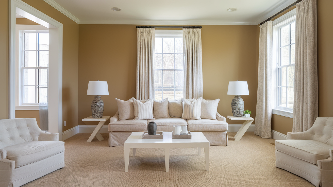
The magic formula? Stick with neutral, timeless, and versatile colors. Bold choices are fun for personal homes, but in rentals, they’re usually a headache.
22 Best Paint Colors for Rental Property
Alright, here we go. These shades are tried-and-true favorites for landlords, property managers, and yes—me, after learning the hard way.
1. Sherwin-Williams Repose Gray
If I had a dollar for every time I’ve used Repose Gray, I’d probably have enough to buy another gallon of paint. It’s the ultimate greige (gray + beige) and works in literally any room.
2. Benjamin Moore White Dove
A soft white that feels warm instead of sterile. Tenants love it because it makes a place look clean and airy.
3. Behr Silver Drop
This one’s subtle but modern. It’s a light gray with a hint of warmth—great if you want a fresh vibe without going too cold.
4. Sherwin-Williams Agreeable Gray
The name says it all—it agrees with everything. This neutral gray with beige undertones works with wood floors, white trim, or whatever random furniture your tenant brings in.
5. Benjamin Moore Simply White
Bright, crisp, and timeless. It’s especially good for smaller rentals because it reflects light and makes rooms look bigger.
6. Behr Swiss Coffee
This off-white shade is warm and welcoming. If you’ve got older rentals with less natural light, Swiss Coffee helps soften things up.
7. Sherwin-Williams Accessible Beige
Not your grandma’s beige. This one feels updated and blends well with pretty much any décor style.
8. Benjamin Moore Classic Gray
Light, subtle, and almost off-white but with just enough contrast to make trim pop. Perfect for hallways and bedrooms.
9. Behr Polar Bear
A bright white that’s clean without being blinding. Tenants with modern tastes love it.
10. Sherwin-Williams Alabaster
This one’s a cult favorite. It’s a creamy white that’s cozy but still fresh—great for making a rental feel homey.
11. Benjamin Moore Gray Owl
Slightly cool-toned, but not icy. If you’ve got a space with tons of natural light, this shade balances it out beautifully.
12. Behr Dolphin Fin
A medium gray that adds depth without feeling heavy. Works great in living rooms where you want a little character.
13. Sherwin-Williams City Loft
A pale greige with just enough warmth. It makes rentals look expensive without actually costing you more.
14. Benjamin Moore Balboa Mist
This one has a soft, warm undertone that avoids the dreaded “cold gray” look. Tenants with cozy furniture will love it.
15. Behr Toasty Gray
Don’t let the name fool you—it’s not dark. It’s a warm gray that feels modern and inviting.
16. Sherwin-Williams Mindful Gray
Darker than some neutrals, but still versatile. Use it for accent walls or to ground large open spaces.
17. Benjamin Moore Chantilly Lace
Crisp, clean, and perfect if you want that “freshly renovated” look. Honestly, it makes almost any rental look brand new.
18. Behr White Moderne
A cooler white that pairs well with stainless steel appliances and modern kitchens.
19. Sherwin-Williams Drift of Mist
Soft, airy, and barely gray. Ideal if you want a color that doesn’t distract but still looks intentional.
20. Benjamin Moore Pale Oak
This shade has a subtle taupe vibe. It looks amazing with hardwood floors and warm décor.
21. Behr Wheat Bread
Warm and versatile, this beige-gray mix hides scuffs and marks really well. Practical and pretty—win-win.
22. Sherwin-Williams Snowbound
A bright white that feels fresh and modern, especially in smaller spaces. Pair it with dark trim for a classy contrast.
Tips for Choosing the Right Paint Finish
Picking the color is half the battle—finish matters just as much. Flat paint looks good until someone touches the wall, and then it looks like a crime scene. Here’s the breakdown:
- Flat/Matte: Looks smooth, but scuffs easily. Avoid for rentals.
- Eggshell: My personal go-to. Easy to clean, hides imperfections, and has a soft finish.
- Satin: More durable, slightly shinier. Great for kitchens and bathrooms.
- Semi-Gloss: Perfect for trim, doors, and areas that take a beating.
Why You Should Stick with Neutrals
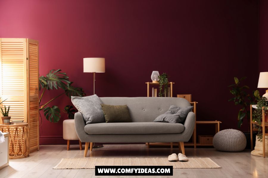
I get it—bright blue accent walls can look fun. But in a rental? They’re usually a disaster. Neutrals are:
- Easier to maintain (you won’t need to repaint after every tenant)
- Appealing to more people (no one says, “ugh, I hate beige”)
- A blank canvas (tenants can decorate however they want)
And let’s be honest—if you go wild with a bright orange kitchen, you’re basically begging tenants to say “pass.”
My Personal Favorites
Alright, if I had to pick my top three rental colors:
- Sherwin-Williams Repose Gray – Never fails, works everywhere.
- Benjamin Moore White Dove – Clean, warm, and timeless.
- Behr Wheat Bread – Practical and hides imperfections (a landlord’s dream).
I’ve used these more times than I can count, and they’ve always gotten good feedback from tenants.
FAQs About Rental Property Paint Colors
Q: Should I paint every room the same color?
A: Honestly, yes. It saves money, makes touch-ups easier, and creates a cohesive look. If you want variety, use a slightly different shade for trim.
Q: Glossy or matte—what’s better for rentals?
A: Go with eggshell or satin for walls. Save semi-gloss for trim and doors. Flat paint looks nice for a week, then it’s ruined.
Q: Are dark colors bad for rentals?
A: Not “bad,” but risky. Dark colors can make rooms feel smaller and harder to repaint. Use them sparingly, maybe for an accent wall.
Q: Do tenants really care about paint color?
A: Absolutely. First impressions matter. A clean, neutral paint job can literally be the difference between renting your property in a week or sitting empty for months.
Q: How often should I repaint a rental?
A: Every 3–5 years, or sooner if the walls take a beating. Neutral colors help stretch the timeline because touch-ups blend in better.
Final Thoughts
At the end of the day, the best paint colors for rental property are the ones that make your life easier while still attracting tenants. Stick with neutrals, pick durable finishes, and resist the urge to “get creative.” (Trust me, your tenants don’t want your Pinterest-inspired purple bathroom.)
Painting a rental isn’t about showing off your personality—it’s about creating a blank canvas tenants can see themselves in. And if you can do that while saving yourself repainting headaches down the line? That’s a win.
So, grab that roller and get painting—your future tenants will thank you.


Leave a Reply