
So, you’re ready to transform your media room into the ultimate movie-watching, game-playing, binge-streaming paradise?
Let me stop you right there: the paint color you choose will literally make or break your entire vibe.
Yeah, you could drop thousands on a fancy projector and sound system, but if your walls are screaming the wrong color, your “home theater” might just feel like a dentist’s office.
And trust me, nobody wants to watch The Godfather surrounded by beige walls that scream “waiting room.”
I’ve gone through this whole paint-color dilemma myself, so I know the struggle. Do you want cozy? Moody? Bold? Or maybe something timeless? Don’t worry—I’ve got you.
Below are the 25 best paint colors for media rooms that will completely transform your viewing experience.
Why Paint Colors Matter in a Media Room
Before we jump into the list, let’s get one thing straight: paint is not just decoration—it’s atmosphere control.
- Dark colors help reduce glare and reflection from the TV or projector.
- Warm tones create cozy, intimate vibes (perfect for popcorn and a blanket).
- Cool tones give that sleek, modern cinema aesthetic.
- Neutral tones make the space versatile so you can use the room for more than just movies.
Basically, your walls decide whether your Netflix marathon feels like a cinematic event or just another Tuesday night.
25 Best Paint Colors for Media Rooms
Alright, let’s dive into the fun part. These colors will give your media room that next-level vibe you’re looking for.
1. Charcoal Gray
Charcoal gray is a classic choice for media rooms. It absorbs light like a champ and creates a sleek, modern look. I painted my first media nook in charcoal, and suddenly everything felt more dramatic—like even reruns of Friends became intense.
2. Deep Navy Blue
If you want rich and moody without going all-black, navy is your best friend. It pairs beautifully with metallic accents like gold or silver and makes your space feel luxurious but not too heavy.
3. True Black
Want the real theater experience? Go all in with black. It kills light reflection and makes your screen the star of the show. The only downside? Dust shows up like it’s auditioning for a role in your movie.
4. Chocolate Brown
Think warm, rich, and cozy—like wrapping your room in a Hershey’s bar. Chocolate brown works great if you want something softer than black but still dramatic.
5. Dark Olive Green
This one’s bold but seriously underrated. Dark olive feels earthy and calming, and it pairs nicely with warm lighting. It’s like watching movies in a chic forest hideaway.
6. Maroon/Burgundy
The ultimate “old-school theater” color. Deep reds scream luxury and drama, making your room feel like a vintage cinema. Pair it with velvet curtains, and you’ve nailed the vibe.
7. Smoky Taupe
For those who want neutral but not boring, smoky taupe is perfect. It has a slight depth that prevents it from looking flat, and it works for multi-purpose rooms where you don’t always want cave-dark walls.
8. Slate Blue
Slate blue is cool, calming, and versatile. It adds personality without stealing attention from the screen. It also works great if you’re aiming for a modern-meets-cozy look.
9. Dark Eggplant Purple
Okay, hear me out: eggplant purple is rich, moody, and unique. It creates an artistic vibe while still being practical for light absorption. It’s basically the color for people who want something bold but not cliché.
10. Graphite
Graphite sits somewhere between gray and black, making it a flexible option. It’s moody without being overpowering, and it looks insanely good with matte finishes.
11. Cocoa Gray
This shade mixes warm brown undertones with gray for a balanced, cozy effect. If you want depth without going full dark, cocoa gray hits the sweet spot.
12. Steel Blue
Cool, industrial, and modern—steel blue adds a subtle edge to your media room. Pair it with leather recliners, and you’re basically living in a luxury loft.
13. Burnt Sienna
Want warm and bold? Burnt sienna brings an earthy, dramatic flair to your space. It’s one of those shades that feels unexpected but works so well.
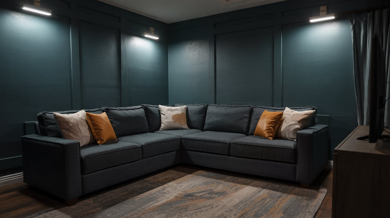
14. Dark Teal
Dark teal screams sophistication with a side of creativity. It works beautifully if you want a stylish space that still feels cozy and inviting.
15. Espresso Brown
Richer and deeper than chocolate, espresso feels grounded and timeless. It’s like painting your walls with a warm cup of coffee (without the jitters).
16. Moody Plum
Plum has that mysterious, cozy vibe. It’s romantic and dramatic, perfect for turning your Friday night rom-com binge into an event.
17. Storm Gray
A mid-dark gray with a slightly cool undertone, storm gray is modern and versatile. It blends seamlessly with almost any décor style.
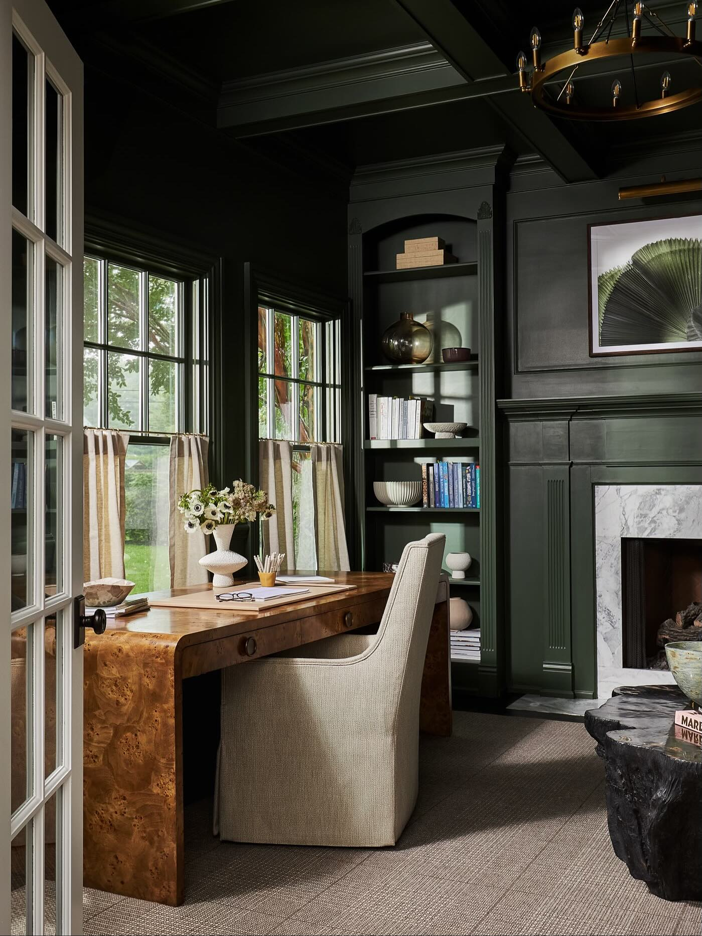
18. Hunter Green
Bold, elegant, and calming. Hunter green adds sophistication to your space while still keeping things moody enough for serious screen time.
19. Brick Red
If you’re into vintage vibes, brick red creates a warm, intimate atmosphere. It works especially well if you mix it with rustic wood furniture.
20. Gunmetal
Gunmetal has that industrial chic edge. It’s basically gray with a touch of metallic, and it makes your room feel modern and dramatic.
21. Ash Brown
Ash brown is soft, neutral, and understated. Perfect for a multipurpose space that doubles as a media room without screaming “home theater.”
22. Midnight Blue
Midnight blue is deep, mysterious, and cinematic. Honestly, if colors had a movie genre, this one would be a psychological thriller.
23. Charred Wood Black
This shade has a rustic, matte vibe. It’s less glossy than true black, so it feels warmer and less intimidating.
24. Dusty Mauve
Dusty mauve adds a softer, vintage-inspired feel. It’s unexpected for a media room, but it brings warmth and a little romance to the space.
25. Warm Greige
Yes, I said it—greige. When you mix gray and beige, you get a neutral that’s modern but not cold. It’s perfect for multipurpose rooms where you don’t want things too dark.
Tips for Choosing the Right Media Room Paint
Picking a paint color isn’t just about aesthetics—it’s about function too. Here are a few quick tips:
- Go darker for fewer distractions. Dark shades absorb light and keep your focus on the screen.
- Think about lighting. If your room has windows (lucky you), darker shades might feel overwhelming during the day.
- Match your furniture. Don’t pick a color that clashes with your seating or rugs. Trust me, it’ll drive you nuts.
- Test before you commit. Paint samples on the wall and check them during the day and night. You’ll be shocked how different colors look in different light.
My Personal Top 3 Picks
If you’re overwhelmed with choices, let me give you my IMO top three winners:
- Charcoal Gray – Timeless, moody, and versatile.
- Deep Navy Blue – Rich and stylish without being cliché.
- Maroon/Burgundy – Perfect for vintage theater vibes.
I’ve tested all three in different spaces, and honestly, you can’t go wrong.
Final Thoughts
At the end of the day, your media room should feel like a space you want to spend hours in. The right paint color sets the stage (literally) for every movie marathon, game night, or lazy Sunday binge.
Whether you go with bold navy, dramatic black, or cozy chocolate brown, the key is to choose something that reflects the vibe you’re going for. Because honestly, the last thing you want is to sit down for a blockbuster and realize your wall color feels more daycare nap room than cinematic masterpiece.
So grab a few paint samples, test them out, and trust your gut. Your dream media room is only a paintbrush away.


Leave a Reply