

Personally speaking, when I set up my home office, I quickly realized that the right paint color could transform the entire space.
I wanted a vibrant atmosphere that would energize me during long work hours.
After researching various shades, I discovered that colors like soft blues promote calmness, while yellows inject a burst of creativity.
I even learned that greens can enhance focus and balance.
Choosing the right hue isn’t just about aesthetics; it’s about creating an environment that fuels productivity and happiness.
So, if you’re looking to revamp your workspace, let’s explore some colors that can truly elevate your office experience!
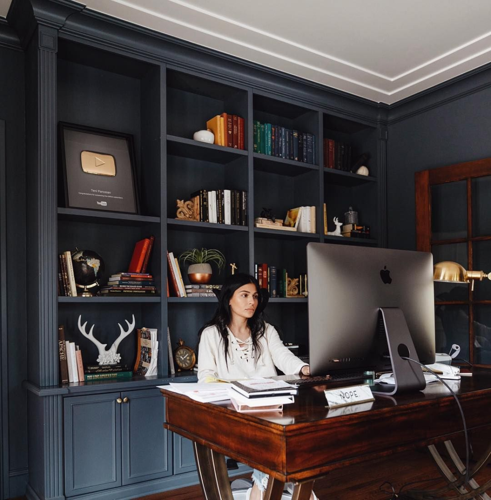
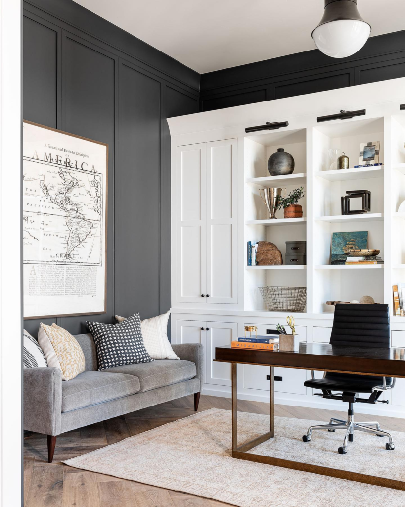
Black Beauty by ohara_interiors
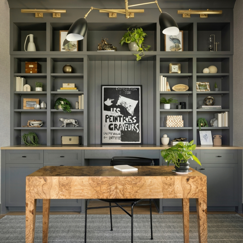
Black is a power color, and when used in a home office, it can set the tone for a productive space.
This moody hue by ohara_interiors is a great color to use for built-ins or bookshelves. The black backdrop will make the items on the shelves stand out.
Pro tip: Use a high-gloss finish to give the color a sleek and polished look.
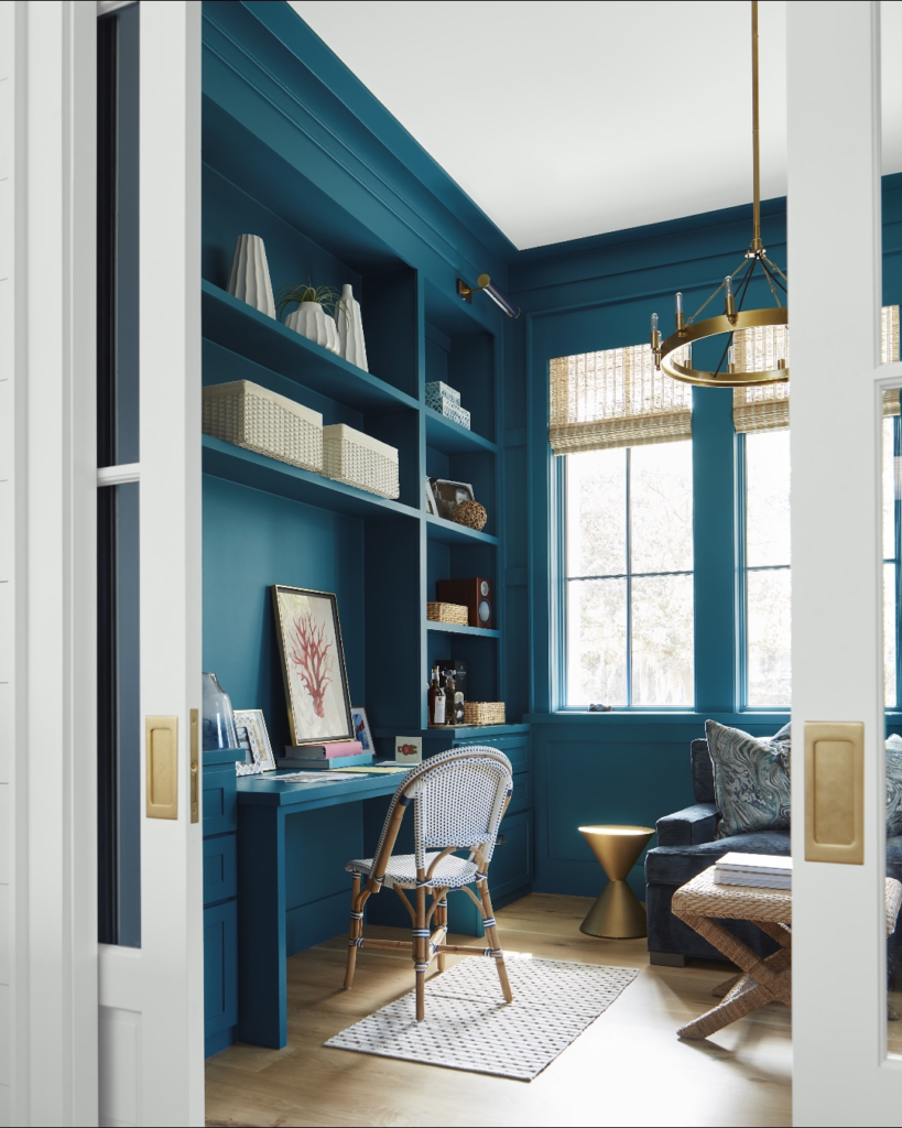
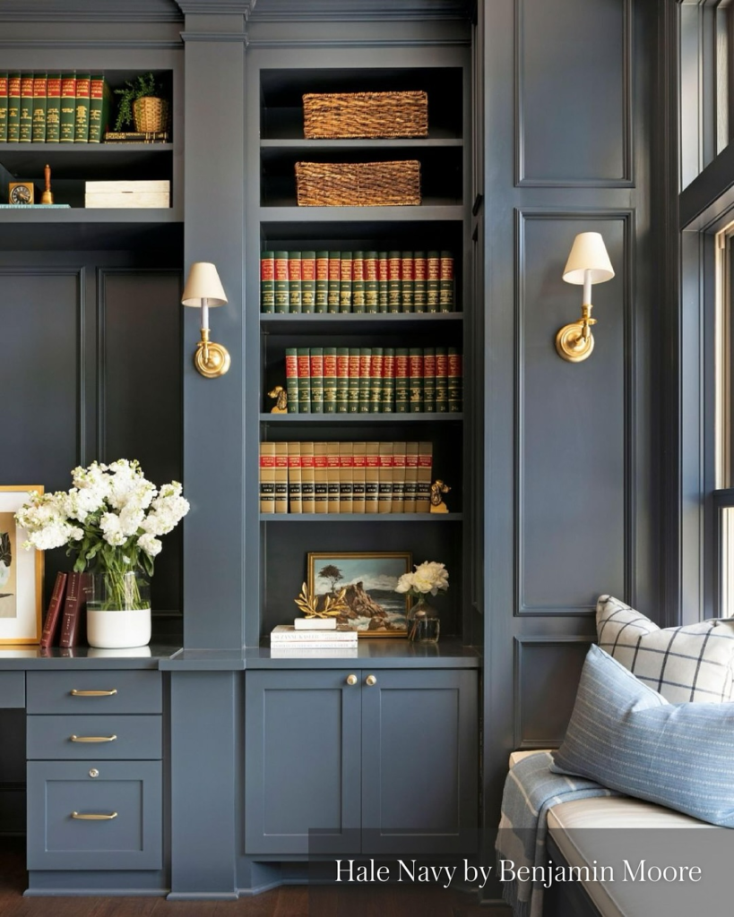
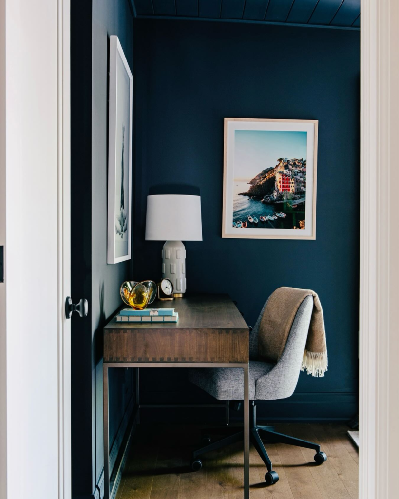
Loyal Blue
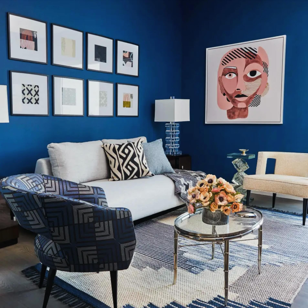
This deep blue color is perfect for the office that wants to make a statement.
It’s dark and moody, but still fun and inviting.
It’s also a great way to add some color to your space without going overboard.
Use it as an accent wall or on the built-in shelves to make a statement.
Night Watch
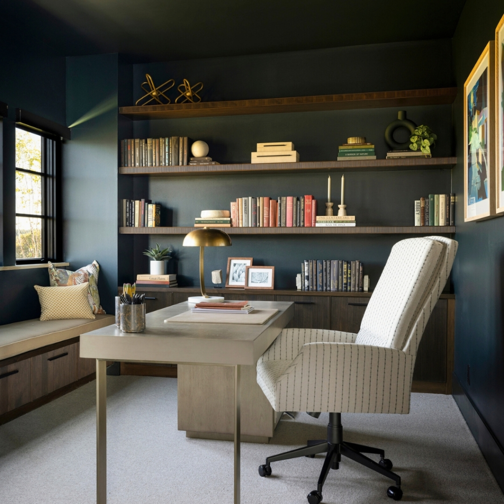
This moody green is so captivating that it was named PPG’s 2019 Color of the Year. It’s inspired by nature, and it’s the perfect color to use if you’re trying to bring the outdoors in.
“Night Watch is about the essence of living in the moment,” says Dee Schlotter, senior color marketing manager at PPG. “
It’s a great color to use if you’re trying to create an environment that encourages productivity and creativity.”
If you’re not ready to commit to a wall of green, use it as an accent color. In this office by Emily Henderson, it’s on the back of the built-ins.
Studio Green
Farrow & Ball Studio Green is a deep, moody green that’s perfect for an office space. It’s dark enough to feel cozy, but not so dark that it feels like a cave.
This is a great color for a room with a lot of natural light, as the light will help to balance the dark color.
Pair it with white trim and accents of brass and other warm metals for a sophisticated, modern look.
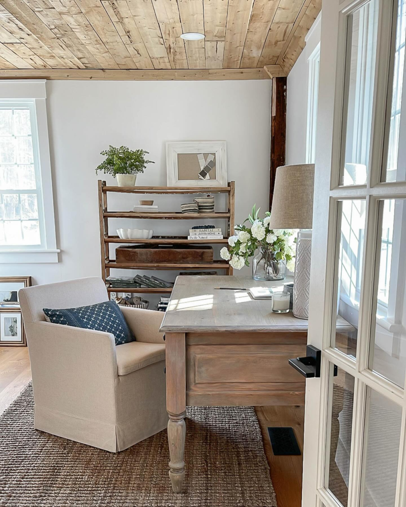
Chalk
If you’re a fan of white paint colors but want a little more depth, Chalk is a great option.
This warm white paint color has a hint of peach to give it a soft, welcoming feel.
Use this paint color in a home office where you want to create a cozy, inviting atmosphere.
Reddened Earth
This earthy red is a great option for most rooms in the home, but we especially love it in a home office.
It’s not too bright, not too dark, and will help to add a touch of color to your space.
Olive
This home office by Cate Holcombe Interiors has a calming and cozy feel, thanks to the olive green walls.
The color, as well as the landscape painting, brings the outdoors in, which is a great way to make a space feel more inviting and less office-y.
“Olive is a grounding color with a nod to nature,” says Holcombe. “It’s not too bold or too muted, and it’s a great way to bring color into a space without it being too overwhelming.”
Hibiscus
This warm coral color is a great choice for a room that needs to feel a little more like home.
But if you’re worried about using a color that’s a bit out of the box, try painting it on the back of a bookshelf or on a large piece of art that can be hung on the wall.
This color can be a great way to add a little bit of fun to a room that doesn’t get much natural light.
In the Moment
This is the perfect shade to use if you want to incorporate a pop of color in your office. It’s a little bit of blue, a little bit of green, and a lot of fun!
This color is calming and can help you focus, but it’s still interesting and modern.
Use this paint color on the walls if you like to keep your office furniture and decor simple.
It’s a great way to add a little bit of personality without going overboard.
New Day by Clare
Clare founder Nicole Gibbons says that this soft, warm, and inviting shade is a great choice for an office. “
It’s a color that feels like a breath of fresh air and can help you start your day with a positive mindset,” she says. “
It’s a perfect color to use in a home office where you may be spending long hours and want to make sure the space feels warm and inviting.”
Black Magic by Benjamin Moore
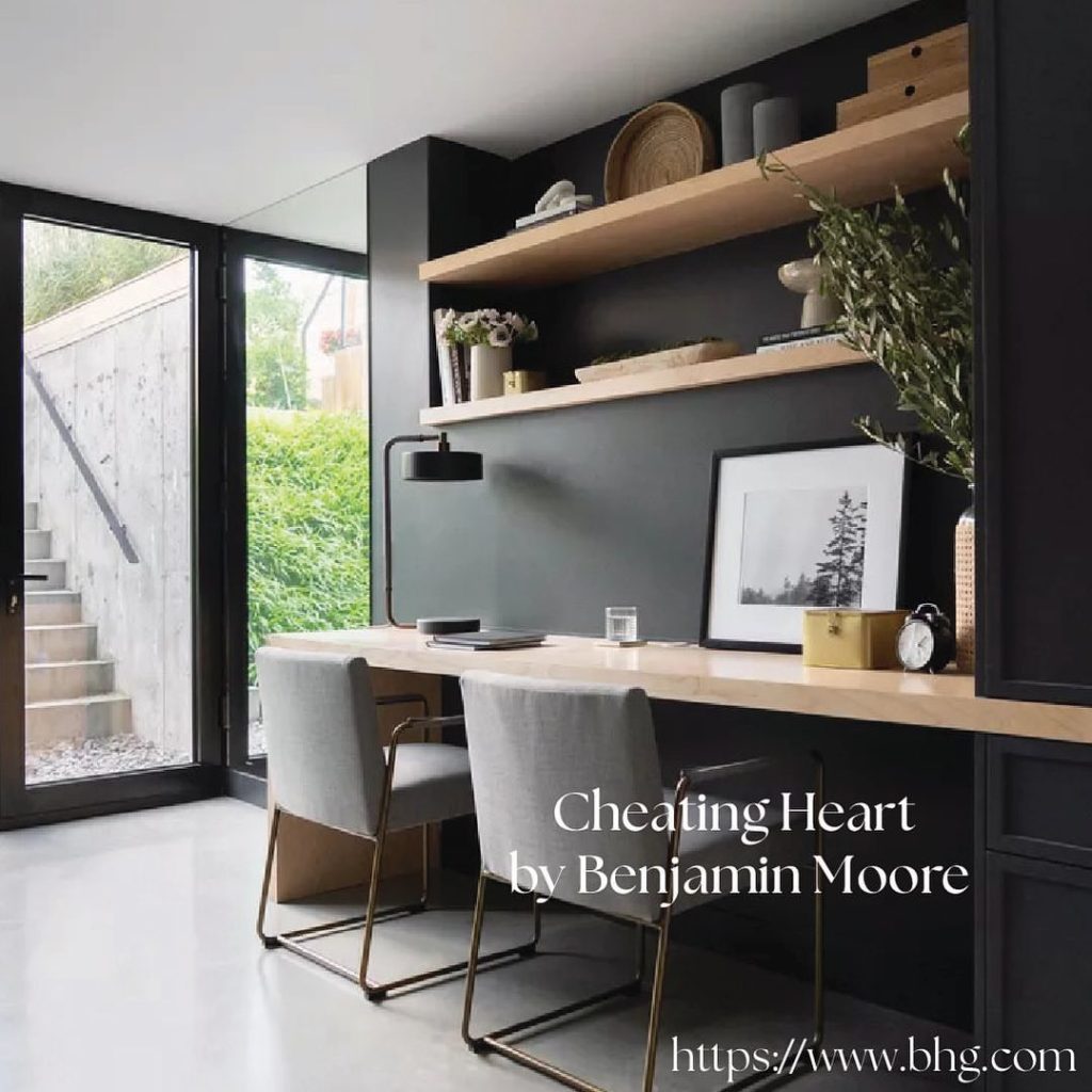
If you have a lot of natural light coming into your office, you can’t go wrong with a dark, moody paint color.
Black Magic by Benjamin Moore is a timeless, elegant hue that pairs beautifully with gold accents.
Try painting the walls this dark color and adding a gold picture frame gallery wall or gold desk accessories.
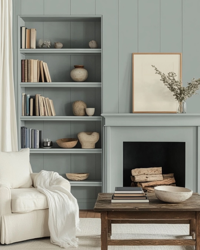
Green Smoke
If you’re looking for a green paint color that’s not too bright or too dark, consider Green Smoke by Farrow & Ball.
This soft and sophisticated green color can help create a calming and serene atmosphere in your office.
This paint color pairs well with white, light wood, or gold accents.
Dusty Rose
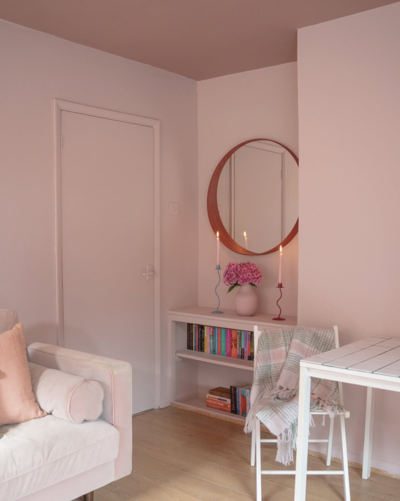
This dusty rose color is the perfect mixture of pink and white. It’s subtle and sophisticated, making it a great option for a home office.
The color is a bit more muted than a traditional pink and pairs well with other soft colors. In this office, it’s paired with a light blue and a soft peach.
Dark Navy
This dark navy office by Benjamin Design is the perfect mix of masculine and feminine without being too much of either.
The dark color is balanced with just the right amount of white, and the gold and wood accents make it feel warm and welcoming.
Pro tip: If you want to try a dark color but are worried it might be too much, consider doing an accent wall or two-toned walls like this one.
It will help break up the color and make the space feel more open.
Smoky White
If you love the idea of painting your home office all white, but you’re worried about it feeling too stark, consider a warm white.
Case in point: This office designed by Emily Henderson. The walls are painted in Smoky White by Sherwin-Williams, which has a touch of gray to keep it from feeling too sterile.
Paired with a bright white trim, the room feels clean and fresh, while the dark wood desk and black accents add warmth and contrast.
Morning Sun by Clare
“Morning Sun by Clare is a warm, buttery yellow that is perfect for a home office,” says interior designer and stager Michelle Minch. “
I like to use it in a room that doesn’t get a lot of natural light, because the color is so bright and cheery.
It’s also a great color to use in a room that has a lot of white built-ins, because it will make them pop.”
Yellow is a great color to use in a home office, because it’s a color that is known to promote happiness and creativity.
Blue Note by Benjamin Moore
Blue Note is a deep, dark navy with a touch of green undertones.
This rich color is perfect for a smaller office space, as it will make the room feel cozy and inviting.
Pair Blue Note with a white trim and ceiling, as well as a white desk and other office furniture.
The lighter colors will help to balance the darkness of the navy.
Charcoal Blue
When you can’t decide between a moody blue or a deep gray, Charcoal Blue is the perfect blend of both.
This color is great for a home office that gets a lot of natural light, as it will help balance out the brightness.
Pro tip: To create a cohesive look, use the same color for the walls and trim, but in different finishes.
Here, the walls are finished with a flat paint, while the trim has a semi-gloss finish.
Sand Motif

A warm and inviting office design is possible with the right color choices.
Paint your office walls in a soft, sandy color like Sand Motif by Behr to create a welcoming space.
This shade is perfect for a creative office design, especially if you want to create a boho or desert-inspired office.
Pair this sandy shade with other warm and natural colors, like terracotta, cream, or sage. Add in some natural textures, like wood and woven baskets, to complete the look.
Crisp Linen
If you prefer a neutral color palette, try this creamy shade that’s not too stark.
It’s a great choice for a home office where you want to keep the space feeling light and airy, but not stark white.
We love how it’s used in this office designed by Emily Henderson.
In the Shadows
If you like the idea of a dark paint color but want something with a little more color, this mauve-based gray is a great option.
It’s dark enough to add a cozy feel to a home office but still light enough to make the space feel open and airy.
Pro tip: Use this color on the walls and ceiling to make the room feel larger.
Painting the trim and doors the same color as the walls will make the room feel seamless and cohesive.
Silver Marlin by Benjamin Moore
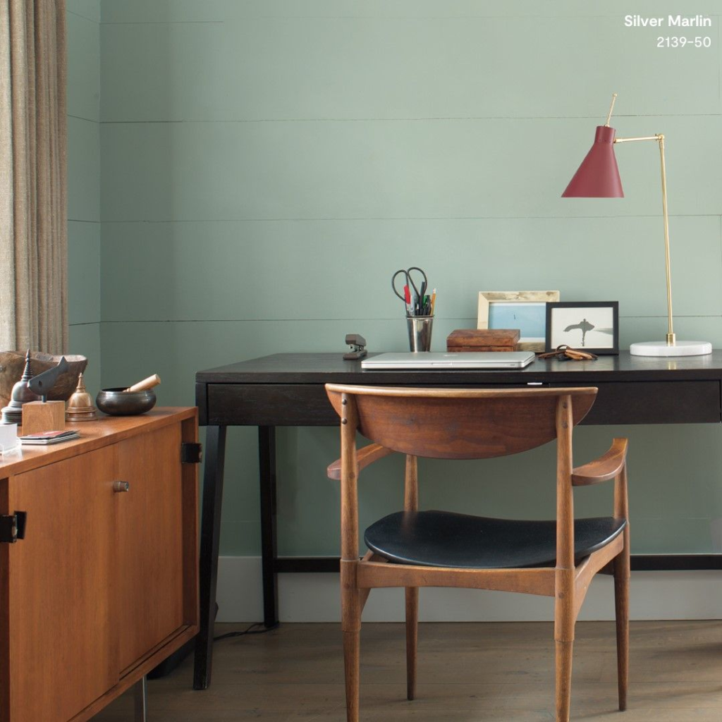
This office designed by Los Angeles-based interior designer Stefani Stein is the perfect example of how to create a modern, neutral space.
The high-gloss finish of the wall paint adds a little something extra to the space, as does the light gray color itself.
Thunder by Benjamin Moore
If you’re looking for a neutral color that’s not white, Thunder is a great option. It’s a light gray with cool undertones, and it’s perfect for a calming office space.
The artwork and accessories in this office by 3rd & Grace make the room feel vibrant and fun, while the paint color keeps the room feeling serene.
Light French Gray
We’re not the only ones who think this office is a dream. Light French Gray by Sherwin-Williams is a color that is often used in homes, but it’s a great choice for an office, too.
This neutral color looks great with woods and whites, and it’s a very calming color.
It’s a great color if you want to add a little bit of color to your office but don’t want to go too bold.
Conclusion
When it comes to choosing the best paint color for your home office, the options are endless.
And that can be overwhelming. To make your life easier, we’ve rounded up the best paint colors for an office, from bright whites to moody dark grays.
We hope you found these home office paint colors inspiring. If you did, please share this article with your friends and family!
If you are in the process of renovating your home office, our team would love to hear from you. Please share your thoughts, questions, and home office paint ideas in the comments below.


Leave a Reply