
If you’ve ever stared at your living room and thought, “Why does this look… confused?” you’re not alone.
I’ve been there, staring at three throw pillows that absolutely refused to get along.
That’s when I discovered the magic of analogous colors—the low-stress, high-impact design trick that basically does the heavy lifting for you. And honestly? It changed everything for me.
You want a living room that feels cohesive, stylish, and effortlessly put together, right?
And you probably don’t want to spend six hours decoding a color wheel like it’s a secret government document. Well, good news—you don’t have to.
I’ve done the experimenting, the mismatching, and the “why did I think teal and mustard were best friends?” phase. So let’s talk ideas that actually work.
Ready to make your living room look like you hired a designer (even if you didn’t)?
Let’s get into the 19 best analogous color living room ideas that can seriously upgrade your space. FYI, some of these might surprise you.
1. Soft Blue, Teal, and Aqua Harmony
Blue, teal, and aqua sit right next to each other on the color wheel, and they create that smooth, relaxing vibe we all secretly want after a long day.
Use a deep teal sofa, then layer in softer aqua accents and navy details for depth. Ever notice how these shades instantly calm you down? Yeah, that’s not an accident.
2. Warm Coral, Peach, and Soft Pink Blend
This trio gives your space that soft, romantic glow without going full cotton candy. I love using peach-toned curtains with subtle coral art to anchor the look.
If you want warmth without shouting, this combo nails it.
3. Earthy Olive, Moss, and Sage Green Layers
If you’re obsessed with greens, this one’s for you. Olive, moss, and sage work together like a dream team.
Try a sage feature wall with moss throw blankets and olive-toned furniture legs. Ever wonder why plant-filled rooms look so good? Same color family magic.
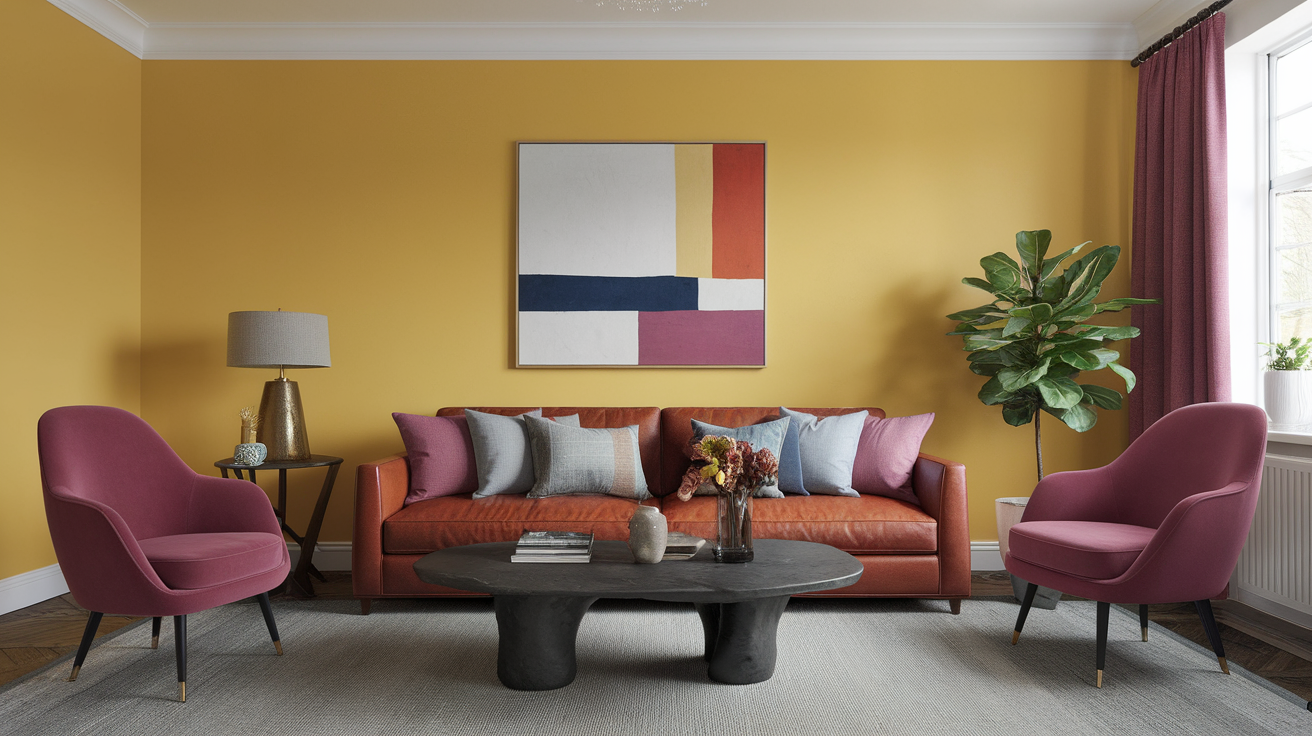
4. Golden Yellow, Mustard, and Amber Glow
You want warmth? This trio brings it. Mustard sofas, amber lamps, and buttery yellow accents create a room that practically glows.
And yes, I once doubted mustard furniture too, but it has major main-character energy IMO.
5. Plum, Berry, and Burgundy Drama
Going moody never looked this good. Berry-toned rugs, plum cushions, and burgundy wall art bring depth without overwhelming the room.
It’s the perfect choice when you want drama without yelling.
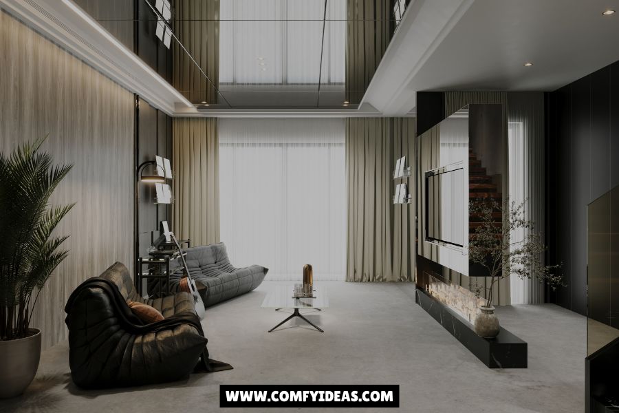
6. Ocean Teal, Deep Green, and Blue-Green Mix
If you love ocean vibes but hate the beach cleanup, try this. Deep green cabinets, teal sofas, and blue-green textiles give your room an underwater richness.
It feels like a coastal trip… minus the sand in your shoes.
7. Terracotta, Rust, and Brick Coziness
Warm, grounded, and ridiculously inviting. I once painted a small accent wall terracotta and instantly felt like I lived in a Mediterranean villa.
Add rust cushions, brick vases, and warm clay art for an earthy, cozy space.
8. Sky Blue, Powder Blue, and Periwinkle Tranquility
Soft blues create a serene, dreamy environment. Use powder blue curtains, sky blue sofas, and periwinkle throws for a fresh, airy feel.
Ask yourself—when did you ever feel stressed looking at soft blues? Exactly.
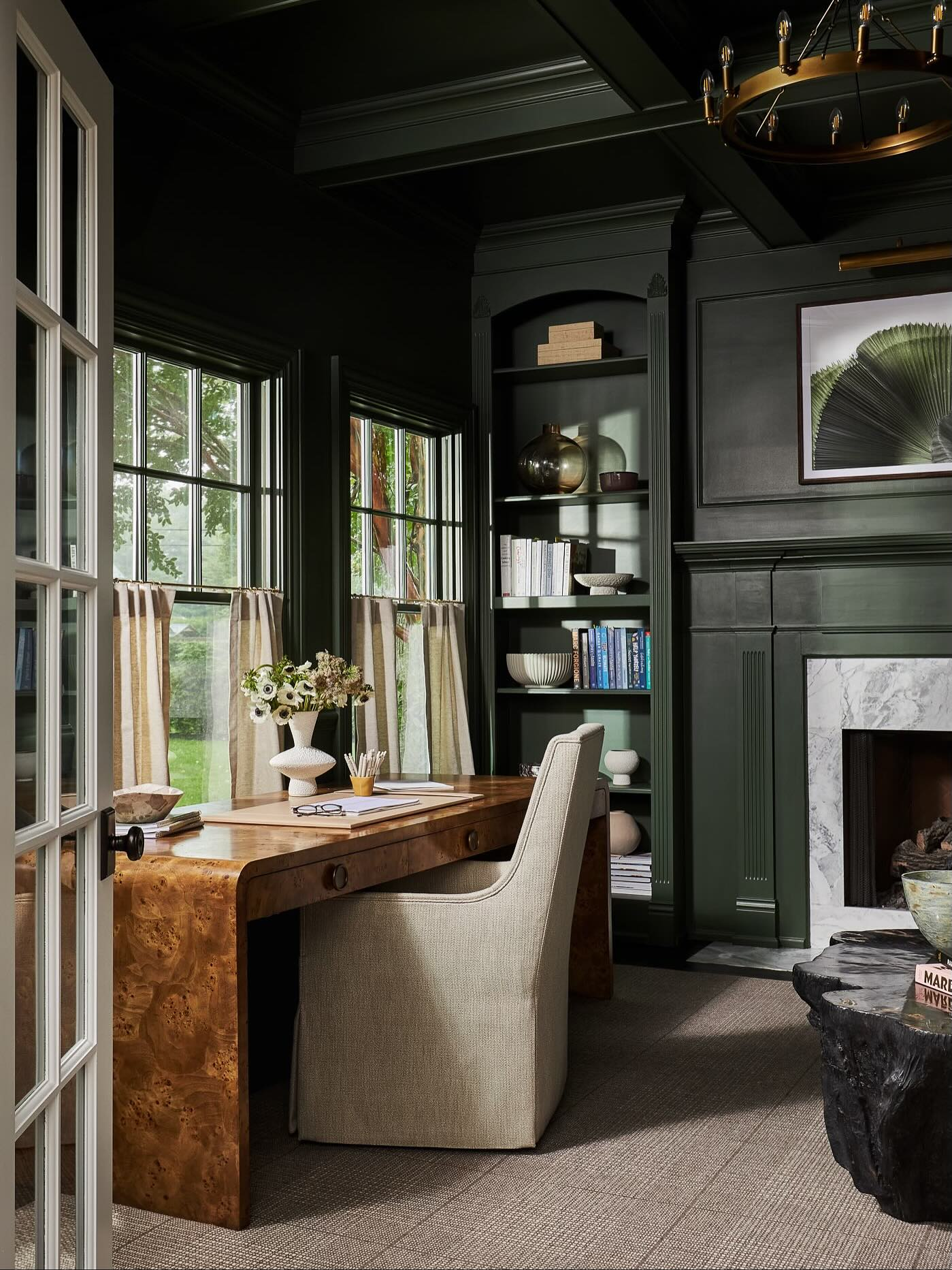
9. Forest Green, Emerald, and Pine Depth
If you want richness and sophistication, these greens deliver. Forest and pine anchor the space, while emerald adds a glamorous twist.
Think pine wood furniture, emerald cushions, and forest green walls.
10. Rose, Mauve, and Dusty Pink Romance
This combo gives your living room the soft, grown-up pink vibe—not the bubblegum nightmare we all survived as kids.
I love using dusty pink sofas and mauve decorative pieces with rose art.
11. Burnt Orange, Cinnamon, and Copper Warmth
Warm, bold, and perfect for fall lovers. Burnt orange sofas, cinnamon throws, and copper accents create a space that always feels welcoming.
You’ll basically never want to leave your sofa again.
12. Mint, Seafoam, and Soft Green Freshness
These shades feel refreshing without leaning too bold. Great for small spaces that need lightness.
Use seafoam rugs, mint pillows, and soft green vases to tie everything together.
13. Lavender, Lilac, and Soft Purple Calm
If you want a calm and whimsical space, this trio shines. Use lilac curtains, lavender throws, and soft purple artwork.
It creates a soothing environment that feels dreamy without being childish.
14. Navy, Indigo, and Deep Blue Elegance
Nothing beats deep blues for instant sophistication. Try navy walls, indigo pillows, and deep blue decorative ceramics.
Your living room suddenly feels like a chic hotel lounge.
15. Khaki, Sand, and Beige Layered Neutrals
Sometimes simple works best. Khaki sofas, sand rugs, and beige throws combine into a warm, minimalist palette.
It’s neutral, but not boring. Yes, that’s possible.
16. Mint Green, Soft Blue, and Blue-Green Mix
Mint and blue cousins blend beautifully. Use soft blue walls and mint furniture for a refreshing, airy combo.
If you want a chill palette that still has personality, this hits the spot.
17. Red-Orange, Tomato Red, and Scarlet Punch
If you love bold spaces, this one packs a punch. Use tomato red art, scarlet pillows, and red-orange rugs to anchor the look.
You’ll feel energized every time you walk in—maybe too energized if you already drink three coffees a day
18. Warm Brown, Tan, and Honey Wood Comfort
Natural, earthy tones create comfort instantly. Pair honey wood furniture with tan upholstery and brown accents.
It feels like nature but without the bugs.
19. Aqua, Turquoise, and Blue-Green Coastal Cool
For a fresh, coastal-inspired palette, nothing beats this. Use aqua walls, turquoise cushions, and blue-green vases.
It feels vacation-ready year-round.
Tips to Make Any Analogous Color Palette Work
Sometimes picking colors feels like gambling, but you don’t have to guess. Here are a few quick tips to keep everything looking intentional.
Keep a Dominant Hue
Choose one main color that anchors the room. Use the other two as accents.
Vary Textures
Layer textures like:
- Velvet
- Woven fabrics
- Linen
- Leather
- Wood
These add depth, especially when colors are close together.
Use Neutrals as a Spacer
Add neutrals like white, beige, or charcoal to keep the palette from looking too intense.
Balance Light and Dark
Contrast matters—even in analogous palettes. Mix light shades with dark tones to avoid a flat look.
Why Analogous Colors Work So Well
You ever walk into a room and think, “Why does this feel so… right?” Analogous colors create harmony naturally because they’re neighbors on the color wheel. Your eye reads them as a family, which keeps the space cohesive without feeling too matchy-matchy.
Honestly, once I switched to analogous combinations, I felt like I unlocked cheat codes for decorating. And you probably will too.
Conclusion: It’s Time to Make Your Living Room Make Sense
If your living room has been begging for a glow-up, analogous color palettes might be the easiest way to do it. They offer harmony, personality, and style without making you feel like you enrolled in a design theory class.
Whether you go bold with reds and oranges, calming with blues and greens, or warm with neutrals and earth tones, you’ll create a space that finally feels intentional. And honestly? You deserve that.
So which of these 19 analogous color living room ideas are you going to try first? Let your space show off a little. It’s ready.


Leave a Reply