
If you’ve ever walked into a Scandinavian-inspired living room and thought, “Why does this feel so effortlessly calming?”, you’re definitely not alone.
I remember the first time I tried to recreate that look in my own space. I grabbed a white paint bucket, slapped it on the wall, and instantly realized I had no idea what I was doing.
Ever felt that way too? Trust me, the right Scandinavian color palette changes everything—and I mean everything.
So today, I’m walking you through 23 Scandinavian color living room ideas that actually work. No stiff design lingo.
No “expert speaks from furniture throne” nonsense. Just real, approachable, friendly advice from someone who’s made more than a few questionable color decisions.
Ready? Let’s get into some seriously good ideas.
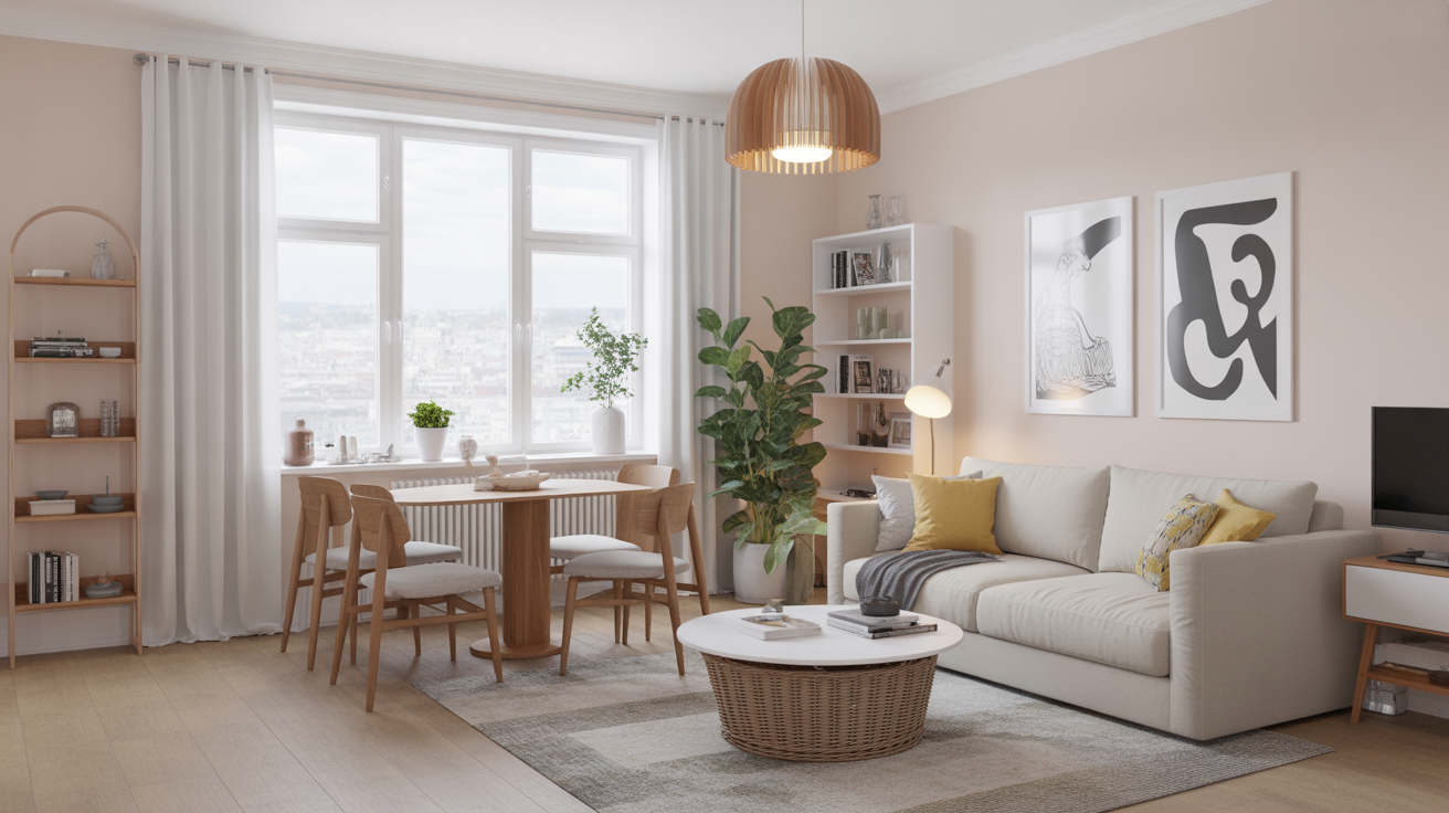
1. Classic White Walls That Never Fail
White walls sound basic, right? But in Scandinavian design, white creates instant harmony. You get that airy, natural, “I keep my life together” vibe even if you absolutely don’t.
Ever wondered why white works so well? It reflects light like a pro and makes even tiny apartments feel roomy.
Choose shades like:
- Pure white for crisp minimalism
- Soft white for warmth
- Matte white for a modern, muted look
I always go for soft white because pure white sometimes makes me feel like I live inside a lightbulb. Just IMO.
2. Warm Beige for a Cozy, Grounded Vibe
When people think “Scandi,” they jump straight to white. But honestly, beige might be the unsung hero here. Beige gives the room warmth without cluttering your visual space.
Try beige when you want:
- A cozy atmosphere
- More warmth than white
- A neutral backdrop for wood accents
I painted my living room beige once during winter, and it instantly felt like a hug. A very stylish hug, obviously.
3. Soft Gray for Subtle Sophistication
Soft gray brings elegance without shouting about it. It offers depth but never steals the show.
Use soft gray when you want:
- A neutral that isn’t boring
- A pairing for black accents
- A modern twist on traditional Scandinavian white
If white feels too bright and beige feels too warm, gray might be your perfect middle ground.
4. Muted Greens for a Nature-Inspired Look
Scandinavian interiors love nature, so muted green fits right in. I’m talking sage, olive, eucalyptus—those soft, earthy tones that whisper “relax.”
Why it works:
- It pairs beautifully with wood
- It mimics nature’s calm
- It softens clean-lined furniture
Ever sit in a room with sage walls and not feel calmer? Yeah, me neither.
5. Greige: The Best of Gray and Beige
Greige sounds like a made-up color you’d hear in a paint commercial, but wow, it delivers. It gives you warmth and neutrality while still staying modern.
Use greige when you want:
- A versatile backdrop
- Minimalist style with warmth
- A Scandinavian tone that feels polished
FYI, greige hides dust better than pure white. And yes, that’s a major win.
6. Dusty Blue for a Soft, Cool Contrast
If you love the clean lines of Scandinavian design but want a subtle pop of color, dusty blue makes magic happen.
Why dusty blue fits:
- It adds color without drama
- It pairs well with oak and pine
- It creates a serene mood
I always recommend dusty blue for small rooms—it gives color without shrinking the space.
7. Charcoal Accents for a Bold Scandinavian Edge
Some people think Scandinavian design avoids dark colors. Not true. Charcoal accents elevate the room instantly.
Use charcoal in:
- Window frames
- Accent walls
- Media consoles
- Throw pillows
This shade anchors your space without overwhelming it.
8. Soft Blush for That Hint of Warmth
I used to think pink didn’t belong in Scandinavian interiors. Then I tried soft blush, and wow, it changed everything.
Soft blush works because:
- It adds warmth while staying subtle
- It feels mature and modern
- It looks amazing with gold or black accents
It’s the color that says, “Yes, I’m calm, but I also have taste.”
9. Taupe for a Balanced, Earthy Feel
Taupe sits between gray and brown, giving you a grounded palette that still feels airy. When beige feels too warm and gray feels too cold, taupe saves the day.
Try taupe for:
- Scandinavian rustic spaces
- Rooms with lots of wood
- Subtle earthy vibes
It’s one of those shades that makes your living room look unintentionally elegant.
10. Black-and-White Contrast for Scandinavian Drama
Scandinavians love contrast. A black-and-white living room looks clean, minimalist, and incredibly modern.
For balance:
- Keep white as the primary color
- Use black for accents
- Add wood so the room doesn’t feel too stark
Trust me, you won’t regret a little black here and there.
11. Soft Brown for a Nature-Friendly Palette
Soft brown walls or accents bring earthy warmth without leaning rustic.
Why soft brown wins:
- It pairs well with wool textiles
- It feels warm but still modern
- It complements white beautifully
Think cozy cabin but make it Scandinavian chic.
12. Sand Tones for Beachy Scandinavian Calm
Sand tones feel like a quiet day at the beach—which is very Scandinavian, if you ask me.
Use sand tones to:
- Brighten small rooms
- Add warmth without yellow tones
- Create a soothing, minimalist base
Ever notice how sand shades instantly slow your mind? Same.
13. Light Terracotta for Artistic Scandinavian Warmth
Light terracotta adds a creative, earthy warmth to your living room. It’s unexpected but still very Scandinavian.
Use terracotta when you want:
- Warmth that isn’t beige
- Earthy tones with personality
- Contrast without clutter
Terracotta looks especially nice with rattan and walnut.
14. Ivory for a Softer Alternative to White
Ivory feels gentler than white but still clean and crisp.
You’ll love ivory because:
- It adds subtle warmth
- It makes natural textures pop
- It works with any Scandinavian palette
Ivory might be the most universally flattering shade on this list.
15. Muted Mustard Accents for Subtle Boldness
Before you roll your eyes, I said muted mustard. I’m not talking neon yellow here.
Muted mustard works as:
- Throw pillows
- Artwork
- Accent chairs
- Blankets
It adds energy without chaos. Big difference.
16. Olive Green for Deep Earthy Comfort
Olive gives your living room warmth, comfort, and depth. It looks amazing with black, wood, and brass.
Choose olive when you want:
- Earthy richness
- Warm undertones
- Scandinavian meets modern farmhouse vibes
This color brings the outdoors inside in the best way.
17. Pale Blue-Green for Airy Coolness
If dusty blue feels too dramatic, blue-green might be your winner. It feels cool, calm, and refreshing.
Why it works:
- Adds color without clutter
- Pairs beautifully with whites
- Feels coastal yet Scandinavian
It’s incredibly calming—like taking a breath of fresh air.
18. Dark Forest Green for Moody Scandinavian Flair
If you like the dark, cozy Scandinavian vibe, forest green absolutely delivers.
Try forest green for:
- Accent walls
- Velvet sofas
- Artwork
Pair it with brass or black for an elevated look.
19. Slate Blue for Sophisticated Cool Tones
Slate blue mixes gray and blue, creating a refined, Scandinavian-approved color.
Use slate blue for:
- A modern look
- A contrast against white furniture
- A calm, cool energy
It feels mature without being boring.
20. Silver Gray for an Airy, Shiny Twist
Silver gray brightens your space without adding warmth.
It’s perfect for:
- Minimalist designs
- Small living rooms
- Light-filled spaces
If your room gets plenty of daylight, silver gray makes it shine.
21. Soft Peach for Subtle Warmth and Light
Soft peach adds gentle warmth and works surprisingly well in Scandinavian interiors.
Try soft peach for:
- Accent walls
- Neutral-loving spaces
- Rooms needing a light touch of color
It feels modern, not childish.
22. Muted Lavender for a Graceful Scandinavian Palette
Muted lavender brings elegance and calm while still staying true to Scandinavian minimalism.
Why lavender fits:
- It softens your space
- It complements natural wood
- It offers color without being loud
It’s one of the most underrated Scandi colors out there.
23. Natural Wood Tones as a “Color” (Yes, It Counts)
Some people forget that wood is part of the color palette. But honestly, wood might be the soul of Scandinavian design.
Use wood tones in:
- Flooring
- Coffee tables
- Shelving
- Picture frames
Natural wood brings warmth that paint alone can’t achieve.
Final Thoughts
So there it is—23 Scandinavian color living room ideas that actually elevate your space, not just in theory but in real life. Each of these colors brings a different personality to your living room, so think about what mood you want. Calm? Warm? Clean? Moody? Or maybe a mix?
Choosing the right color takes experimentation. And yes, sometimes you’ll paint a wall, hate it, repaint it, hate it again, and eventually find “the one.” Happens to the best of us 🙂
If you try any of these Scandinavian color palettes, tell me which one surprised you the most. I’m always curious—don’t you love seeing how one color can change everything?


Leave a Reply