

Yes, it is quite ironic that we all have at least one room in the house with minimal natural light. Interior
design becomes a question mark, as I am also afraid that it may become even darker with the wrong
choices. One thing I must say is that the selection of paint color matters a lot.
Some colors have the tendency to boost the available light by reflecting it, while some paints even dim the available light.
To avoid bad choices, I am sharing the maximum possible paint colors for low light rooms for inspiration.
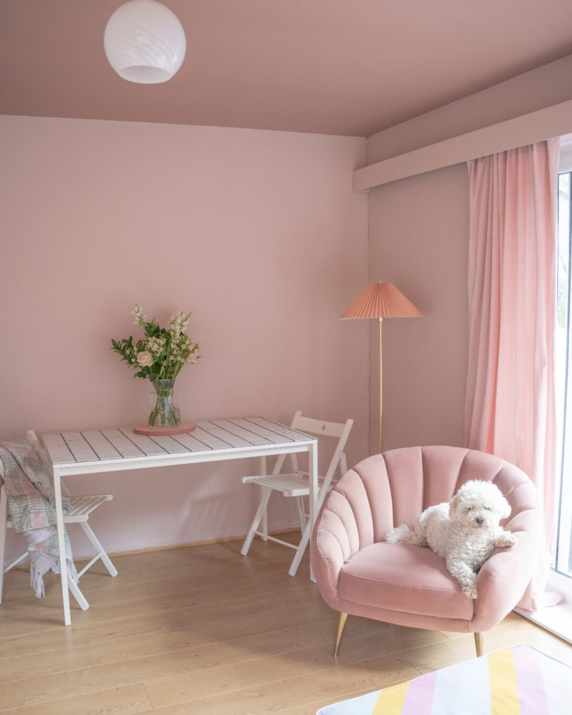
Pale Pastel Pink for Adorable Look
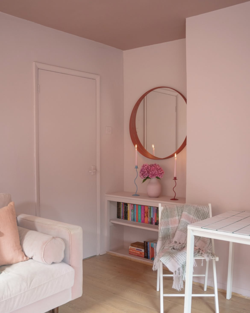
These lighter shades of pink with white and violet tones have a high light reflectance value of 78.
I am saying if you invest in good artificial lighting, this paint is magical.
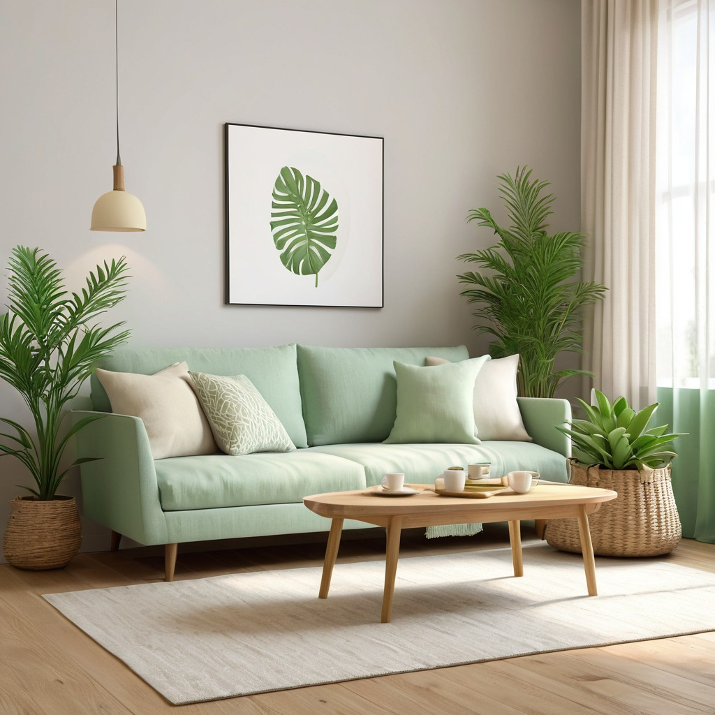
Soothing Sage Green Light
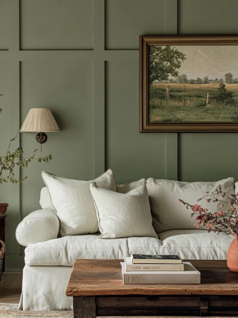
If you are more into darker hues and want to pick something that also works for a darker ambience, then try light sage green.
Just have your doors and windows in cream white to create a lovely contrast.
Light Peach for Elegance
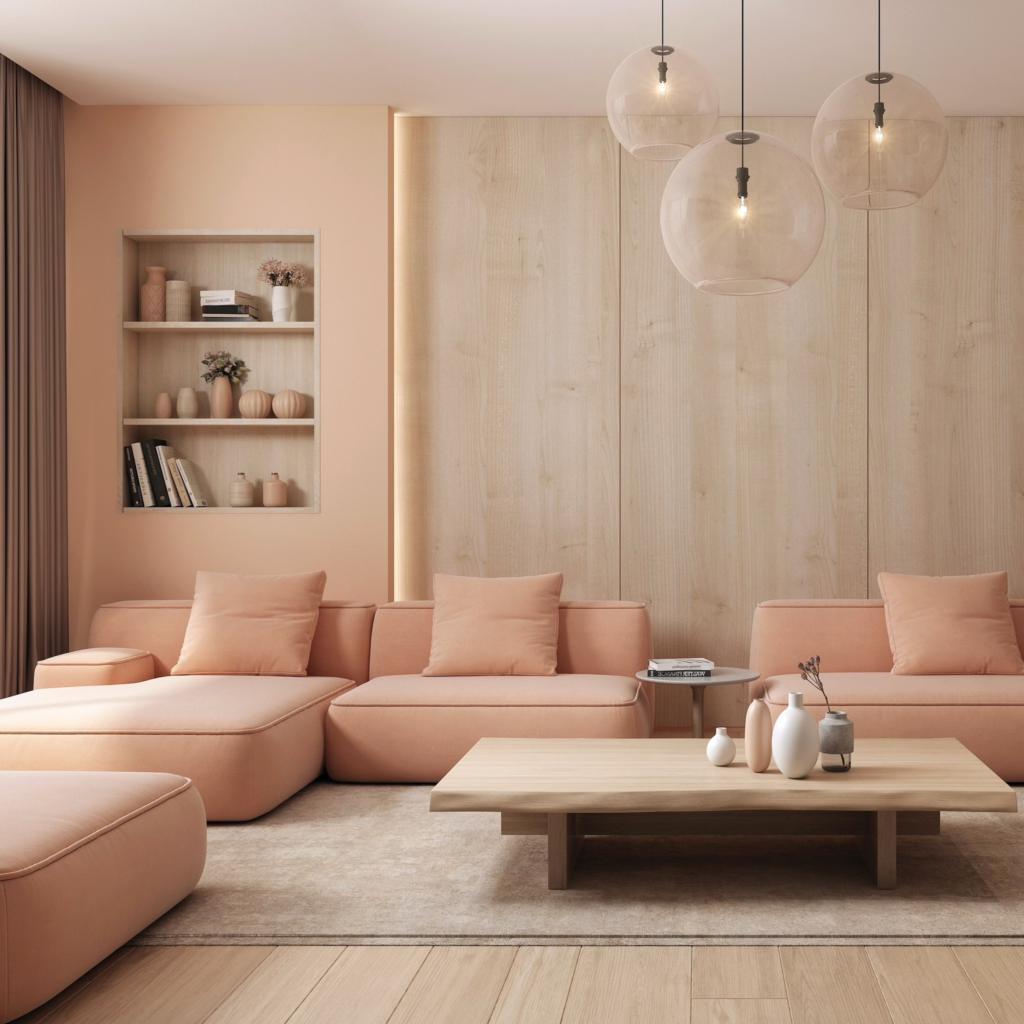
If you are not too much into a pink theme, you can try light peach. It looks lovely, whatever the room size is.
Having drawers and wall art in dark brown or other earthy hues looks perfect with it.
Warm Off-white for Modern Touch
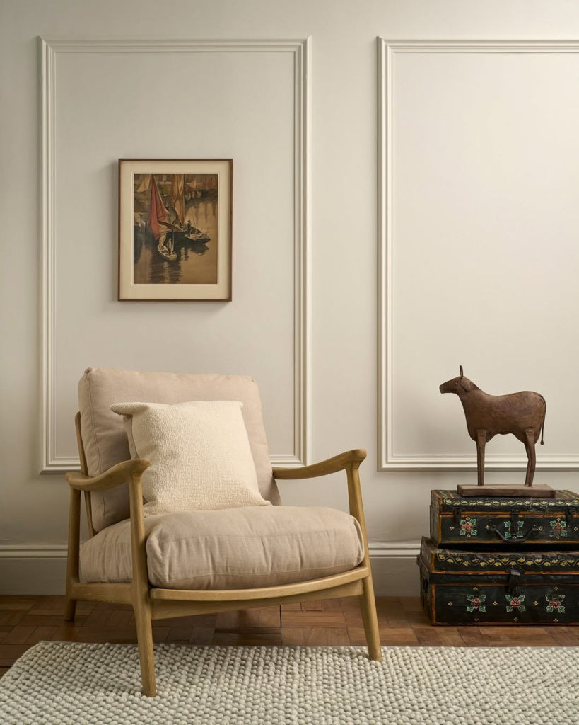
Pure white has the most light reflection, but it is not always workable for dark rooms.
The absence of natural light can make it look grey, so I suggest using warm off-white for a better ambience.
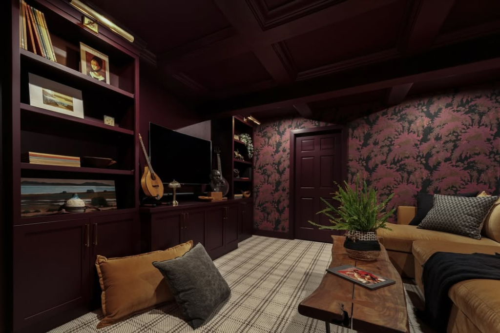
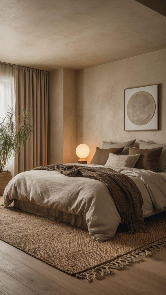
Espresso Brown Ceiling with Subtle Walls
If you want to have dark paint colors but don’t want to compromise on lighting, then add colors smartly. Have the ceiling in a dark color, such as espresso brown.
For the rest of the walls, off-white works perfectly.
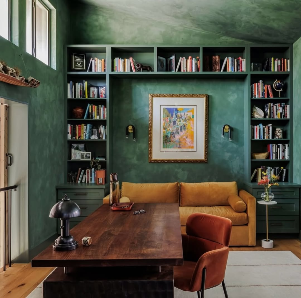
Pastel Green for Natural Appeal
Here again, I recommend having one wall in a darker hue, such as forest green, for its cooling effect.
Select light hues for the rest of the space and have some curtains in contrast as well.
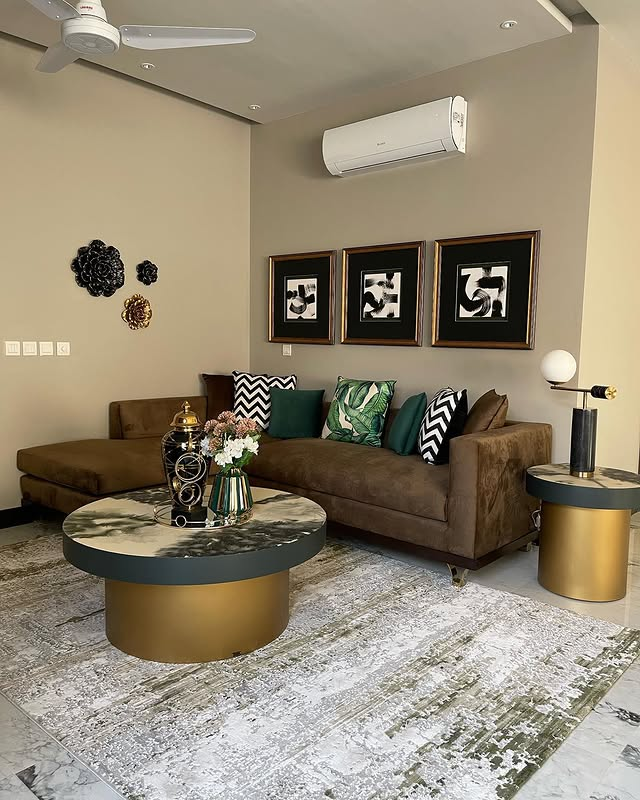
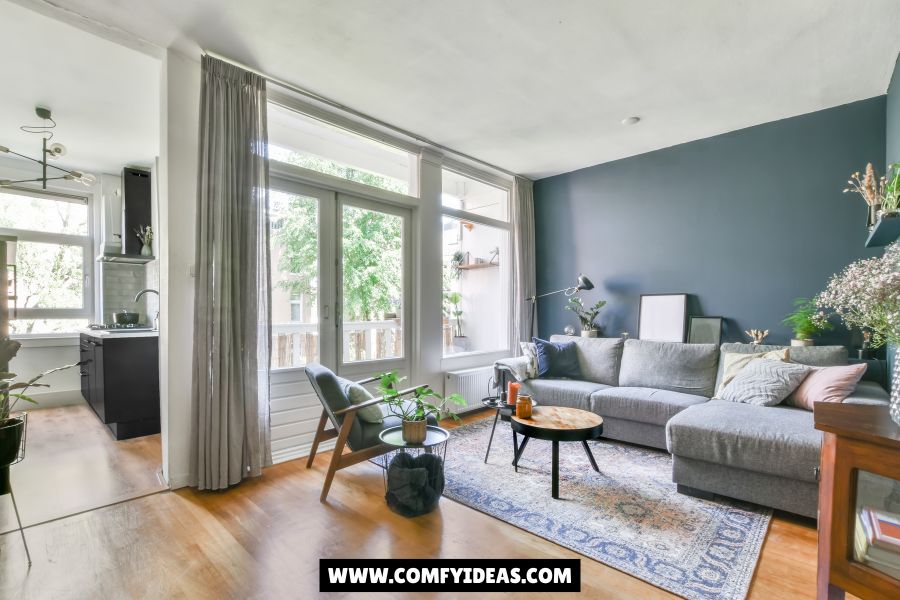
Designate One Wall for Dark Paint
Of course, in a low-light room, you must have illuminating paint, so keep one wall in dark purple and the rest in grey for better light reflection.
White Theme with Lilac for Contrast
This is a great way to achieve an attractive interior with better light reflection. Lilac looks amazing when applied in contrast with off-white furniture.
Although the maintenance is high, the results are spectacular.
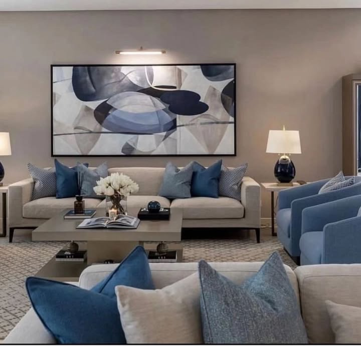
Greyish Blue and Cream Wooden Work
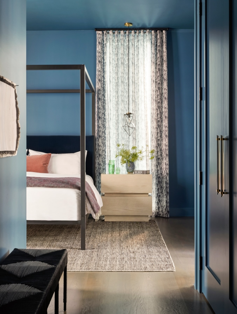
This is another option to make your room feel soothing and more spacious.
Use greyish blue with some white woodwork for storage. You will definitely love the final results.
Creating Contrast with Greyish Blue
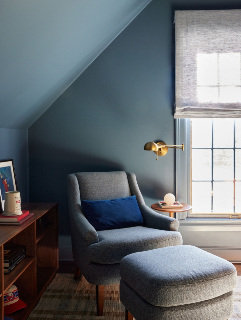
Try blue grey for its elegance, and pair it with contrasting tones such as cream, emerald green, beige, or any other subtle choice.
Mustard Yellow with Terrazzo Surfaces
I personally like to have a warm appeal with yellow paint.
If you are worried about lighting, then have one wall in mustard yellow and pair it with terrazzo-style surfaces for more vibrancy.
Blue Shades Combination
Brittany Blue and Blue Chalk Blue make your space look cool. You can give it a modern touch by having walls in various shades.
You can experiment with available options, but I personally like chalk blue with Brittany blue.
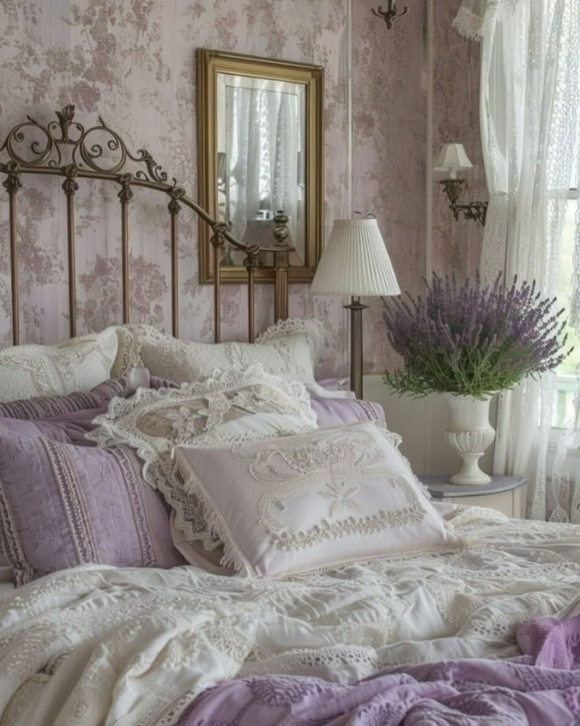
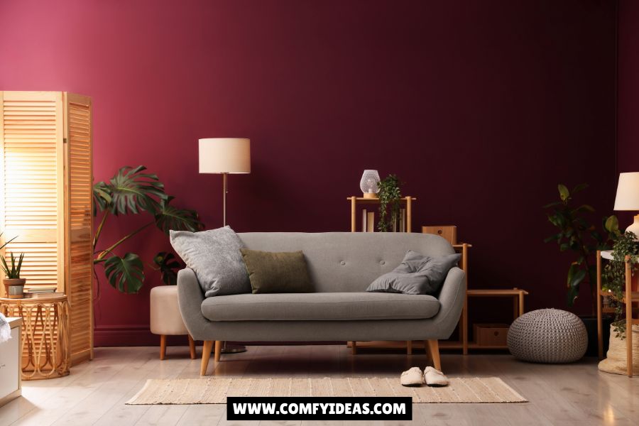
Dusty Rose and Cloud White
Cloud white looks amazing when paired with soft and subtle colors such as dusty pink.
You can have the ceiling in contrast by having walls in pink or vice versa.
Greige for Extravaganza
If you are more into beige tones, try its warmer variant called greige.
It looks stunning when paired with bold-colored artwork or statement lighting fixtures.
One Bold Wall with Black Patch
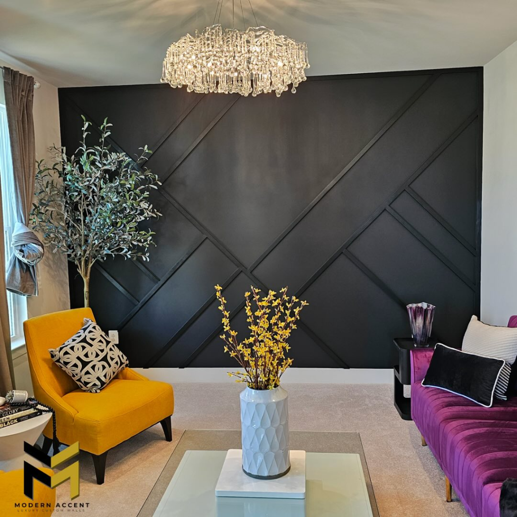
I think for those who loves bold looks, then dark colors are always perfect for their space, even for low-light rooms.
I understand the preference for neutral colors, so here is the perfect contrast. Just have one portion of the wall in black with the rest in off-white.
I am suggesting to use Black Fox by Sherwin Williams.
Brown Rich Paint for Deeper Look
Here is another contrasting idea with a beige variant.
You can have creamy chocolate or coffee color. For simple yet impactful decor, have some curtains in contrast.
Matching Wall Paint and Furniture with Beige
Are you looking for one paint color for everything? Then I will recommend trying out Beige. Trust me, it works perfectly for almost all kinds of spaces.
From paint to furniture, it gives you easy coordination.
Warm Greige with Wooden Furniture
Warm beige is another choice for creating an elegant interior.
To make it look more attractive, invest in wooden furniture, woven decor baskets, and mirrors.
Olive Green Accent
Olive green works well for both low- and high-light rooms. It has enough capacity to reflect light while still giving warm and cozy vibes.
Simply create a modern interior with simple decor and wooden work.
Clean and Simple Appeal with Vanilla Cream
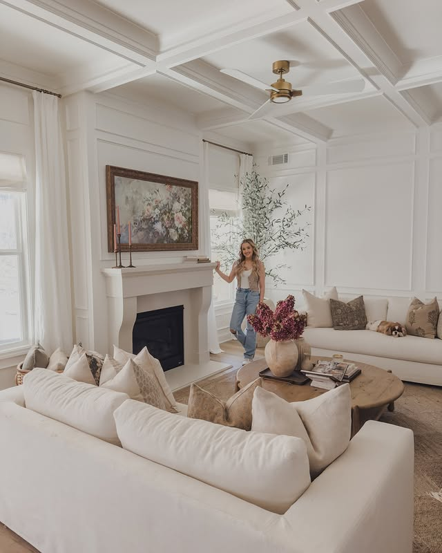
Another one of my top favorites for its illumination and clean appeal.
Paint your room in a simple vanilla cream shade and forget about issues with minimal natural light.
Limewash Color for Natural Appeal
Limewash colors with textured patterns come with high labor costs, but you will get an artistic touch for your dark room.
Just invest in some abstract pieces or minimal decor with such wall paint.
Limewash Olive
This is another good choice. I personally like it for darker living rooms.
Modern interior with a few decor items works with such textured limewash olive paint color.
Bottom Line
Paint color for low-light rooms matters a lot in making them feel vibrant and less gloomy.
I preferred light colors for your inspiration, as I personally believe they are better for light reflection.
You can still use some darker shades, but I suggest going for mid-tone paint colors with an LRV of around 50. Just understand that both dark and light colors work well in dark rooms.


Leave a Reply